This Week in Design: April 18, 2014
I am going to confess right now. I am a little obsessed with typography this week. And there’s been plenty happening in the world of type, making it the theme of this week in design.
Every week, we plan to a look at major product releases and upgrades, tools and tricks and even some of the most popular things you are talking about on social media. And we’d love to hear what’s going on in your world as well. Have we missed anything? Drop me a line at [email protected].
2 Million+ Digital Assets, With Unlimited Downloads
Get unlimited downloads of 2 million+ design resources, themes, templates, photos, graphics and more. Envato Elements starts at $16 per month, and is the best creative subscription we've ever seen.


There’s a ‘Neue’ Comic Sans in Town
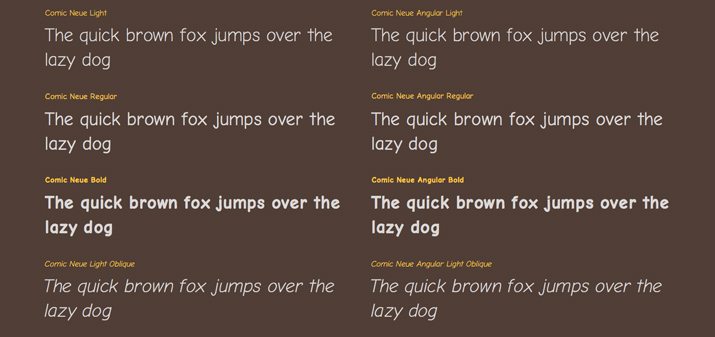
Comic Sans has long been at the end of many designer jokes. The light font, which was introduced in 1994 and is a part of the Windows operating system, is often criticized. (As a designer, I know I avoid it.)
But the font is getting a new bit of life, with a little more style and a little more funk to the comic-book style lettering. Digital designer Craig Rozynski developed a new typeface, Comic Neue and the more angular Comic Neue Angular, for free download right now.
“Comic Sans wasn’t designed to be the world’s most ubiquitous casual typeface. Comic Neue aspires to be the casual script choice for everyone including the typographically savvy,” according to the font website. “It’s perfect as a display face, for marking up comments, and writing passive aggressive memos.”
It’s nice to see a fresh take on the font that is known in design circles as bad. It’s also fun to see the tongue-and-cheek approach of the new version.
Comic Neue also comes with a fun little tool that replaces the use of Comic Sans in the style sheets of major browsers such as Chrome, Firefox, Opera and Internet Explorer. (So if you want to avoid looking at the original version, you can.)
But will it take off? Will designers (or the general public) latch on to Comic Neue? Will you download it? Let us know what you think in the comments.
Can a Font Make You Safer?
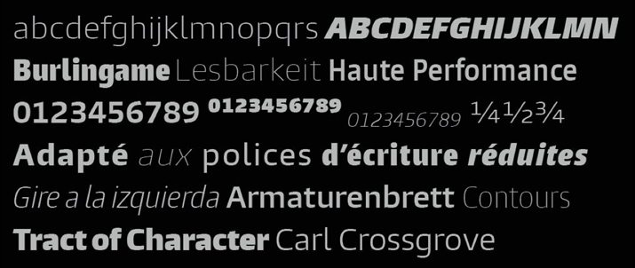
Designers at Monotype conducted a study that found a change in the typeface commonly used in car dashboards could make driving a little safer, because of displays that are easier to read. Burlingame, a Monotype font design, is considerably highly legible in a recent study conducted at MIT.
Because of the letterforms and spacing used, Burlingame is easy to read at a glance. This means drivers spend less time looking at their dashboards and more time with their eyes on the road (hopefully).
“Truthfully there haven’t been any good scientific studies to prove what we consider our trade craft, our intuition as designers that makes things legible,” Steve Matteson, creative type director at Monotype, who took part in the MIT AgeLab study, told Fast Company. “We worked with MIT to basically test typefaces side by side to figure out which ones were legible and try to figure out why they are legible.”
If adopted, a change would replace the commonly used Eurostile, which is most commonly used for speedometers and radio interfaces.
The full study results are quite fascinating. Learn more from Fast Company.
The Best of Icon Fonts
There are times when you just need an icon. An icon font is often the solution. But where can you find a quality icon font set.
Line 25 recently put together a roundup of some of the best sets available for download. This collection includes a dozen free all-icon webfont sets from some pretty well-known names in web design and development.
An icon font can be especially useful for web-based projects because these characters will scale and retain quality, allow for color change using CSS and provide a library of glyphs in a single file.
Websites that People and Google Like
There are two big things to think about when it comes to designing for the web – usability and search engine optimization. Often these concepts don’t mesh, but they can.
This week Vandelay Design released an article with suggestions on how to create such a project in “Website Designs That Are People-Friendly Are Google-Friendly.” The post is filled with solid and doable suggestions that apply to almost any project.
Here are the highlights, visit Tara Hornor’s post on Vandelay Design for more.
- Define the audience
- Provide high-quality content
- Design for mobile
- Publish images properly
- Get involved in social media
- Involve the experts
- Use Google Webmaster Tools
Just for Fun

A fun little gizmo, called the G-pad, allows you to turn your iPhone into a Gameboy. (Children of the 1980s and 90s will love this.)
“The iPhone, iPod touch or iPad mini game controller you always wanted. Whether in the air, on the road, or between classes, G-pad opens a new world of mobile gaming with style controls,” says the description from parent company AJD Design Studio.
Slate took a look at the device and says the device is a lot of fun but there are some downsides as well. You have to download a program to make it all work and it hinders some touch features.
The G-Pad is an IndieGogo project and starts at a backer price of $13. The developer plans to sell them for $33 retail later, making it an early steal.