This Week in Design: Aug. 8, 2014
For many people vacation season, is in full swing.So this week in design we are having a little fun. From a great debate over the difference between a logo and symbol, to fun “commandments” for freelancers, to a typography contest, there’s a little something for everyone.
Every week, we plan to a look at major product releases and upgrades, tools and tricks and even some of the most popular things you are talking about on social media. And we’d love to hear what’s going on in your world as well. Have we missed anything? Drop me a line at [email protected].
2 Million+ Digital Assets, With Unlimited Downloads
Get unlimited downloads of 2 million+ design resources, themes, templates, photos, graphics and more. Envato Elements starts at $16 per month, and is the best creative subscription we've ever seen.
Logos vs. Symbols
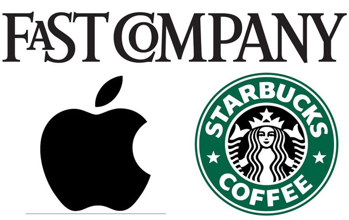
Are a logo and symbol the same thing? Have you ever gotten into an all-out argument over this very question?
Fast Company recently interviewed experts Michael Bierut (Pentagram) and Brett Wickens (Ammunition) to get the answer. And you might be a little surprised at the conclusion: A logo is not the same as a symbol … but most people don’t think of it that way. (So is it really worth arguing over?)
So what’s the difference? (In case you do want to hold your ground.) A logo is a word; a symbol is an image; a combination mark is the combination of a logo and symbol. “Logo” actually comes from “logotype,” which is from the Greek language, meaning “word imprint.”
“I don’t think the distinction is that important,” Wickens, partner and identity specialist at Ammunition Group told Fast Company. “Almost everyone refers to the emblematic visualization of a brand as a ‘logo,’ even though it might be a symbol, a stylized word, or a combination of both. For a designer, what really matters is deciding what’s most useful, and what’s likely to convey the right attitude and distinction for the brand.”
Well said.
Commandments for Freelancers

A common complaint of freelancers is often dealing with distractions. There are so many things that can stand between you and finishing projects when you are working from home.
This week Celeste Kaufman’s piece, “The Ten Commandments for Freelancers,” published by Contently offered a great bit of advice on how to be a better boss and employee. The article includes just the right amount of advice (which we sometimes all need to hear again) and snark to keep you entertained.
Make sure to hop over and read the full details of each commandment listed here:
- Thou shalt not lead thy entire life from a bed
- Thou shalt not blur the lines between thy social network and thy social network
- Thou shalt not treat thy intern poorly
- Thou shalt not wallow in rejection
- Thou shalt not panic when thou must interact with another human
- Thou shalt not sell thyself short
- Thou shalt not let the internet animals become distractions
- Thou shalt not forget thy swag
- Thou shalt not wear the same pajamas more than two days in a row
- Thou shalt not forget they brothers and sisters
Call for Entries
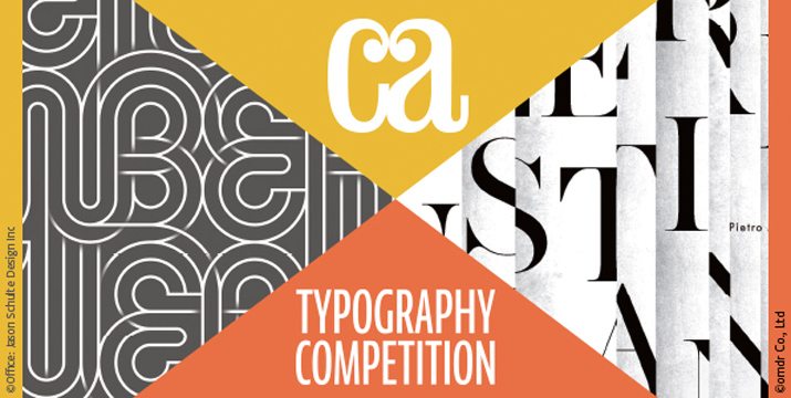
The annual Communication Arts Typography Competition is open for participation. The juried competition is open to any typographic project published or produced from September 2013 to September 2014.
The contest is designed to celebrate the best typography “as the primary visual element in design and advertising, plus new typeface designs, calligraphy and handlettering.” Winners earn worldwide recognition in the “Communication Arts Typography Annual” and online. Winners also get a personalized Award of Excellence, milled from solid aluminum, and a certificate.
The best in typography is chosen by a group of design professionals. This year the jury includes John Clark, founder and director of Looking; Juan Carlos Pagan, design director for Deutsch, Inc.; and typeface and lettering designer Laura Worthington.
New this year is a student competition. Other categories include advertising, brochures, posters, ephemera, packaging, books, periodicals, digital media, environmental, identity, motion, typeface design, calligraphy or handwriting, miscellaneous and unpublished work. The deadline for entries is Sept. 5.
The full list of rules and qualifications can be found from Communication Arts. Good luck!
What’s New in Creative VIP?
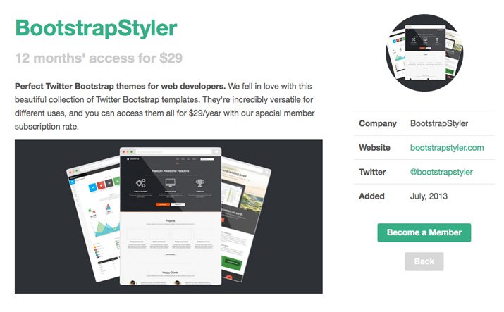
Creative VIP subscribers should be on the lookout for goodie bags that shipped out this week. (I can’t wait to see what’s in mine.) And it’s not too late to sign up for the exclusive subscription-based network of deals, design resources, discounts and even goodie bags for creative professionals, just got a whole lot better. The site recently launched a redesign and a single subscription plan that includes a ton of design resources.
Here are three brand new deals members are taking advantage of:
- Only $29 for 12 months of access to BootstrapStyler, a collections of templates for Twitter Bootstrap.
- Free PixelsDaily membership. The site is packed with graphics, icons, vectors and web elements and Creative VIP members get a free account for life!
- 20% off PDFPen, which allows you to fill out and sign PDF forms, add text and images, correct typos, make notes, and even combine and reorganize PDFs.
- Free collection of option and check mark icons in vector and PSD format for use in a variety of projects.
Join today. This is a great value for creative professionals.
Leader’s Handwriting Made into a Font

Former Venezuelan president Hugo Chavez left an impression on his nation under years of leadership (1999-2013). So much so that replicas of his scribbles are painted on the sides of buildings in the country.
Type group Creative Trench has taken those writings and turned them into a digital replica. Anyone can download the “Anti-Imperialist” font for free from their website. (Click “Descarga Aqui” for a downloadable zip file.)
The lettering is designed from actual handwritten letters Chavez wrote during his time in prison after a failed coup in the early 1990s. The release of the typeface is timed to what would have been his 60th birthday.
Learn more about Chavez and the typeface from The Guardian.
