This Week in Design: May 16, 2014
This week you should try to get smarter. This is true every week, but our roundup today is focusing on tools, ideas and items that will make you work and feel just a little more educated. That’s what the design community is all about, right?
Every week, we plan to a look at major product releases and upgrades, tools and tricks and even some of the most popular things you are talking about on social media. And we’d love to hear what’s going on in your world as well. Have we missed anything? Drop me a line at [email protected].
The Ultimate Designer Toolkit: 2 Million+ Assets
Envato Elements gives you unlimited access to 2 million+ pro design resources, themes, templates, photos, graphics and more. Everything you'll ever need in your design resource toolkit.

“Type on Screen” Released
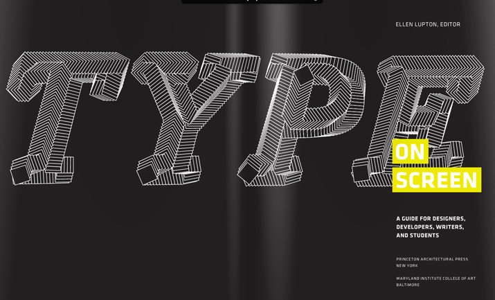
Ellen Lupton is the queen of typography. Her newest book, “Type on Screen,” was released this week and is just as good as you might imagine. (The book follows her typography manual, “Thinking with Type,” originally released in 2004.)
I have already spent hours looking through the book – which you want as a paper copy; it is beautiful. The information is presented in an easy to follow way that works for beginners or experienced designers and includes plenty of practical applications.
From the publisher: “Covering a broad range of technologies, from electronic publications and websites to videos and mobile devices, this hands-on primer presents the latest information available to help designers make critical creative decisions, including how to choose typefaces for the screen, how to style beautiful, functional text and navigation, how to apply principles of animation to text, and how to generate new forms and experiences with code-based operations.”
The practical applications are many. The examples and logic behind type designed for screens is based on many of the basic principles of typography and is explained both with practical use and theory and shown in examples and with code.
The six sections of the book are divided into categories that cover a wide-range of digital typography uses:
- Fonts on screen
- Text on screen
- Digital publishing
- Type and interface
- Icons and logotypes
- Animation and code
And Lupton is the authority when is comes to typography. She has 13 books about type and graphic design in the Princeton Architectural Press collection and “Thinking with Type” has sold more than 150,000 copies and has been translated into 10 languages.
“Type on Screen” is the absolutely the definitive go-to guide for any modern-day designer.
Build a Better Mobile Site
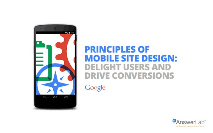
What makes a great, and highly usable, mobile website? Researchers from Google and AnswerLab recently conducted an extensive study to find out the answer.
The result is a list of 25 guidelines complied in “Principles of Mobile Site Design: Delight Users and Drive Conversions.” The overall goal of the whitepaper is to help mobile web creators establish best design practices. Broken down into five categories – homepage and site navigation, site search, commerce and conversions, form entry, and usability and form factor – the study presents a best-case study and pseudo-checklist for web designers.
Here are the 25 things you can do to help design a better mobile web. (Make sure to go read the entire whitepaper for the logic behind each principle and key takeaways.)
- Keep calls to action front and center
- Keep menus short and sweet
- Make it easy to get back to the homepage
- Don’t let promotions steal the show
- Make site search visible
- Ensure site search results are relevant
- Implement filters to improve search usability
- Guide users to better search results
- Let users explore before they commit
- Let users purchase as a guest
- Use existing information to maximize convenience
- Use click-to-call buttons for complex tasks
- Make it easy to finish converting on another device
- Streamline information entry
- Choose the simplest input method for each task
- Provide a visual calendar for dates
- Minimize form errors with labeling and real-time validation
- Design efficient forms
- Optimize entire site for mobile
- Don’t make users pinch to zoom
- Make product images expandable
- Tell users which screen orientation works best
- Keep users in a single browser window
- Avoid “full site” labeling
- Be clear why you need a user’s location
What Happens to Social Media When You Die?
What happens to Facebook or Twitter or Google+ after you are gone? Many places are struggling to bring laws up to speed with technology.
In the United States, individual states are considering “digital asset laws,” which set ground rules for how such accounts will be handled after the death of the owner. These “digital assets” include any online accounts, email, social media profiles, blogs and online texts and messages.
The Washington Post’s “The Intersect” column recently examined laws that are on the books and legislation that is in progress. But it all begs a bigger question: Should you have a plan for your accounts? Or do you even care?
Adobe Illustrator Through the Years
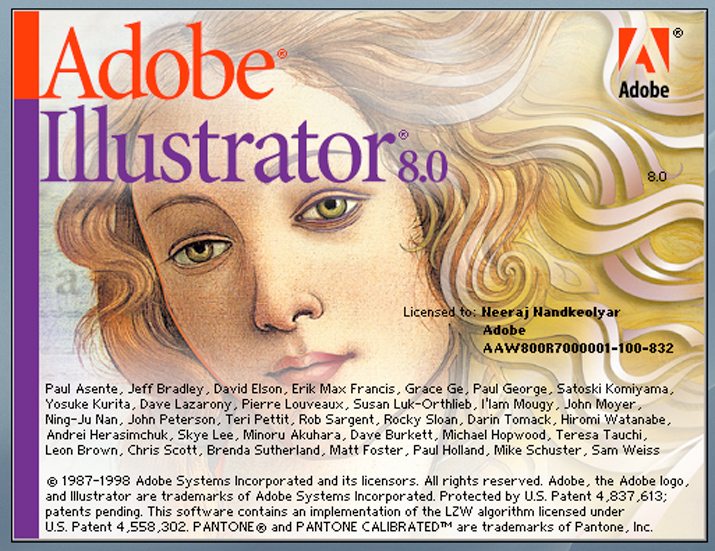
Just as much as looking at old photos, looking through decades of popular software logos and splash screens can be a lot of fun. The Next Web recently interviewed Adobe senior creative director Russell Brown for a peek inside the history of the famous graphic design software.
Brown explains why Illustrator is such a big deal – it’s the vector format – and how the software has changed over time. Plus the article shows off years of splash screens from the very first black and white version in 1987 to the orange angular shape associated with today’s version.
The interview is incredibly interested and gives us a glimpse of what some of the great minds in the field are thinking. It also provides context as to have far graphic design and computer design have come in a relatively short time.
Just for Fun
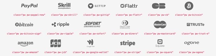
Have you ever wanted a simple icon to show that your business accepts a certain payment method? Sometimes using standard logos for every different payment type can get clunky – and quite colorful – on the screen.
Enter the payment webfont by Orlando TM Merone. The simple webfont includes 34 glyphs for the most popular payment options. From Visa and MasterCard to PayPal and Bitcoin, this type family has you covered with a simple library of icon letterforms.
Check out the font family or download it free on Github.