This Week in Design: Nov. 14, 2014
Designing for the web can be a common assignment for almost any designer. What should you be thinking about when planning such a project? That’s what we are looking at this week in design, from wireframing on your tablet to lessons in lettering.
Every week, we plan to a look at major product releases and upgrades, tools and tricks and even some of the most popular things you are talking about on social media. And we’d love to hear what’s going on in your world as well. Have we missed anything? Drop me a line at [email protected].
2 Million+ Digital Assets, With Unlimited Downloads
Get unlimited downloads of 2 million+ design resources, themes, templates, photos, graphics and more. Envato Elements starts at $16 per month, and is the best creative subscription we've ever seen.


Wireframing on a Tablet

Yes, designers, you can design wireframes on a tablet. And if you don’t know how or think this reality is beyond reach, Webdesigner Depot has some great tips and ideas for you.
A wireframing app can help you get started and work on projects. For most projects though, it will not be a catch-all solution. What you should look for in a wireframing app are some shapes to work with; a workspace where you can place, arrange and edit objects; and a way to share your work or export it to your primary workspace.
There are a variety of apps out there and the write does a good job of introducing a number of options for Android or iOS users. (You’ll have to read the article to see the list of both free and paid app options.)
And since this is a pretty new way to map out a website design, it does come with some drawbacks. Working on a major project on an app may not be as comfortable as working at a desktop computer, there will be functionality issues and depending on the app, it might not do everything you want. But it is a good place to brainstorm and play.
Are you using apps for wireframing projects? Which ones do you like? Share your thoughts with us in the comments.
Things to Do, And Not Do, With Type
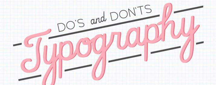
If you are designing for a living, you likely understand what you should and should not do with type. You likely have a good grasp on the principles of typography design. But sometimes, its nice to have a little refresher course.
That’s where “9 Do’s and Don’ts of Typography” comes in. The practical tips are illustrated in a fun way. (You might even see some concepts reminiscent of your own mistakes.)
Here are the don’ts from the list. Make sure to check out the article for some things that you should be doing.
- Don’t go crazy over fonts.
- Don’t overdo it.
- Don’t add a shadow to everything.
- Don’t rely on Photoshop effects.
Tips for Building Websites with Touch Support
Anyone who is building a website should be thinking about mobile. That’s where a good number of users will access the site. Because of this, every website design should include considerations for touch capability.
But do you know where to start when working with touch screens? DesignM.ag recently answered that question in “Guidelines for Building Touch-Supported Website Layouts.” The article offers practical tips for thinking about designing websites that work in touch environments.
- Page elements need to be large.
- Navigation should be accessible. “You don’t always need to hide a navigation offscreen to accomplish accessibility,” according to the article. “There are plenty of responsive navigations which drop links into a large vertical block right near the header.”
- Reduce clutter on smaller screens.
- Leave room for swipe actions to be completed with ease.
Great Resources for Illustrators
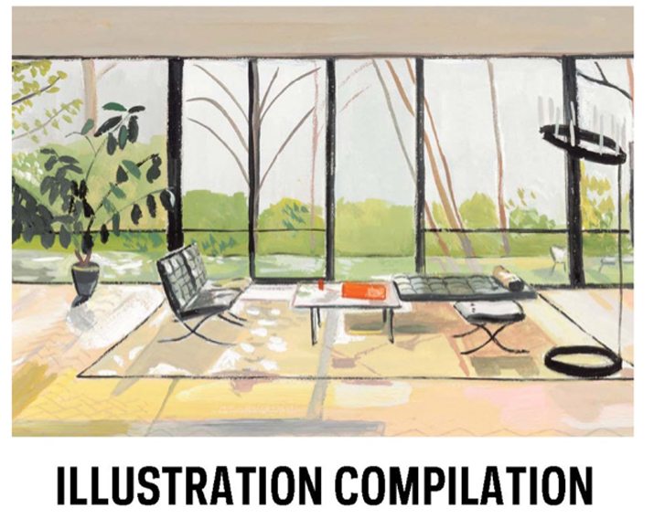
Illustration is a common part of the graphic design field. It is also a skill that not everyone has and we sometimes forget to acknowledge.
Print magazine recently created a list for these creative workers with “9 Creative Resources for Illustrators.” The list is packed books and collections that can help anyone who is skilled at putting pen to paper.
Here’s a quick look at what’s on the list. Visit Print magazine online to learn more and find out where you can find each item.
- 50 Markets of Illustration: A showcase of Contemporary Illustrators by John Roman
- Fifty Years of Illustration by Lawrence Zeegan and Caroline Roberts
- Print’s Illustration Compilation: A Guide for Illustrators
- Illusive. Contemporary Illustration Part 3, edited by R. Klanten and H. Hellige
- The Creative Process Illustrated: How Advertising’s Big Ideas Are Born by W. Glenn Griffin and Deborah Morrison
- Illustrative Design presented by Von Glitschka
- The Top 24 Illustrations of 2013 by Karl Petrovix
- An Illustrated Life: Drawing Inspiration from the Private Sketchbooks of Artists, Illustrators and Designers by Danny Gregory
- An Illustrated Journey: Inspiration from the Private Art Journals of Traveling Artists, Illustrators and Designers by Danny Gregory
Just for Fun
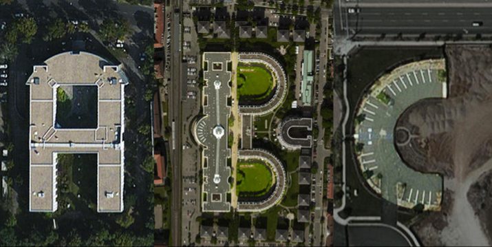
A new typeface collection on Kickstarter is made entirely of lettering found in satellite images. The layout of buildings, landmarks, roads, trees and waterways creates a series of letters to form the typeface Aerial Bold.
Fast Company recently featured the lettering, which was created by Massachusetts Institute of Technology alums Joey Lee and Benedikt Grob. The pair are creating letters using an algorithm and satellite imagery. The font will also be more than that; it will also work as a searchable database of imagery that looks like lettering.
“The entire letterform database will be made available as a ‘usable’ dataset for any of your art/design/science/textual projects and selected letterforms will be made into a truetype/opentype font format that can be imported to your favorite word processor,” according to the Kickstarter page.
Support for the project ended earlier this week. The project exceeded its $10,000 goal ahead of closing on Kickstarter.