This Week in Design: Nov. 21, 2014
Challenges and solutions. These are the essence of what a designer does in a visual format. And it’s what we are looking at this week in design, from better ways to design responsive websites to a typeface for dyslexics to presenting complex information in an award-winning way.
Every week, we plan to a look at major product releases and upgrades, tools and tricks and even some of the most popular things you are talking about on social media. And we’d love to hear what’s going on in your world as well. Have we missed anything? Drop me a line at [email protected].
2 Million+ Digital Assets, With Unlimited Downloads
Get unlimited downloads of 2 million+ design resources, themes, templates, photos, graphics and more. Envato Elements starts at $16 per month, and is the best creative subscription we've ever seen.


Designing Better Responsive Websites
With the number of designers working on responsive design projects, there is an ever-increasing importance on make better responsive websites. UX Magazine tackled some of those issues in “10 Responsive Design Problems and Fixes.”
What the article showed is many designers are facing some of the same challenges when it comes to thinking about responsive design. It also proves that with a little work, many of those challenges can be tackled head-on.
“The most important thing to remember is that responsive design should improve experiences, not reduce opportunities for users, and all designer and developer efforts should be aimed at making that goal a reality,” writes author Kirill Strelchenko.
Here, we’ll highlight the 10 problems, but you will have to head over to UX Magazine for the solutions.
- The visual stages (sketching, wireframing) can be chaotic and problematic
- Placement of navigation is unclear
- Appearance of background images and icons must be flexible
- Showing data on small screens
- Creating rich experiences that actually load quickly
- It takes longer to design, develop and test
- Hiding and removing content can be tough
- Converting fixed sites to responsive ones is not easy
- Older web browsers don’t support CSS3 media
- Not everyone understand why they should go responsive
Information is Beautiful
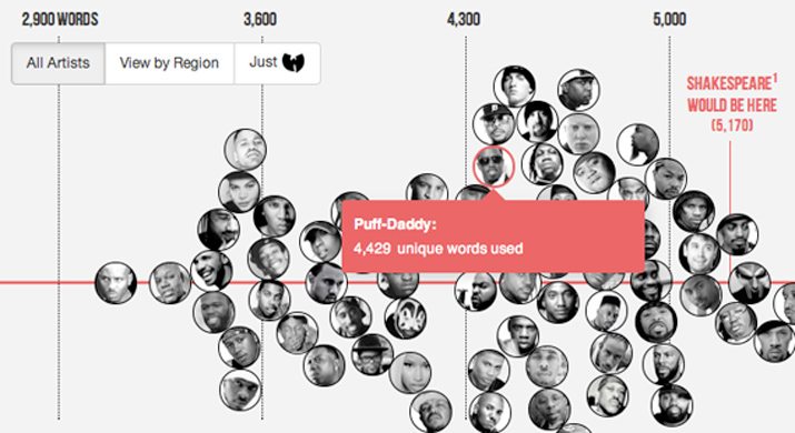
Creative Review has released its list of Information is Beautiful Award winners for 2014. The gallery includes a great look at how to design and present a lot of information in a usable and visually stunning way.
The winners include:
- Chris Whong’s NYC Taxis: A Day in the Life
- Matthew Daniels’ project, Rappers, Sorted by Size of Vocabulary
- Hyperakt and Ekene Ijeoma’s The Refugee Project
- RJ Andrews’ Creative Routines
You can see each project in detail from Creative Review.
Design Books and Type
I have read a ton of design books over the years. And most were designed beautifully – as you would likely expect. But have you ever thought about the design that actually goes into these publications?
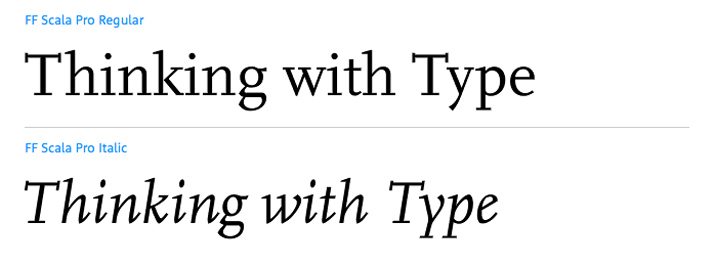
David Airey recently published a piece on his blog, “Typeface Combinations Used in Design Books,” that looks at the font combinations from some popular works. Interestingly, he notes that “not all authors were responsible for the design of their books.” This really makes you think about the design in a whole new way: Maybe not as the writer (or often designer) envisioned it, but how it was perceived by the book typographer or designer.
The post takes a good look at some of the books we probably all know pretty well and the primary typefaces and families used therein. The combinations are phenomenal in most instances and showcase the use of nice typography and how to use typography for large blocks of text.
It’s also interesting to see how many type families keep popping up in the typography palettes of these books. Some of these typeface choices could be indicative of design trends but many of the choices include letterforms of a more classic nature.
Typeface Could Make Reading Easier for Dyslexics
Designer Christian Boer might be on to something that could change the way people read. His new typeface, Dyslexia, is designed for people with dyslexia, which can make it difficult for people to read and comprehend lettering because elements can be flipped, rotated or mixed.
The typeface, which is on display at the Istanbul Design Biennial, has letterforms that are unique in a way that makes the separate in the brains of people with Dyslexia. The typeface works in that letters are designed so that the bottom-most strokes are heavier than uppermost strokes so that letters are less likely to be visually “flipped.” (In contrast, most other typefaces have common strokes from top to bottom.)
“By changing the shape of the characters so that each is distinctly unique, the letters will no longer match one another when rotated, flipped or mirrored,” Boer said. “Bolder capitals and punctuation will ensure that users don’t accidentally read into the beginning of the next sentence.”
He developed the typeface in 2008 and the current display runs through Dec. 14.
Just for Fun
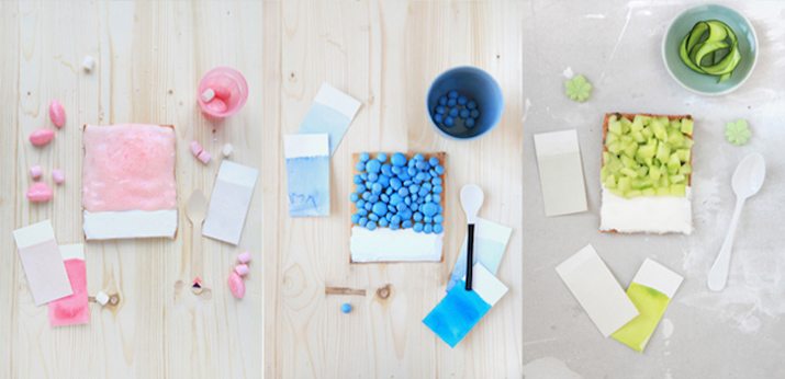
Who ever knew you could have so much fun with color? HOW magazine recently featured “9 Enchanting Projects Using the Pantone Matching System” and they are likely to inspire designers to go play with color.
Each of the projects is a fun use of color matching, such as the Pantone food match project above. Every example is from a designer who has actually done this project. So it’s more than just a few ideas of things you can do; it’s a gallery of things that have been done.
The other examples include:
- Beer packaging
- Mosaic posters
- Tiny PMS cards
- Holiday poster
- Business cards
- Street art
- Color chip magnets
- Advent calendar
Now what projects are you inspired to do? Share your ideas (and examples) in the comments.