This Week in Design: Nov. 28, 2014
The holiday season has officially arrived! And with that, this week in design focuses on something a little new (material design), something old (usability) and something to gift (a new book on responsive web design).
Every week, we plan to a look at major product releases and upgrades, tools and tricks and even some of the most popular things you are talking about on social media. And we’d love to hear what’s going on in your world as well. Have we missed anything? Drop me a line at [email protected].
2 Million+ Digital Assets, With Unlimited Downloads
Get unlimited downloads of 2 million+ design resources, themes, templates, photos, graphics and more. Envato Elements starts at $16 per month, and is the best creative subscription we've ever seen.


Thinking About Apps and Material Design
Everyone seems to be talking about material design these days. Many are even starting to freak out a bit. But material design, as an overall concept, is nothing to be sacred of.
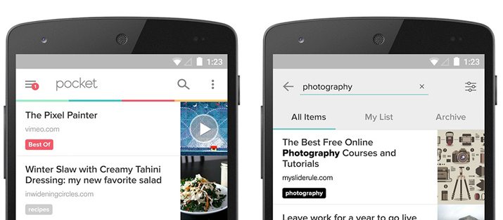
Max Weiner, Android Lead Designer at Pocket, offers a great getting started guide in “How to Not Freak Out About Material Design.” The article explains the basics of the design language and offer plenty of resources to help you gain a better understanding. Plus Weiner helps you get started with a case study based on projects happening at Pocket.
In case you have not been exposed to material design yet, it is a new design language/concept from Google that combines principles of good design with “the innovation and possibility of technology and science.” The idea, in a nutshell, is to create and build designs that have a unified experience across platforms and devices.
Here’s what you need to know right now. (Make sure to read the full post for more details and relevant links.)
- Learn the basic theory of material design
- Interact with apps using material concepts. (It’s Google’s idea, so start with those.)
- Conduct an audit of your app. What do you need to do?
- Prioritize. Remember, you can’t overhaul everything in a day.
- Stay focused and work toward the goal.
What impact do you see material design having on your projects moving forward? Do you think it is something you will encounter? Learn more about the concept from Google in its quite extensive documentation.
10 Common Usability Mistakes to Avoid
Now that you are thinking about your website and app, thanks to material design, it is also a good time to make sure you are not making common usability mistakes. (We’ve all done one of these at some point.)
Just Creative put together a list of 10 mistakes that too many websites suffer from. Use this guide as a checklist of things to avoid in your projects.
- Lack of consistency: “Visitors expect to see the same colors, logos, fonts, navigation tabs, et cetera in the same place on every page.”
- No search
- Experimental navigation
- Outdated content: “Weeding out outdated content should be part of regular website maintenance.”
- Dead links
- Odd or unconventional organization
- Poor readability
- Music: “If a music player is used, be sure to have a stop button and keep the loop continuous.”
- Neglecting mobile users
- Forgetting the contact page
Once you pinpoint these mistakes, get out there and do something about it. They key to a great design, is usability. You need your audience to interact and understand the design.
Stocking Stuffer
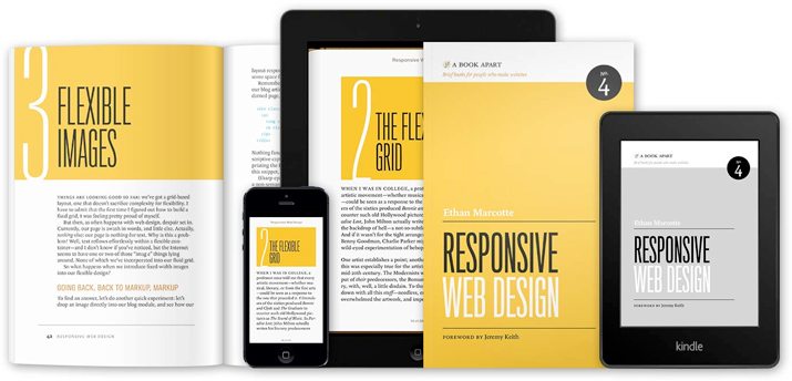
You can avoid all those crazy Black Friday shoppers and lines by waiting until Dec. 3 and ordering the second edition of “Responsive Web Design” by Ethan Marcotte. This book is a great addition to the shelf (physical or digital) of any designer or developer.
From publisher A List Apart: “In the second edition of ‘Responsive Web Design,’ Ethan Marcotte expands on the design principles behind fluid grids, flexible images, and media queries. Through new examples and updated facts and figures, you’ll learn how to deliver a quality experience, no matter how large or small the display.”
You should be very, very excited about this release. All the good designers on my list will get a copy for sure!
Typography Quiz: What Font Fits You?
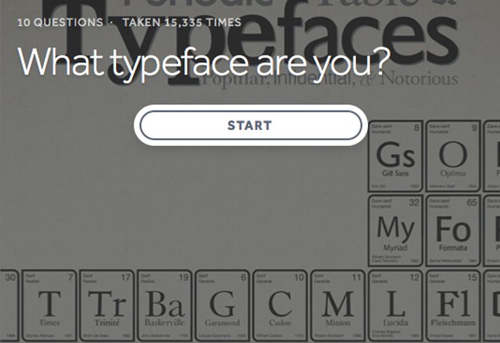
So … it’s not that much of a shock that I am Helvetica. It’s my go-to default use-it-everywhere without shame typeface. And apparently – because the quiz says so – I am this font personified.
In a nutshell: “Classic and reliable, you’re picky about design. Clean and streamlined, you don’t get bogged down in detail or decoration. Versatility and simplicity is key, and you’re the master of both.”
Yes, I will admit this description very much describes my personal and design styles. Maybe these silly internet quizzes do know what they are talking about. (Just don’t base any major life decisions off the results.)
While there are not a lot of typeface options that you can “be,” the quiz is still a lot of fun. And with only 10 questions, it’s a quick diversion when you need a break. Take the quiz to find out if you are Impact, Courier, Brush Script, Comic Sans, Helvetica, Times New Roman, Franklin Gothic or Futura and make sure to share the results with us in the comments.
Just for Fun
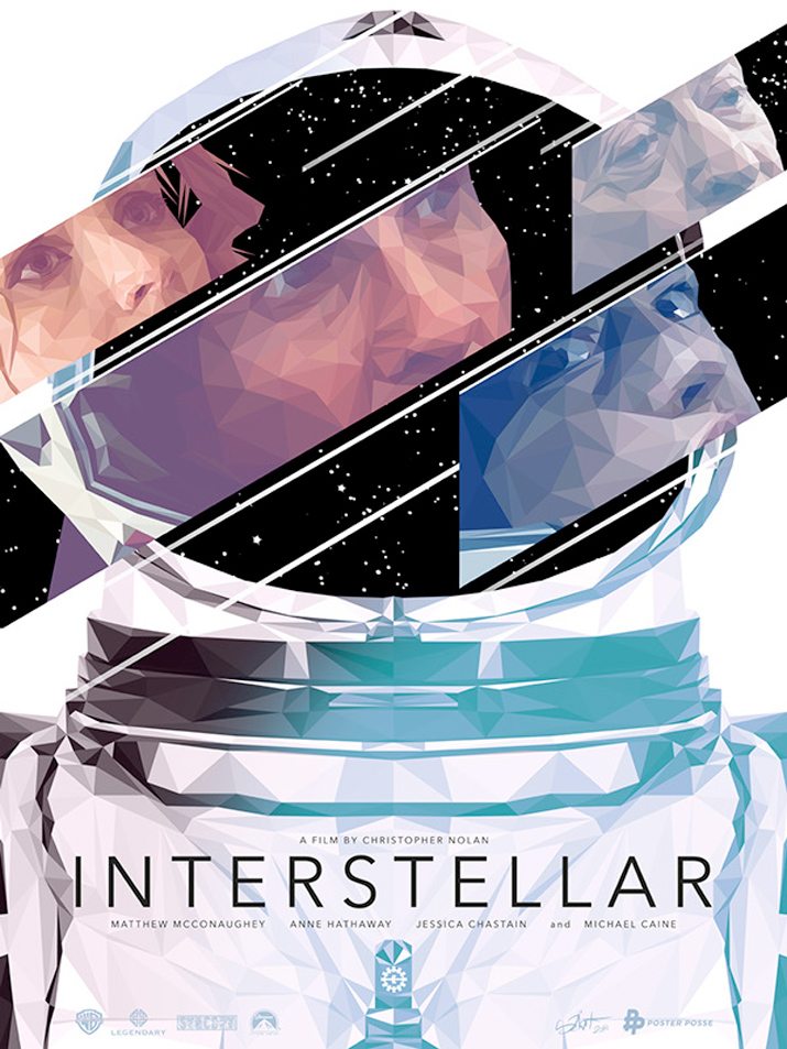
Box-office hit “Interstellar” has inspired designers to create. Creative Market found 30 of the best movie poster designs out there inspired by the space thriller.
The designs are great, regardless of what you thought of the movie or whether you have even seen it at all. Each takes a dramatically different take on the movie and design concepts. Browsing through the poster gallery is inspiring for sure.
My favorite, above, has a stained-glass effect that includes remarkable detail. The designer, Simon Delart, also took quite a different approach to the design with more light colors than many of the other spaced-themed poster styles.