This Week in Design: Oct. 24, 2014
Most weeks, we head into our “Week in Design” recap with a theme in mind. This week that theme is lacking, but hopefully this mix of resources about logos, type design, photography and even beer as a team motivational tool will inspire you.
Every week, we plan to a look at major product releases and upgrades, tools and tricks and even some of the most popular things you are talking about on social media. And we’d love to hear what’s going on in your world as well. Have we missed anything? Drop me a line at [email protected].
2 Million+ Digital Assets, With Unlimited Downloads
Get unlimited downloads of 2 million+ design resources, themes, templates, photos, graphics and more. Envato Elements starts at $16 per month, and is the best creative subscription we've ever seen.


How Your Brain Sees a Logo
As a designer you understand that what people see when they look at almost anything has a strong impact on decision-making, buying and even emotion or feeling. But did you every stop to think about how you actually see that visual information?
The Daily Positive recently posted a fun infographic that shows how your eyes and brain work together to see logos and process information. And the process is incredibly interesting. (You can find the full graphic in “The Crazy Science on How Your Brain ‘Sees’ a Logo.”
It basically works like this in just 400 milliseconds:
- You see a logo and the brain perceives color, shape and form.
- Color, shape and form are grouped to identify objects.
- Your brain matches visual patterns to previous experiences with the same patterns from your memory.
- Your brain adds semantic attributes from past experiences to the logo, such as company name or brand attributes and your preferences about that company.
What’s just as interesting is how it makes you think about design during the process. Will you pick a different color or shape after reading this information? Will you intentionally create a visual pattern or flow? (Or try to find one you created without thinking about it?)
How different parts of the brain collect and perceive information is equally important. There are eight (yes, eight) different areas of the brain that interpret and collect information about everything you see. I know this is making me think twice about those sometime haphazard design choices we all make from time to time.
The Hardest Part of Type Design? The Name
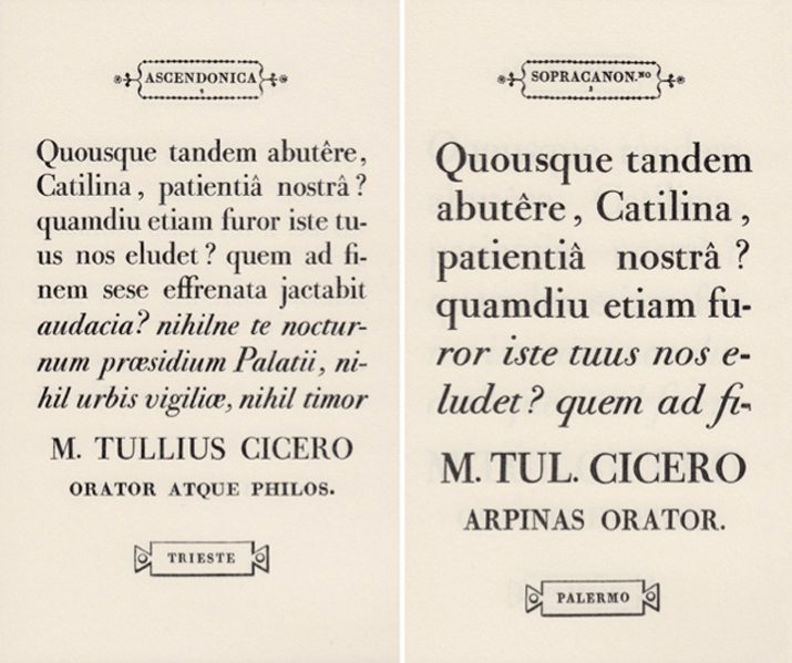
The history of how typefaces get named is a story of periods, eras and design outlines. But how are those names developed? Where do they come from? That’s the hard part, according to type designer Tobias Frere-Jones in a recent blog post, “Scrambled Eggs and Serifs.”
“Type has a long and rich history, not just in its shapes but also its organization and presentation,” he writer. “Scholars have discussed the marriage of roman and italic, originally independent forms. Others have charted the idea of “bold”, the shift of weight that is a signal all by itself. But the idea of a typeface name has received less attention.”
That attention can be boiled down to a group of genres that most designers commonly know, such as blackletter, Greek and others. Those distinctly Roman typefaces later evolved into schools known as Bodoni and then type terminology that mirrored typeface weights and had geographic naming cues. The evolution continued, Frere-Jones described as names took the forms of more distinguishable terms such as “Gothic Condensed No. 7” and names that are more common now that fit the look and emotional theme of the typeface.
“The name is now part of the design itself, rather than a retrospective description, or a part number. The name precedes the typeface like a herald, rather than trailing behind like a stenographer. At its best, a typeface’s name is a one-word sales pitch.”
And creating that, he says, is the hardest part.
Tips for Great Photos
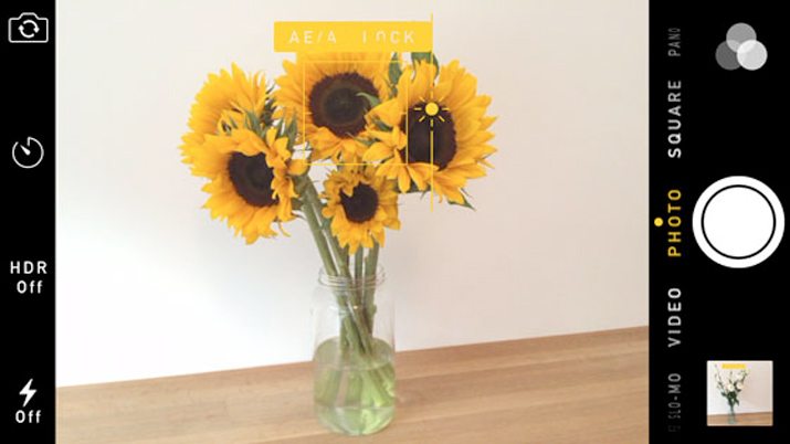
While taking photos may not be at the crux of a designer’s job description, it is an often designed task. You may find yourself taking photos on the fly for a project with your mobile phone camera with little or no advance planning.
But you can get a decent photo. iPhone Photography School recently posted 10 tips for taking great iPhone photos in the sun. This roundup includes great advice that can apply to taking a photo with almost any device in other conditions as well.
- Shoot with the sun behind you.
- Adjust image exposure.
- Shoot with the sun to one side.
- Shoot into the sun to create silhouettes.
- Backlight your subject to reveal color and detail.
- Capture a glow around your subject.
- Take control of lens flare.
- Capture shadows.
- Position an object in front of the sun.
- Don’t forget composition in sunset photos.
Just for Fun
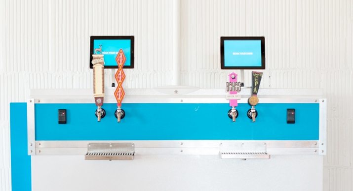
Motivating workers can be a tough prospect in any industry. And one company in Minneapolis has figured out an interesting way to keep workers engaged.
Colle+McVoy built a TapServer machine that helps you earn points for free beer from the keg by completing tasks and timesheets. Other companies, such as the JWT Agency, have similar incentives according to AdWeek.
I don’t know about you, but this seems like a fun motivator … and potential creative tool. What do you think? Share your thoughts with us in the comments.