This Week in Design: Sept. 12, 2014
An essential part of what makes someone connect with design is emotion and feeling. And these are two things that can be hard to predict, describe and design. But there is a little science behind emotion and feeling and why you might react a certain way, and that’s our focus this week in design.
Every week, we plan to a look at major product releases and upgrades, tools and tricks and even some of the most popular things you are talking about on social media. And we’d love to hear what’s going on in your world as well. Have we missed anything? Drop me a line at [email protected].
The Ultimate Designer Toolkit: 2 Million+ Assets
Envato Elements gives you unlimited access to 2 million+ pro design resources, themes, templates, photos, graphics and more. Everything you'll ever need in your design resource toolkit.


How Fonts Make You Feel
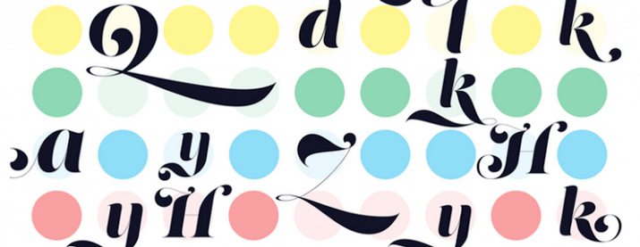
There is a science to typography. More specifically there is a science to how fonts can make you feel. The Next Web has a great look at how type can impact you and what designers can do to better impact type in “The Science Behind Fonts (And How They Make You Feel).”
Breaking down the science is simpler than you might imagine:
- Think about how you read. (It’s a natural pattern!)
- Think about how the right fonts make you feel. (They match the tone of what you are reading.)
- Think about how the layout makes you feel. (If elements are placed in ways that don’t disturb the flow of text, you are happier.)
- Think about cultural associations with typefaces. (Lettering can represent or help you relate to other objects or items.)
But what can you do with this information? How can you use it to design with typefaces that associate with better feeling? Understanding typography is the place to start. Knowing the basics such as categories of typefaces (serif, sans serif, script and decorative) and principles of legibility and readability are a good start.
But there are a few other things you can do as well:
- Pick font sizes larger than 12 points. “Many designers mention that 16pt font is the new 12pt font.”
- Be aware of line length. Note the ideal line length for a desktop website falls between 50 and 75 characters.
- Pay attention to spacing. Ensure there is enough room between lines of text to make reading easier.
Understanding CSS Shapes
The shape of an image or block of text can make you feel something about it. The shape also provides additional information about an element, its use and function in the overall design. But creating shapes for web projects was not always easy, especially with complex images.
CSS shapes creates a solution to that problem. “Most websites stick to a simple mold: fitting content inside rectangles within other, larger rectangles, something that most users are likely to find more boring than mind-blowing,” writes Zack Rutherford for UX Magazine. “CSS shapes, on the other hand, allow greater freedom to designers looking to contour their content within or around interesting and visually appealing parameters.”
But when should you use CSS shapes in your projects. The answer is in the article, “Symmetry, Size, Speed, and CSS Shapes.”
There’s a pretty persuasive list of reasons why you should be working with CSS shapes in addition to it being fun.
- Novelty: “The ability to alter text to squeeze into tight spaces or, alternatively, expand into wider ranges, will offer greater freedom to designers putting together their layouts.”
- Advanced control of user flows: Allows for shaping content into figures, decreasing text line by line or using text as shapes to emphasize other page elements.
- Shaping content facilitates visual storytelling: “The options for variability once you ditch the idea of a walled in structure for your written content are staggering.”
- Symmetry, size and speed: “CSS shapes can be utilized to maintain your content’s shape regardless of viewport, making it universally symmetrical, not to mention RWD friendly.”
Designing a Font
Creating fonts is not as simple as just sketching a few letters on a napkin. Font and typeface development is a multistep process that you have to commit to. But even without a lot of experience you can crate your own font.
Type designer Tyler Finck recently put together an 18-minute video less and article for Creative Market to walk you through the process. “How to Make a Font” is a nice look at creating something on your own (but you have to have a Mac for this tutorial).
And while almost anyone can do it, you will need to be ready to have a little patience and dedication. Creating a font is not quite as easy as 1-2-3.
“Making a good and usable font will take practice and lots of hours,” Finck said in the article. “It isn’t ‘hard’ if you love doing it, and chances are, you’ll know right away if it is something you love to do. You will probably make revisions, potentially incorporate feedback from other users, test in a variety of circumstances (different apps/print/web), and more.”
If creating your own typeface maybe isn’t your cup of tea, consider downloading one of Finck’s creations. He’s been a professional designer since 2005 and had several typefaces available on Creative Market.
Just for Fun
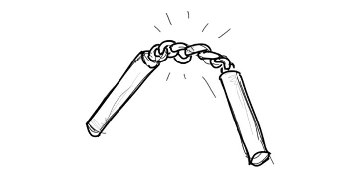
Finally a visual representation of what programming languages feels like. (And a very accurate one at that, for me.)
Bjorn Tipling peened and drew a fund little sequence in “If Programming Languages Were Weapons.” The post goes through each programming language and how it relates. The comparisons are quite clever and relatable.
“C++ is a set of nunchuks, powerful and impressive when wielded but takes many years of pain to master and often you probably wish you were using something else,” he writes. Further: “JavaScript is a sword without a hilt.”
Make sure to go take a read. It is a lot of fun and might even be a great late afternoon pick-me-up.