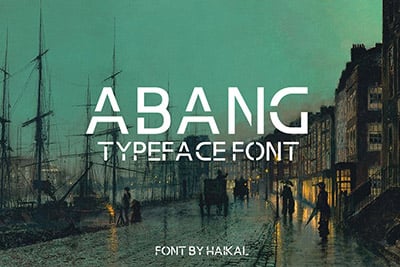
How to Design With Handwritten Typefaces: 10 Tips
Plenty of designs – both in print and online — are featuring handwritten typefaces in a big way. From custom options to fonts that you can sync online or buy for print projects, this flair for letting is quite popular. The most trendy use is as a dominant headline element in a hero header-style homepage design.
This style can be tricky to use, though, and is not a fit-all solution. Today, we’ll look at eight ways to make the most of the handwritten typeface trend in your design projects.
2 Million+ Fonts, Typefaces, and Design Resources With Unlimited Downloads
Download thousands of stunning premium fonts and typefaces with an Envato Elements membership. It starts at $16 per month, and gives you unlimited access to a growing library of over 2,000,000 fonts, design templates, themes, photos, and more.
1. Create an Interesting Accent

A handwriting typeface is a perfect accent element for almost any design. It’s a great way to add an interesting style that feels personalized without creating concerns for readability.
You’ll often see a handwriting typeface accent as a single letter or short word and then used again for emphasis with underlines or punctuation. Color is a popular tying element for handwriting typefaces that can be used as an “accent on the accent” in design projects to create a cool element that carries through your theme.
Patta x Tommy uses a handwriting style “x” as an accent to tie the brands together in this collaboration. Additional elements such as underlining and circling are also used to further link the design element. And it is all perfectly readable!
2. Add an Element of Fun

When you are looking for something fun to add to a design, a handwriting font can help create that element without going too crazy in the design. A typeface can bring a strong personality.
Think of the handwriting font here as an extra display element and try to keep it readable for the best success.
Glu Studios uses a super fun handwriting-style typeface in their video reel. Not how the typeface matches the fun look of the illustrations and people on the screen. When it all ties together in this manner, the font doesn’t have to be super funky to carry the vibe of the design, but the personal touch of handwriting makes it lighter and more engaging.
3. Create an Art Element
One of the biggest challenges with handwriting-style typefaces is the same challenge as with actual handwriting – readability can be a real concern. This simple fact makes it important to design a type hierarchy where the handwriting typeface is less about the text and more about the overall design. Using this type-style as an art element is the solution right in the middle.
With typefaces that might not be as readable, making them larger and limiting usage to just a few words, or even characters, can help.
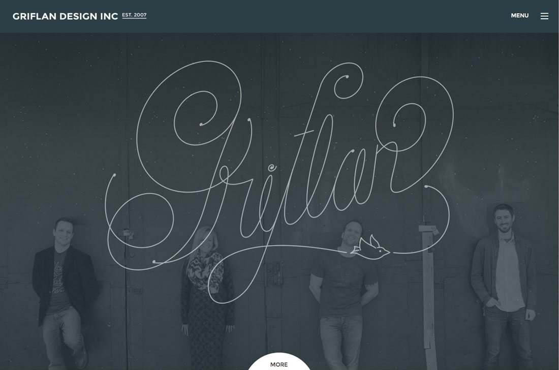
Griflan Design does a great job of this with a logo-style handwriting typeface over a photo on their homepage. The handwriting typeface draws the eye into the site, so you see the business name first and then look at the photos of the creative team. The use of the bird in the type design is a nice element as well that adds to that sketch-style design.
4. Use Handwritten Fonts Typefaces Sparingly

Because handwriting typefaces can present readability concerns and because they are so visually interesting, you’ll want to use them sparingly. (Just imagine reading an entire book that someone has written out by hand.)
Island does a good job of this with a little more text than the example above but accents the handwritten typeface with simple typography for the rest of the homepage design. As a bonus, the “special font” is used as a divot inside card-style links further down the page to create a nice consistency with the design.
5. Think Beyond Cursive
The first visual that comes to mind when someone says handwriting font is often an image of cursive lettering. But it does not have to be.
Handwriting styles encompass anything that could be drawn by hand. While this includes cursive options, it also includes block lettering, sketch style, the “Sharpie” marker look, and plenty of other options.
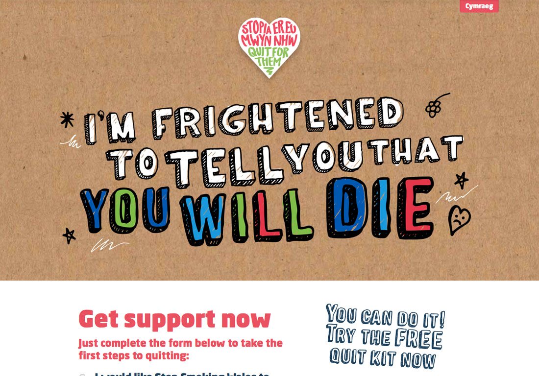
Stop Smoking Wales uses a handwriting-style typeface with a lot of fun elements. The sketch-style lettering is bold and the color adds impact. Look closely and there are two uses of handwriting typefaces; letters in the top heart logo appear in a more marker style that compliments the sketchy type below.
6. Try It With a Kids Project
Simple handwriting-style fonts scream fun and creativity. What better way to use them than with a design for kids? It is important to pay particular care to your audience here. Is the design about a child thing and designed for adults or is it made for children to read themselves?
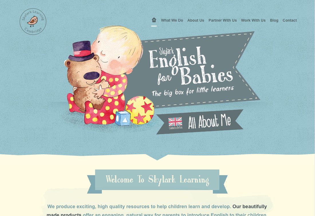
The style of lettering you choose hinges on the answer above. Remember, younger children will be able to read and comprehend block- or chalkboard styles, but could struggle with cursive options. Adults can appreciate any option or combination of typefaces, such as Skylark English for Babies. The site uses a fun mix of handwriting styles to set the tone for its learning program.
7. Use it With a Name
A handwriting font can serve as your (or your brand’s) signature. Use a handwriting style typeface to create a unique logo. This can be a great time to order a custom typeface or create a lettering design based on your penmanship.
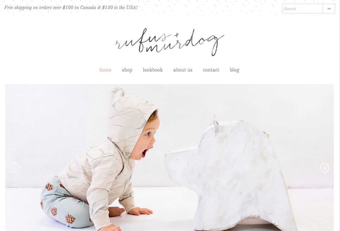
This is a popular option for portfolio websites, but retailer Rufus + Murdog uses the style quite well for its signature logo. Look closely and the handwritten logotype matches the dog sketch that is used on the rest of the site design and for some of the children’s wear. What’s especially nice about the handwriting style here is how nicely it pairs with the elements in the store.
8. It Needs to Look Handwritten
A handwritten style font needs to look like it was written by hand. (You don’t want to end up with something that has the silliness of meshing handwriting and typesetting like Comic Sans, do you?)
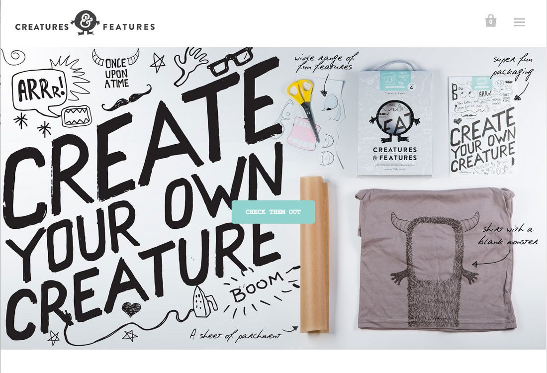
Creatures Features is a good example because the site features several different handwriting style typefaces and each one looks like someone made notes or sketched out an idea right on the screen. The typefaces have lines that are imperfect and look like what you would expect from a pen or pencil.
The other trick to keeping a handwritten typeface from looking too typeset is to avoid repeating letters. (Another reason for sparing usage.) Repeating letters will always look the same in typesetting, but rarely are identical when penned. This can be a small detail that can create a challenge for getting the most out of this style of type.
9. Writing for Emphasis

As color or size can create a great deal of contrast and emphasize specific words, so can a handwritten typeface. Just as you might make the most important words in your design red or orange, you can create this same effect with a change in typography.
TaDah showcases this beautifully. The first thing you see when landing on the site are the words “Plenty of Soul.” That phrase sets the tone for everything else you read as you move through the design. The handwriting theme is carried through the rest of the design as well but is used in quite the opposite manner as an accent in the background. This yin and yang concept is effective and visually appealing.
10. Go for the Unexpected
Many of the uses of handwriting style typography so far have been for the biggest and boldest lettering in the design. You can also use this style more unexpectedly, such as for smaller elements, navigation, or even just as an accent.
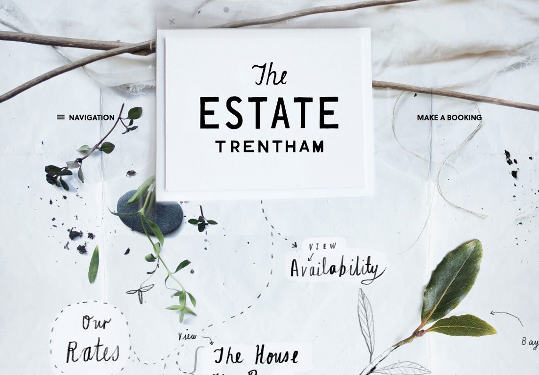
The Estate Trentham uses the handwriting style in a unique way that makes you want to click around on the page. Each handwritten element is a link within an almost hidden main navigation. Click the navigation menu to see how each word corresponds and connects to the navigation. Using the same typeface within the navigation when it is expanded is an equally nice effect.
Conclusion
While trendy, the use of handwriting fonts can be more than just a replica of another site you have seen. (That’s never the way to best use trends.) With eight ways to experiment with handwriting-style typefaces, we hope you have the tools you need to create something modern and all yours.
One last little tip when working with handwriting styles: Remember to keep the rest of the design simple. Handwriting styles often work best in black or white and with backgrounds that are not too busy.