Why I Love Ampersands & You Should Too
Without a doubt, the most beautiful character in the English language is the ampersand. The single character comes in so many fashions – from the simple & to the casual E- to t-style representations.
But where did this character come from? What does it mean? And most importantly how can you take advantage of using it in your design projects? Here we will take a look at my favorite character from its history to uses and a gallery of great ampersands to inspire you.
2 Million+ Digital Assets, With Unlimited Downloads
Get unlimited downloads of 2 million+ design resources, themes, templates, photos, graphics and more. Envato Elements starts at $16 per month, and is the best creative subscription we've ever seen.
History Lesson

The ampersand is a visual representation of the phrase “and, per se and.” It is a graphic representation of the Latin “et,” which translates to “and.” That definition is how the ampersand is most commonly used today — as an inclusionary symbol meaning “and.”
The character dates to 45 A.D., according to a history of the letter by type designer Max Caflish for Adobe. The character appeared on papyrus and was handwritten in the Roman cursive style. The earliest representations of the character were a combination of the letters ET (in the form of a ligature) and evolved into the more common & single-character representation over the course of the next 700 years.
Key points in ampersand history can be pinpointed to characters found in various writings, pictorial depictions and some even trace the ampersand back to a common phrase that came at the end of the alphabet. Here are some of the most well-documented highlights:
- 63 B.C.: Marcus Tullius Tiro included the phrase “and, per se and” at the end of his alphabet recitals and included a shorthand character to represent the phrase, but that character looked more like a 7 than modern ampersand.
- 45 A.D.: One of the first written ampersands was found on papyrus.
- 79 A.D.: A representation of ET was scribbled in Pompeian graffiti.
- 775 A.D.: The ET ligature becomes a part of the Roman alphabet and was more commonly depicted as a single character.
- The ampersand was included, albeit unofficially, in a character set written by Anglo-Saxon monk Byrhtferth, the author of many historical textbooks.
- 1440: Johannes Gutenberg includes the ampersand on his first printing press.
- 1499: Francesco Colonna’s “Hypnerotomachia Polophili,” printed by Aldus Manutius, used 25 different ampersands (and several representations) on one page of text.
- 1837: Modern dictionaries begin to include an entry for “ampersand.”
- 1899: The “Concise Manual on Typography” calls the ampersand “a sign interchangeable with the conjunction and.”
The ampersand is now a common character in Roman lettering and typefaces created for the English language. Many of today’s ampersands are influenced by handwriting styles – much like the original characters – and calligraphy, making italic styles especially popular.
Using Ampersands
While ampersands are quite common, there is a set of standard usage for the character. Proper usage, while sometimes debated, is important to maintaining the integrity of the character.
- Ampersands can be used to represent “and” in phrases and names, but should not be used in the structure of a sentence as a substitute for and. Ampersands should be generally avoided in longer blocks of text.
- Ampersands can be used as a designation for a two-part name in a list to avoid confusion.
- Ampersands are commonly used in titles and business names (especially in the areas of law, consulting, engineering and architecture).
- Ampersands do not need to be preceded or followed by a comma in a list.
- An ampersand followed by “c.” can be used to represent the phrase “et cetera,” although this usage is rather uncommon. The preferred usage is “etc.”
Ampersand Styles

Typically designer use on of four different styles of ampersands in projects: Calligraphy or italic, traditional, contemporary or casual. Each style can include vast numbers of representations but can be identified by a few specific characteristics.
Calligraphy: The calligraphic style of ampersands is among the oldest style of the character. Many ampersands of this style still have a look that includes the letters E and T combined by a ligature in some way. The merged letters can appear as uppercase, lowercase or a combination of the two. The elaborate letterform is often created using multiple strokes and includes various serifs and decoration.
Traditional: The traditional style of the character is what most designers know and use today. The typefaces are more simple and direct than the calligraphic style, but still frequently include serifs and some decoration. Traditionally-styled ampersands appear in a variety of weights and with varying stroke widths as well.
Contemporary: The most simple style of ampersand is the contemporary look. In this style, characters often lack serifs and can often (but not always) be drawn with a single stroke and have a uniform stroke width. The characters can be bold or narrow and are commonly used in posters and logos.
Casual: The casual style of ampersand follows very few of the rules of ampersands and may not even quite look like what most designers would label the character to be. The most casual styling look like a uppercase cursive-style E, often with small strokes above and below the letter, or as an almost cursive lowercase t. These character forms are more commonly seen in handwriting styles.
‘Famous’ Ampersand Usage

The ampersand is a common character in quite a few famous brands and logos –television network A&E, clothing brand H&M, phone company at&t, tax preparation company H&R Block, fast food chain A&W, typography company Hoefler & Frere-Jones, the famous D&G used for Dolce and Gabbana.
There are so many common brands with an ampersand in the name that quiz network Sporcle even has a game devoted to naming brands that contain the & character. (Take the quiz and let us know how you scored. It was a little tougher than I expected.)
Beautiful Characters
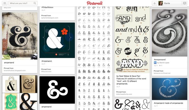
My personal love affair with the ampersand is long-standing. I love the curves of a calligraphic or traditionally-style character. And the simplicity of the contemporary style just makes me want to create logos filled with ampersands. Even my own handwriting and shorthand style is filled with the casual E style ampersand.
One of the things that really draws me to the character is the intrigue behind it. The ampersand is one of the few characters in the English language that stands alone with a distinct meaning. Think about it, other characters have to be combined to mean something specific. The ampersand does it all.
In terms of space and design, the ampersand can be both an economical character in terms of space or a point of display. The ampersand is visually appealing and versatile enough to be used as a simple character or as design element of its own.
I have my own small collection of ampersands that I use for inspiration as well. You can find that collection on Pinterest, and I am adding new characters all the time.
I even collect items showcasing my favorite character. Here are five of my favorites:
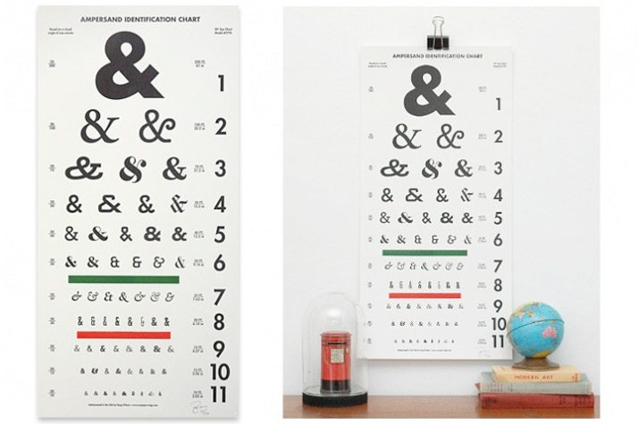
Ampersand Identification Chart: This letterpress print is based on the style of an eye chart and contains 61 styles of the character. It would make a great addition to anyone’s office.
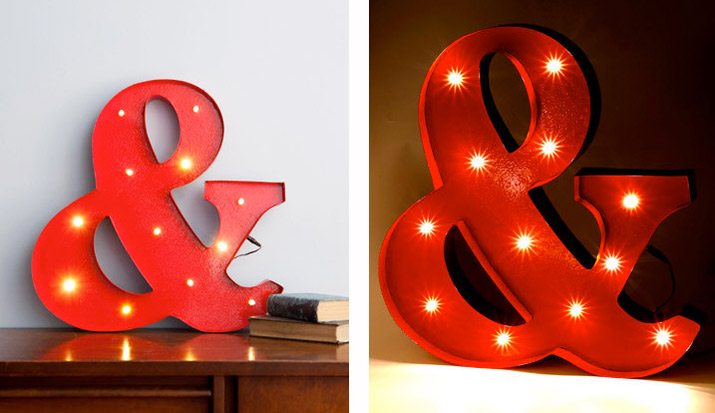
Lampersand: An ampersand lamp with a modern look. It has an industrial style and looks great hanging or sitting on a shelf.
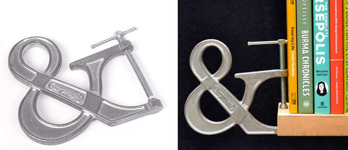
Ampersand Clamp: Add a little typography style to almost any room with the adjustable “Clampersand,” a heavy-duty clamp with an ampersand shape. It makes a perfect stopper for bookshelves, in the garden or toolshed.
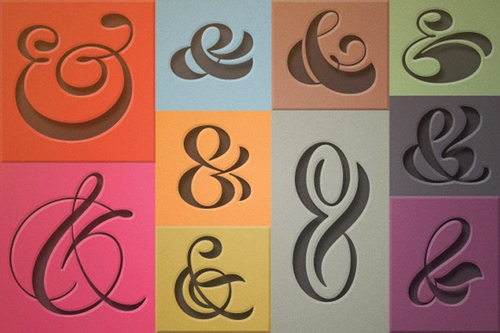
Ampersand 10-Pack: This little package of goodies from Creative Market includes a letterpress-style font and vector pack for a variety of design projects.
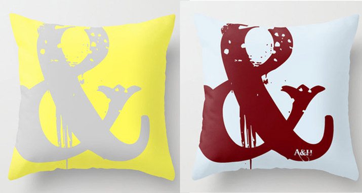
Ampersand Throw Pillow: I love the modern style of this pillow. It comes in a ton of colors and has a super-modern look and feel.
10 Fun (and Free) Ampersands
Aver

Batik Dayak

Candara

Caslon

Chopin Script

Franklin Gothic Medium

Little Lord Fontleroy

Lobster

Raleway

Rochester

Conclusion
The ampersand has a long history as more than just a letter than can help you pretty a logo. It has distinct meanings, rules for proper usage and includes four pretty distinct styles. The character is relatively versatile in terms of design use as well, as a character used to save space or as a graphical design element.
Now that you’ve learned a little more about my favorite character, is there a letterform that really appeals to you? What is it and why?
Image Source: Wikipedia.
