Designing Hover Styles and the Future of the Technique
Despite arguments that hover styles are dead, these small boxes that pop-up over images, text or other elements on websites are still found all over the web. Designers like them for an added bit of style and information; users like them for functionality. (They are only “dead” because hover styles don’t work without a mouse-over).
The UI function is still there for now. And if you opt to use it, you’ll want to create well-designed hover styles that engage users. You’ll also want to think about how to alter these areas of your website for responsive sites.
2 Million+ Digital Assets, With Unlimited Downloads
Get unlimited downloads of 2 million+ design resources, themes, templates, photos, graphics and more. Envato Elements starts at $16 per month, and is the best creative subscription we've ever seen.


Hover Effects 101

Hover effects are a way to help users navigate and interact with a website. When a user moves the mouse over a certain area of the screen, a hover effect forces the area to change color, show text or pop-up a box of related information. A hover can spawn a simple action such as a color change or something much more complex.
Hover styles are most often associated with one of two things – a link or a tooltip, which provides additional information. A tooltip is a specific type of hover style where a small box pops up containing information about the item the mouse is hovering over. The effect is useful because it provides a good way to include extra information to a site without getting in the way of the design. Hover styles can actually add an extra and fun element to the overall visual scheme of a website.
Hover actions and tooltips also provide a valuable user experience. They allow users to get extra information without clicking away from where they are on the site. These small pieces of information can aid in navigation or provide additional resources.
When working with hover styles the design concept should be to create a style that fits the rest of your design outline, but is different enough so that users will notice it with a mouse-over. Create a popup or element change that has plenty of contrast and an element of mystery. You want users to move around the site to see what other elements might include hover information.
In terms of CSS, the :hover selector can be used on any element on a website, not just links. We aren’t going to explain the code here, but there are some resources listed below that can help you with the nuts and bolts of building hover styles for your projects.
Pros of Using Hover Styles
Hover styles can be a fun component to a website aesthetic. There are so many neat things you can do using this technique, which is one of the reasons it is so popular.
- Cool effects such as making photos zoom, move or change size.
- Provide information for users.
- Add searchability to a website with additional information.
- Provide information about links to users before they click.
- Users are used to and understand the functionality.
- Show users possibilities on a website before they commit to a specific action.
Cons of Using Hover Styles
Depending on who you ask, hover styles are over with. Because they are not made for responsive websites, the technique will slowly become obsolete. This has not happened yet, but there are some cons to using hover styles.
- They do not work on mobile, touchscreen or tap-based devices.
- Hover actions can hide other information on the screen.
- Effects can get in the way for some users and prove to be frustrating.
- Hover navigation can force users though “tunnels” that impede navigation.
Design Options
Once you decide if hover is right for your site or not, you have to start thinking about how the style will look. What action will the style perform? What will it entice users to do?
Hover styles come in a variety of forms and while they used to almost exclusively be of the pop-up variety, many are simple and live within elements. (This helps eliminate blocking or covering other parts of the site.)
Depending on your knowledge of CSS, options for hover styles are almost limitless. Options include pop-ups, color changes, image adjustments, adding or moving text, glow or scroll, sliding elements and so much more. Here are five sites using five different types of hover effects as a little inspiration.
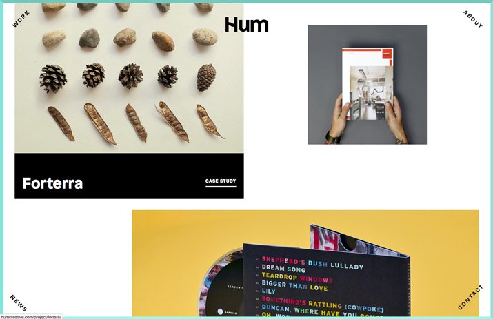
The Selfie Collection
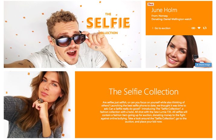
The Selfie Collection is a project that auctions items using self-portrait styles. The fun hover effect here is when the user lands on each image, which the drops down an orange box describing the item for auction and allows a click for bidding. There’s even a hover action within the hover style for the “Go to Auction” link. The use of colored boxes to add information is a popular hover effect and use is especially common in projects using flat design. (You can also see from the image that third-party plugins also come in the form of hover styles such as Pin It buttons.)
Svenska kyrkan
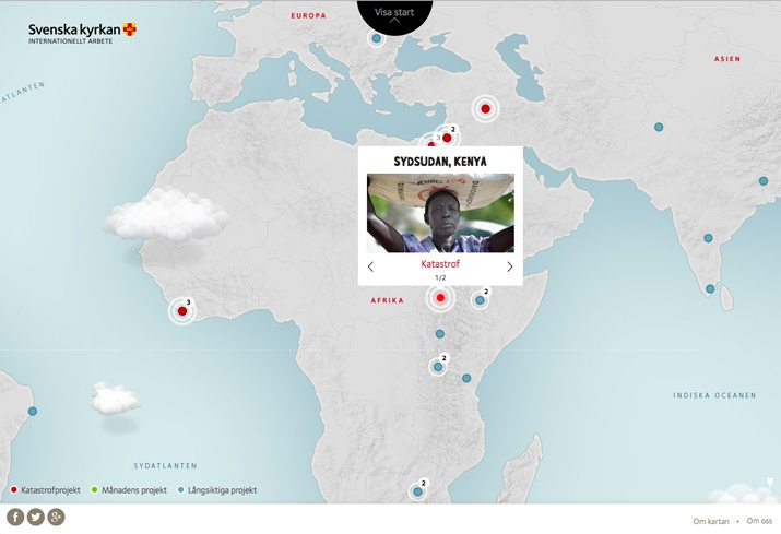
This site uses a tooltip-style box that pops up on a map to show images and links from the location selected. The effect loads quickly, provides valuable information and has a polaroid-style design that meshes with the content. Tooltips are a common feature when it comes to mapping and have a nice usage as demonstrated by the Svenska kyrkan site.
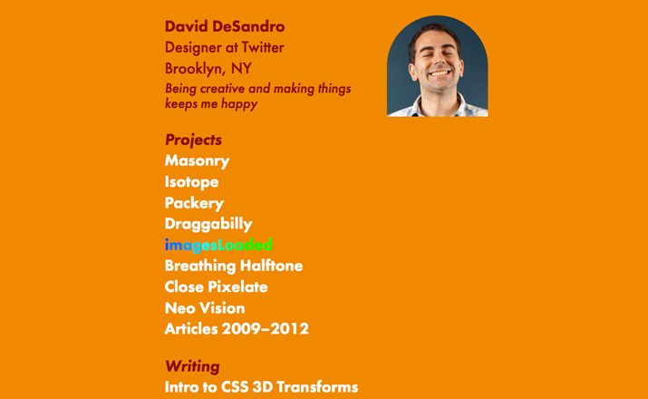
Luke Dorny
There are fun hover effects all over this page and they make you want to click around. From the fun “Now Playing” icon to color and state changes for various elements, hover is used to engage users in various ways across a number of elements. One of the techniques employed here is that each hover state makes a clickable element look more like a button, encouraging users to click.
All Essentials
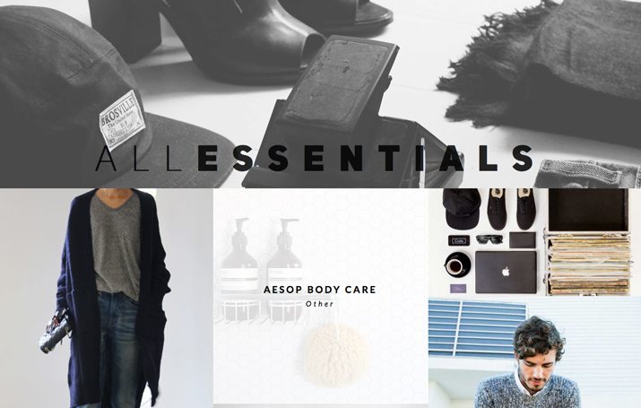
Using a hover effect in which an entire element is covered by a “new” element helps convert images into text for All Essentials. Each photo is of an item for sale on the site and the hover tells you what the item is. A click takes you to that and other like items for purchase. Hover effects are commonly used on e-commerce sites to help users learn more about a product or price. (Just think about all the “Quick View” and “Quick Look” hovers some of your favorite retailers use online.)
The Cleanse Kitchen
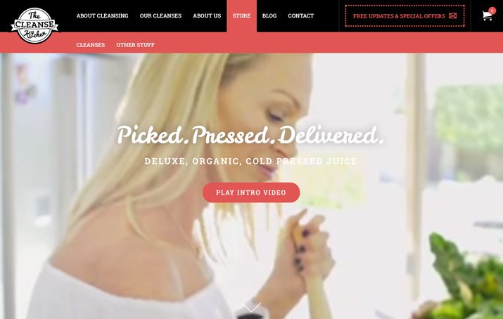
Hover effects don’t have to be complicated in design to be effective. The Cleanse Kitchen uses a simple hover to expand the navigation. Further, hover effects allow the logo to zoom forward telling users that it is a clickable area of the page. As a navigational tool, hover effects have been popular for some time; this is one of the areas that you have to think about for responsive projects. This site accounted for the hover style with a slide out navigation for smaller screens.
Going Beyond the Hover
What’s next for hover with the surge in responsive websites? Honestly, we don’t quite know yet. Designers must remain flexible and adapt to change as it comes our way. While hover styles are still a useful and important tool, usage will continue to evolve.
Think about your site and effects and turn off hover for mobile and touch devices. Be aware that you must be able to build differently for these devices. Consider alternative options for navigation and additional information on these devices such as slide out controls or using icons for these features.
Resources to Help You Design and Code
Ready to start building a few hover effects or tooltips of your own? Here are a few various resources to help you get started, from items you can copy and paste into your design or tips for building something purely from scratch.
- Hover.css Collection of Downloadable Effects on GitHub
- How to Design Hover Effects for UI Elements in Photoshop
- Ideas for Subtle Hover Effects
- How to Create a Simple CSS3 Tooltip
- Creating Basic and Advanced Tooltips
- Easy Image Hover Effects You Can Copy and Paste
- HTML5 Templates 10 Top Hover Effects Tutorials
- Tooltip Styles Inspiration
Conclusion
Hover styles can be a fun and useful addition to almost any desktop website design. Remembering that this technique does have limitations will help you use it in the best way possible.
It presents many opportunities and challenges for designers. Are you using hover effects in current projects? Why or why not? Let us know in the comments.