Graphics - Page 18

Inspiring advice, tips, and suggestions for improving your graphic design skills, logo design, working with templates, and more.

5 Traits of Successful Minimalism

Minimalist Graphic Design / 2 Oct 2013

5 Traits of Successful Minimalism

At first glance, minimalist websites might look like they’ve just been slapped together as quickly as possible. After all, they’re plain and simple, and most people tend to associate lots of detail with good craftsmanship. But the same rules just don’t apply to the online world.

It only takes a small amount of user interaction to quickly reveal the quality of a minimalist site. This is because the original idea that fueled the rise of minimalism was that functionality is inherently beautiful. A design that clarifies and reveals the structure of a website can be just as appealing as one that obscures its purposes behind fancy decorative additions. Furthermore, it often yields a much better user experience, because those unnecessary distractions are eliminated.
Pros and Cons of Working With Design Kits

Graphics / 23 Sep 2013

Pros and Cons of Working With Design Kits

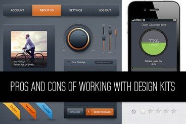
Design kits seem to be everywhere these days. From UI kits, to templates and grids, to complete design kits, what makes these tools so popular (and what are the disadvantages)?

Today we’re going to take a look at the pros and cons of using different types of design kits, and even show you a few kits in the examples that might be worth trying out for various purposes.

Graphics / 12 Aug 2013

8 Tips for Print Designers Switching to Web & Digital Design

More designers are working across platforms these days, switching back and forth between print and digital projects. Although much of the theory is the same, in practice there are a lot of technical differences when it comes to working on something that will be printed versus a website. It takes a specific set of knowledge and skills to work effectively and efficiently in both environments.

But it is possible. Here we share eight tips for print designers making the switch to digital projects. (And I can vouch for every single tip as a designer who has made the switch.)

Current Color Trends: Muted Pastels

Graphics / 30 Jul 2013

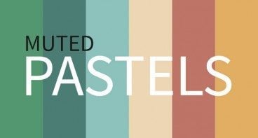
Current Color Trends: Muted Pastels

Of late, you may have noticed a crop of new site designs have a softer and lighter look. After all the rainbow brights and even neon or fluorescent hues that have been so popular of late, it seems that some designers are taking a more subtle approach by using lighter or muted colors.

Although the same basic treatments are still being utilized — like colorized photography or color blocking — the new hues are making for a more refined and understated variation on these themes. Today we’re going to delve into this trend a little more, and explore various design examples and approaches.

Understanding Color: Dominant vs. Recessive Colors

Graphics / 11 Jul 2013

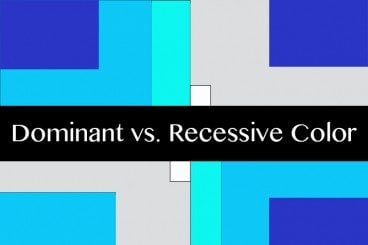
Understanding Color: Dominant vs. Recessive Colors

Ever wonder why your colors don’t look quite right in some situations? It could be a simple as the color choice. Certain colors tend to take on the characteristics of other hues, while others always look pure. In addition, the human eye perceives color in different ways based on whether it is in the foreground or background.

This phenomenon can be explained through dominant and recessive colors. Join us as we take a closer look at these two terms today, and delve into deeper understanding of how they can guide your design choices and decisions.

Using Moo.com for Your Wedding Stationery

Graphics / 8 Jul 2013

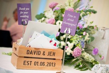
Using Moo.com for Your Wedding Stationery

Weddings can be an expensive business. Photographers, venues, food, drink, entertainment, and all manner of other things to consider. But it’s also a fun opportunity for some design work! Wedding “branding” and stationery has the potential to be another big wedding expense, but by thinking a little creatively, you can not only give your special day a personal touch, but also cut down on the cost.

Today I’ll be sharing a little insight into how you can use your copy of Photoshop, and Moo.com, to create a fantastic array of different wedding stationery. We did it for our wedding a couple of weeks ago, and it went down brilliantly.

How to Choose Effective and Attractive Icons in Your Designs

Graphics / 20 May 2013

How to Choose Effective and Attractive Icons in Your Designs

Icons can be considered one of the universalities of web design; almost any website benefits from the addition of at least a few of them. So it’s tempting to assume that if you sprinkle in a handful of these little pictures, your job is done. But there’s a lot more to it than that: good icons should feel like they’re visually integrated into the group of images that they’re in, as well as into the site design as a whole. They need to have a conceptual clarity and purpose that goes beyond being mere eye candy. Any icon that doesn’t serve a stated purpose, or doesn’t convey the right concept in its imagery, is one that needs to be reconsidered.

Of course, there’s room for interpretation and generalization with any kind of imagery, but icons are not mere illustrations that are used purely to break up space and add interest: they’re visual metaphors that can invest meaning into a subject at a single glance; and as such, they’re a powerful tool for improving user experiences.

How to Build a Brand Bible & Visual Style Guide

Graphics / 13 May 2013

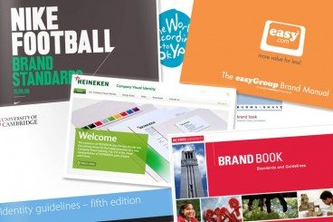
How to Build a Brand Bible & Visual Style Guide

Every brand, from the smallest website or startup, to corporate giants such as Nike or McDonald’s, need a set of branding guidelines and rules to maintain their identity. This document, which can range from a couple of pages, to several hundred, is the thread that holds together what the public sees from a company.

A brand bible establishes the voice and personality of a company, as well as who the public will see, and it governs every aspect of communication from the company. The brand bible is the basis for all interactions on behalf of a company – personal communications, social media, advertising and design. While a brand bible focuses on many things, we are really going to look at how it affects design.

Data Driven Design: A Simple Primer

Graphics / 15 Apr 2013

Data Driven Design: A Simple Primer

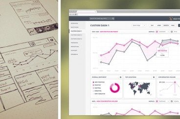
Web apps are becoming ever-more prevalent on the internet. Some may argue that they are simply more complicated websites. Regardless of their definition; what happens when you are designing for large amounts of constantly fluctuating data?

There are a few examples of data driven interfaces and they all have to handle a lot of varied data that is constantly changing. The most common are admin areas and analytic dashboards. The data can take many forms; graphs, charts, tables or text. Each can be displayed in a variety of different ways depending on the context and meaning you are trying to convey with the data. One thing to remember is that you can rarely be sure of the length or amount of data you need to cater for; so think simple to start…

5 Tips and Tools for Designing a Stand-Out Presentation

Keynote Templates / 20 Feb 2013

5 Tips and Tools for Designing a Stand-Out Presentation

Most people who need to create an exciting presentation are not design experts. Fortunately, there are a number of really neat tools and websites that can assist you in creating a captivating, professional look for your slides.

In this article, we’re going to take a look at five such tools. While I can’t promise that these tools alone will turn you into a design professional, they will certainly point you in the right direction.

Check Out the New American Airlines Logo

Graphics / 23 Jan 2013

Check Out the New American Airlines Logo

American Airlines has had the same logo for forty-five years. That’s definitely a pretty impressive stretch! They’ve decided to hang up their Helvetica though and look to not only a new typeface, but a new eagle and even a new livery design.

Read on to see the logic behind the new design and whether or not I think it’s another chapter in a long line of recent brand redesigns gone bad.

How to Design the Perfect Twitter Header Image

Graphics / 20 Sep 2012

How to Design the Perfect Twitter Header Image

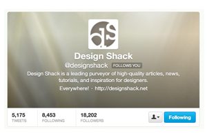
Twitter recently rolled out an updated design for profile pages, which allows you to insert a new “header photo” that sits on top of your feed, much like Facebook’s timeline cover image.

Today we’re going to dive in and see some examples of good Twitter profile images and discuss how you can design your own. I’ll even toss in a free template so you can get started right away.