Layouts - Page 6

Advice for crafting layouts and structure that can create a clear, original web design. Break the mould, and build a unique layout!

7 Ways to Design a Killer ‘First Screen’ for Your Website

Graphics / 6 Jan 2016

7 Ways to Design a Killer ‘First Screen’ for Your Website

It’s time to talk about first screen design. The first screen is that initial glimpse that a user gets into your website. It’s everything above the scroll, whether the user accesses a website from a desktop, tablet or mobile device.

The information you include on this “first screen” is the key to website success. The design can entice and keep users clicking, or force them to navigate away from the page. What needs to be on the screen before users start scrolling? Let’s take a look.

Designing With Constraints: Thinking Inside the Box

Graphics / 4 Jan 2016

Designing With Constraints: Thinking Inside the Box

It’s one of those fundamental parts of design we don’t talk about much: Designing within the rules. We talk a lot about creativity and innovation, but sometimes leave out one of the ideas that pushes most projects along, and that’s actually creating something with a lot of rules attached. It’s thinking “inside the box.”

Design constraints are those little keys to consistency that help brands establish visual identity and guide voice. These restrictions can come in a number of forms, and like them or not, it’s something you are going to have to deal with.

And here’s the good news: Constraints can actually help you become a better designer.

9 Tips for Better Typographic Hierarchy

Layouts / 30 Dec 2015

9 Tips for Better Typographic Hierarchy

Every project requires a system and hierarchy for text elements. Just think about all the small pieces of text that are used throughout a design – headlines, body copy, navigation elements, legal information, captions and so on.

But how do you create that hierarchy so that every text element flows smoothly to the next? Today, we’ll take you step-by-step through building a system of typography hierarchy that can be used for almost any design project. (And we are pairing the tips with beautiful examples of great typography to help you gather a bit of inspiration.)

Design Trend: How to Create a Cool Split Screen Aesthetic

Layouts / 22 Dec 2015

Design Trend: How to Create a Cool Split Screen Aesthetic

One screen divided in two. This might be one of the bigger design trends emerging right now. More and more websites are using design patterns that include two vertical or square panels placed side by side.

And it’s a nice aesthetic. The look is user friendly, can be adapted for a variety of needs, and helps guide navigation. It’s a trend that we are likely to see more of – and design – in the coming months. Today we are looking at a few great examples of split screen design with mini case studies and finding out how you can make the most of this design trend.

Grid-First Design: How to Create Vertical Rhythm and Harmony

Layouts / 8 Dec 2015

Grid-First Design: How to Create Vertical Rhythm and Harmony

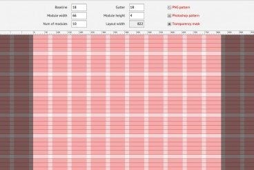
When you hear grid, what’s the first thing that comes to mind? For most designers, it is often a horizontal based concept with columns across the canvas. This is especially true when thinking about web and digital design projects.

But what about vertical grids? It is just as important to create flow up and down the page as well. And there are a number of ways to do this with grid systems.

Modular Design: The Complete Primer for Beginners

Layouts / 27 Jul 2015

Modular Design: The Complete Primer for Beginners

There are a lot of block and card style designs out there right now. For designers, they are both trendy and functional. The look is streamlined and simple and in terms of website design, works great in responsive frameworks.

The root of this design trend is modular design. And regardless of what you think, it’s not new. Modular design is rooted deep in design theory and has been used by a number of designers for a long time. Today we’re delving into the background, and practical applications, of modular design!

7 Website Design Mistakes That Drive Me Nuts

Layouts / 7 Jul 2015

7 Website Design Mistakes That Drive Me Nuts

Sometimes websites make me grouchy. I click with anticipation and then… design disaster. Admit it, you have grumbled at the screen more than a few times, too.

From poor type to missing links to usability issues, I am going to share the mistakes that just drive me absolutely bonkers. Take heed! These are things to address and fix on your own site, before someone else comes across them!

15 Tips to Make Your Designs Feel More Human

Layouts / 29 Jun 2015

15 Tips to Make Your Designs Feel More Human

What makes something on a screen or canvas feel real? The answer is simple. It’s human connection. People want to interact with and use designed elements that work in the physical world in a way that mimics reality.

It’s the case study for human-centered design and why it matters so much in every project every design takes on. This human connection is more than physical, it also creates an emotional bond between the user and the design. That’s where you begin to create things like loyalty to a brand and a connection to users that goes beyond the screen. Here are a few ways you can use design techniques and tools to help you get there.

Minimalist Design Is Taking Over: Here’s Why

Minimalist Graphic Design / 15 Jun 2015

Minimalist Design Is Taking Over: Here’s Why

Everywhere you turn, another designer is releasing a project featuring a minimalist design style. This focus on space, simplicity and beautiful typography is refreshing. And it’s a great option for a number of design projects. That might be one of the reasons minimalist design is so popular.

But the trend is not brand new. Minimalism has been around almost as long as design itself. It’s a technique that ebbs and flows, but always remains as one of the classic styles, making it a design choice that almost always works.

Interaction Design: What Is It, and How Can You Use It?

Graphics / 8 Jun 2015

Interaction Design: What Is It, and How Can You Use It?

Interaction design might be the most talked about design concept of 2015. It’s something you should be thinking about and planning for in all of your digital projects.

But how can you make the most of interaction design? How can you design something people want to interact with? While some of those answers are changing with technology, one element remains the same – people want to use design that is intuitive, functional and aesthetically pleasing.

Asymmetrical Design: Creating Beautiful, Balanced Layouts

Layouts / 3 Jun 2015

Asymmetrical Design: Creating Beautiful, Balanced Layouts

How do you feel about asymmetrical design? That simple question can sometimes spark a lot of debate among designers. Asymmetrical design can be one of the more complicated techniques to pull off, but when done well results in beautiful and eye-catching designs.

While the definition of asymmetry is the lack of symmetry or equality between two halves; it is not a lack of balance as some wrongly assume. Designers can use asymmetry to create balance and harmony even though two sides of the design do not mirror one another. Here’s how to get started.

Visual Composer: A Drag-and-Drop WordPress Page Builder

Layouts / 28 May 2015

Visual Composer: A Drag-and-Drop WordPress Page Builder

WordPress powers a large percentage of the web, and it’s a famously easy-to-use content management system. But creating immersive, in-depth pages and layouts can be a tricky process.

Visual Composer is a plugin that lets you take full control over your WordPress site, and build any layout you can imagine. It’s all based around adrag and drop page builder interface, doesn’t require any programming knowledge, and is really simple to get started using. Today we’re going to be taking a look at how it works, and sharing a few examples of how it’s powering some lovely WordPress designs!