Background Textures / 11 Jul 2023
30+ Best Background Templates (Free + Pro)
Designing the header section of a website is one of the most difficult parts of the entire website design process. You have to think about your content arrangement, the font size of the headline, product image placements, menu design, and much more to get it just right. But, background templates can help to give you a great head start!
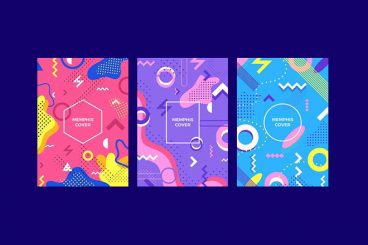
Background templates are customizable background designs crafted by professional designers with the proper content layouts for you to use with your own projects.
The templates are available in vector format to let you easily edit the text, colors, and everything else to make a unique design for your own website or print design.