Design Shack
Twitter
Facebook
Pinterest
RSS Feed
Articles
Applications
Adobe InDesign
Adobe Lightroom
Adobe Premiere Pro
Adobe XD
Affinity Designer
Affinity Publisher
After Effects
Bootstrap
DaVinci Resolve
Figma
Final Cut Pro
Google Fonts
Google Slides
Instagram
Keynote
Photoshop Actions
Photoshop Brushes
PowerPoint
Procreate
Microsoft Word
Sketch
Tumblr
Design Projects
App Templates
Background Textures
Brochures
Business Cards
Business Templates
Christmas
CV & Resumes
Email Templates
Flyers
Fonts
Free iOS Icons
iPhone Mockups
Logo Templates
Mockup Templates
Posters
Weddings
Categories
Business
CSS
Graphics
Inspiration
Layouts
Mobile
Navigation
Software
Trends
Typography
UX Design
More →
Resources
All
Fonts
3D
Art Nouveau
Baseball
Blackletter
Block
Cartoon
Chalkboard
Chunky
Clean
Comic
Condensed
Corporate
Cursive
Cute
Cyberpunk
Decorative
Elegant
Feminine
Futuristic
Gaming
Geometric
Gothic
Graffiti
Groovy 70’s
Halloween
Handwriting
Japanese
Kids & Children
Logo
Marker
Medieval
Mid-Century
Minimal
Monogram
Monospace
Movie
Number
Old English
Outline
Pirate
Pixel
Poster
Psychedelic
Retro
Rounded
Rustic
Sci-Fi
Script & Brush
Serif
Shadow
Slab Serif
Space
Sports
Stencil
Swash
Tattoo
Thin & Skinny
Title
Vintage
Western
Graphics
Actions
Brushes
Graphic Templates
Icons
Logos
Mockup Templates
Textures
Photography
LUTs
Presets
Presentations
Animated
Business Plan
Charts & Graphs
Clean
Company Profile
Corporate
Creative
Education
eLearning
Fashion
Finance
Flow Chart
Fun
Infographic
Management
Marketing Plan
Medical
Minimal
Modern
Photography
Pitch Deck
Portfolio
Real Estate
Research
Roadmap
Sales
Science
Simple
Social Media
Startup
Timeline
Travel
Webinar
Wedding
Print
Book
Brochure
Business Card
Business Plan
Calendar
Catalog
Corporate
Cover Letter
eBook
Event Proposal
Flyer
Greeting Cards
Invitation
Invoice
Letterhead
Lookbook
Magazine
Marketing
Newsletter
Portfolio
Proposal
Resume & CV
Save The Date
White Paper
Video
Intros & Openers
Logos
Lower Thirds
LUTs
Slideshows
Social Media
Titles
Transitions
Typography
Video Templates
Web
Gallery
All
Web Design
Logo
Interface
About
Advertising
Write for Us
Contact
Home
›
Gallery
›
Designs Colored #aa2222
Design Gallery
Filter by Design Type
All
Web Design
Logo
Interface
Browse by Color
Filtering by
Color #aa2222
Remove
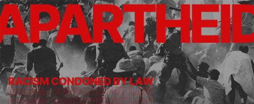
Apartheid
Color Code #444444
Color Code #222222
Color Code #cc0000
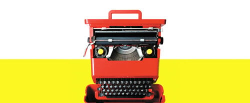
Readymag
Color Code #eeeeee
Color Code #eeee22
Color Code #ee4422
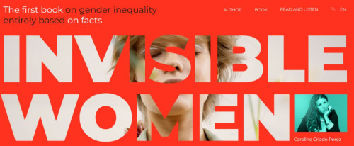
Invisible Women
Color Code #ee2222
Color Code #2222
Color Code #eeeeee
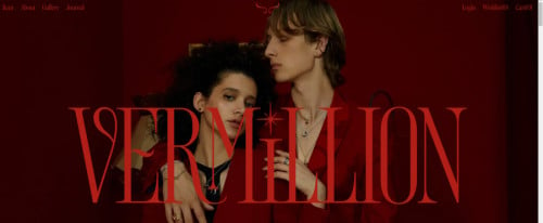
Vermillion Jewelry
Color Code #220000
Color Code #aaaaaa
Color Code #aa2222
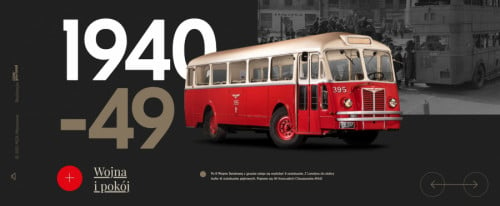
Museum of Transport in Warsaw
Color Code #222222
Color Code #444444
Color Code #666666
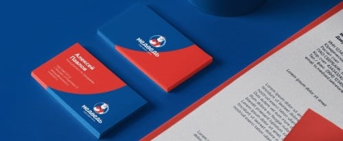
Medved Branding
Color Code #4488
Color Code #2244
Color Code #cccccc
Awwwards
Color Code #eeeeee
Color Code #cccccc
Color Code #aaaaaa
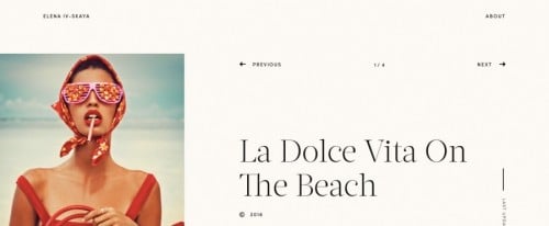
Iv Skaya
Color Code #eeeeee
Color Code #aa2222
Color Code #cccccc
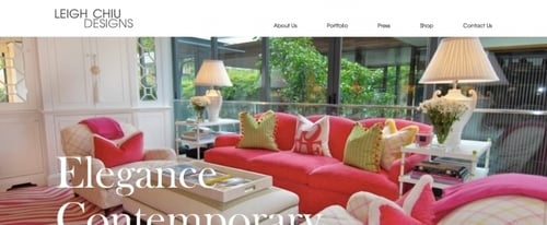
Leigh Chiu Designs
Color Code #886644
Color Code #222222
Color Code #cc4466
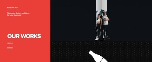
Mate and Mate
Color Code #ee4444
Color Code #000000
Color Code #222222
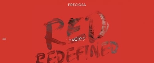
Red Redefined
Color Code #cc4422
Color Code #aa2222
Color Code #aa6666
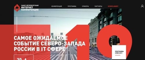
Saint Petersburg Internet Conference
Color Code #222222
Color Code #ee4422
Color Code #aa2222
Audrey & Bernice
Color Code #444444
Color Code #cc2244
Color Code #888888
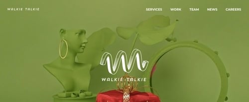
Walkie Talkie
Color Code #888844
Color Code #668822
Color Code #aa2222
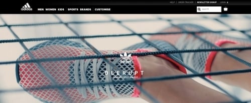
Adidas Deerupt
Color Code #cccccc
Color Code #888888
Color Code #aaaaaa
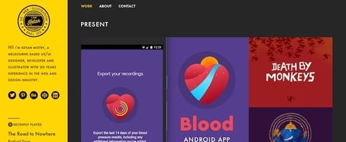
I Am Ketan – Portfolio
Color Code #aa8822
Color Code #666622
Color Code #ccaa22
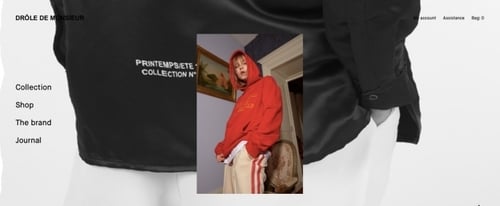
Drole De Monsieur
Color Code #eeeeee
Color Code #222222
Color Code #444444
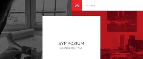
Sympozium Agence Digitale
Color Code #eeeeee
Color Code #444444
Color Code #880022
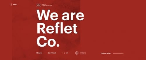
Reflet
Color Code #aa2222
Color Code #eeeeee
Color Code #aa4444
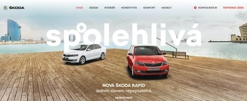
Skoda
Color Code #aa2222
Color Code #000000
Color Code #cc4444
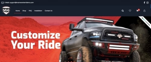
Main Event Emblems
Color Code #220000
Color Code #cc6666
Color Code #888888
1
2
3
4
5
6
7
8
9
>