Design Shack
Twitter
Facebook
Pinterest
RSS Feed
Articles
Applications
Adobe InDesign
Adobe Lightroom
Adobe Premiere Pro
Adobe XD
Affinity Designer
Affinity Publisher
After Effects
Bootstrap
DaVinci Resolve
Figma
Final Cut Pro
Google Fonts
Google Slides
Instagram
Keynote
Photoshop Actions
Photoshop Brushes
PowerPoint
Procreate
Microsoft Word
Sketch
Tumblr
Design Projects
App Templates
Background Textures
Brochures
Business Cards
Business Templates
Christmas
CV & Resumes
Email Templates
Flyers
Fonts
Free iOS Icons
iPhone Mockups
Logo Templates
Mockup Templates
Posters
Weddings
Categories
Business
CSS
Graphics
Inspiration
Layouts
Mobile
Navigation
Software
Trends
Typography
UX Design
More →
Resources
All
Fonts
3D
Art Nouveau
Baseball
Blackletter
Block
Cartoon
Chalkboard
Chunky
Clean
Comic
Condensed
Corporate
Cursive
Cute
Cyberpunk
Decorative
Elegant
Feminine
Futuristic
Gaming
Geometric
Gothic
Graffiti
Groovy 70’s
Halloween
Handwriting
Japanese
Kids & Children
Logo
Marker
Medieval
Mid-Century
Minimal
Monogram
Monospace
Movie
Number
Old English
Outline
Pirate
Pixel
Poster
Psychedelic
Retro
Rounded
Rustic
Sci-Fi
Script & Brush
Serif
Shadow
Slab Serif
Space
Sports
Stencil
Swash
Tattoo
Thin & Skinny
Title
Vintage
Western
Graphics
Actions
Brushes
Graphic Templates
Icons
Logos
Mockup Templates
Textures
Photography
LUTs
Presets
Presentations
Animated
Business Plan
Charts & Graphs
Clean
Company Profile
Corporate
Creative
Education
eLearning
Fashion
Finance
Flow Chart
Fun
Infographic
Management
Marketing Plan
Medical
Minimal
Modern
Photography
Pitch Deck
Portfolio
Real Estate
Research
Roadmap
Sales
Science
Simple
Social Media
Startup
Timeline
Travel
Webinar
Wedding
Print
Book
Brochure
Business Card
Business Plan
Calendar
Catalog
Corporate
Cover Letter
eBook
Event Proposal
Flyer
Greeting Cards
Invitation
Invoice
Letterhead
Lookbook
Magazine
Marketing
Newsletter
Portfolio
Proposal
Resume & CV
Save The Date
White Paper
Video
Intros & Openers
Logos
Lower Thirds
LUTs
Slideshows
Social Media
Titles
Transitions
Typography
Video Templates
Web
Gallery
All
Web Design
Logo
Interface
About
Advertising
Write for Us
Contact
Home
›
Gallery
›
Designs Colored #eeaa66
Design Gallery
Filter by Design Type
All
Web Design
Logo
Interface
Browse by Color
Filtering by
Color #eeaa66
Remove
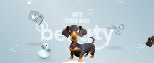
My Dog Company
Color Code #aacccc
Color Code #444444
Color Code #222222
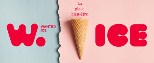
Wanted Ice
Color Code #eecccc
Color Code #ee0044
Color Code #eeaaaa
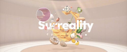
Taking Shape by Adobe
Color Code #ccaaaa
Color Code #eeeeee
Color Code #eeaa66
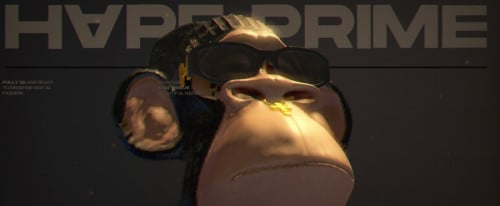
Hape Prime
Color Code #222222
Color Code #cccccc
Color Code #aaaaaa
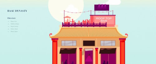
Baau Dynasty
Color Code #cceeee
Color Code #ee6666
Color Code #eeaa66
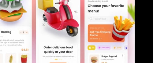
Food Deliver App
Color Code #eeeeee
Color Code #eecccc
Color Code #ee8844
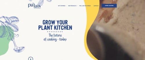
Pa’lais
Color Code #eeeeee
Color Code #ee8844
Color Code #aa8866
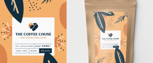
The Coffee Cause
Color Code #eeeeee
Color Code #eeaa66
Color Code #ccaa88
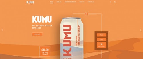
KAMU Drinks
Color Code #ee8844
Color Code #eeeeee
Color Code #cc6644
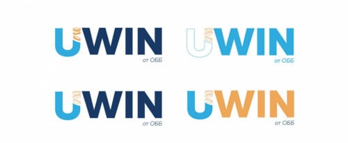
United Bulgarian Bank
Color Code #eeeeee
Color Code #224466
Color Code #aaaaaa
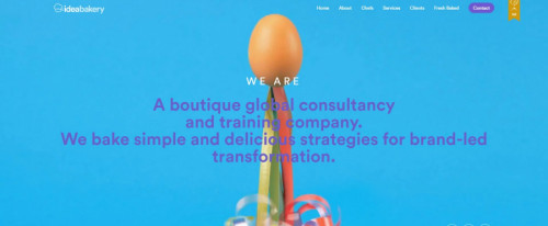
Idea Bakery
Color Code #22aaee
Color Code #4488cc
Color Code #66aacc
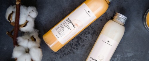
Manuka Botanics
Color Code #444444
Color Code #222222
Color Code #cccccc
Appeak
Color Code #44
Color Code #eeeeee
Color Code #aa2288
Gucci Decor
Color Code #cccccc
Color Code #448888
Color Code #cc66cc
Emergence
Color Code #446666
Color Code #aa8844
Color Code #cc8888
Colourful Chamelion
Color Code #888888
Color Code #aaaaaa
Color Code #eeaacc
Moqups
Color Code #2288ee
Color Code #44aaee
Color Code #eeee44
Nine Feet Tall
Color Code #666666
Color Code #ee8822
Color Code #220000
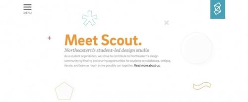
Meet Scout
Color Code #eeeeee
Color Code #88cccc
Color Code #66aacc
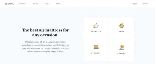
Bedowl
Color Code #666688
Color Code #aa8866
Color Code #ccaa88
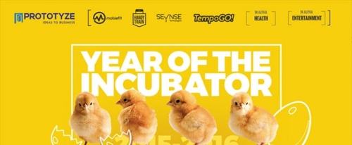
Prototyze
Color Code #eecc88
Color Code #eeaa66
Color Code #aa6622
1
2
3
4
5
6
7
8
9
10
>