9 Tips for a Great Newsletter Signup Design
If newsletter signups are one of the desired conversions on your website, a great design is vital to achieving success. A clear, well-designed newsletter signup form will help draw attention to the element on the page, and encourage people to use it.
This form is often see as a small element in the overall website design, but it can pack a big punch. So don’t overlook it in your design process!
Here are nine tips to help you make the most of your email newsletter signup design.
1. Only Ask for an Email Address
If you want people to sign up for your email newsletter, make it easy. Don’t ask for a ton of information because that can be a barrier to entry.
Ask for an email address and nothing else.
If you need other information for your subscriber database, send a follow-up opt-in with a form for that information from your email provider service.
In the vein of keeping it simple, when you ask for only an email address, use a single button to complete that interaction. (You’d be surprised at how many forms lead to confusion because of multiple buttons or requests for information.)
2. Use a Horizontal Design
When asking for an email address, the field must be wide enough to handle that information. So in most instances, this will lead you to a horizontal design because you only need two elements: An input field for the email address and a button.
By thinking horizontally here, you’ll create an easy-to-navigate, common sense form.
Structure it like this: Email signup/input field to the left and button to the right. Keep it all aligned and put any instructions or headers above the field and button or on the left before the input field.
3. Make It Minimal
With only a couple of design elements, this is not a complicated layout. Consider a minimal option that streamlines the design, making it super easy to understand.
This applies to everything about the email signup, from typography choices to the tone and microcopy of instructions to the structure and design.
A minimal aesthetic is the epitome of easy-to-understand. That’s exactly what you want here to generate conversions and collect email addresses for your subscriber list.
4. Use a Direct Call to Action
The microcopy in the email newsletter signup button matters. You are more creative than “send” for this call to action.
Use a direct – and actionable – CTA for the email signup.
Consider things like “Subscribe,” “Join the List,” or “Get Started.” Be creative but use a word or phrase that tells users what to do and expect straightforwardly.
5. Use Color with High Contrast
Color can help draw users to the email signup form on the screen. Use a high-contrast color combination to help the signup form get maximum visibility in the design.
Further use contrast to ensure the instructions for signup are easy to read as well. The most common design mistake is tool-tip copy that’s so muted that it is difficult to read. If the input field includes words such as “enter email address,” they need to be readable and include enough contrast.
While black text in a white box might be too bold for you, 70% black is much preferred over 30% black for this text.
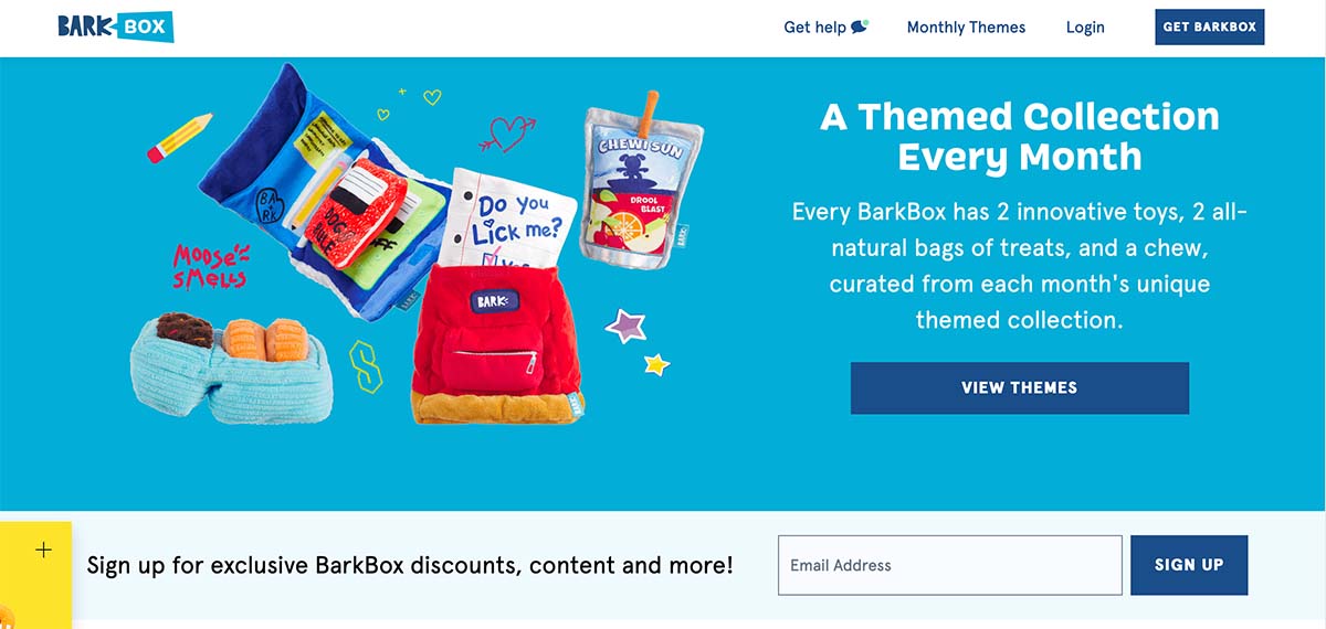
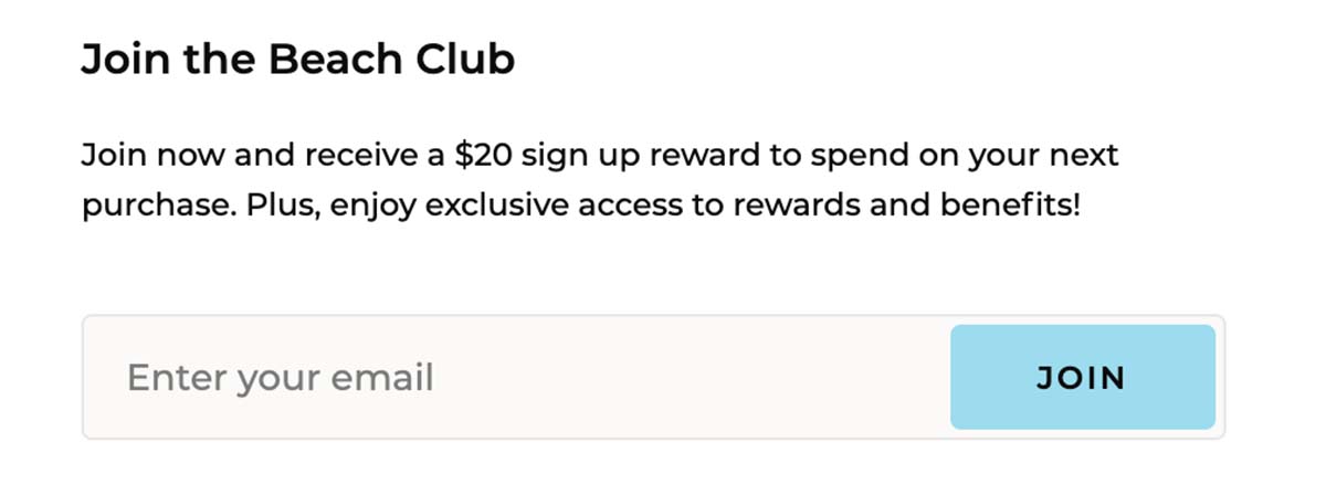
6. Offer an Incentive
Sometimes users might need a little extra incentive to sign up for an email list. If you are selling a consumer product, website visitors might even expect it.
Consider adding this to the signup form. Offer a discount for new email subscribers or another benefit or perk that will be emailed to them when they sign up.
This small benefit can help generate signups and even contribute to sales of items on your website.
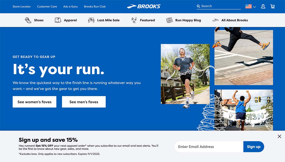
7. Consider a Pop-Up or Landing Page
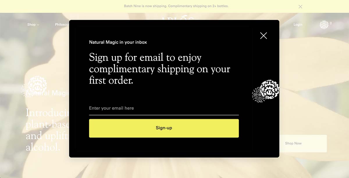
If you aren’t getting the email signup form conversions you were hoping for, it might be time to be a little more aggressive with the design or placement. This is where including a pop-up form or even a landing page with reasons to sign up can be beneficial.
If you go this route, you’ll have a lot more surrounding imagery or sales language with your email signup, but don’t let this change the way you think about the form design itself.
The same tips and guidelines apply, you are just thinking about other ways to enhance surrounding elements to help bring more attention to the signup itself.
8. Put It in the Footer
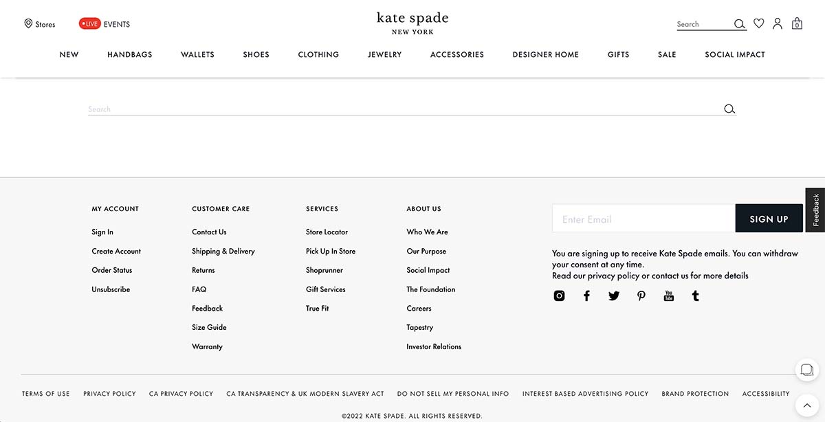
A strong static location for an email signup form is another good option. By putting your email signup in the footer, any user can find it with ease at any time from where ever they may be on the website.
This easy opportunity to signup can be a huge bonus and help generate conversions.
It’s also a more passive, less intrusive option for signing up that some users appreciate in a major way.
9. Tell Users What They Are Signing Up For
This might be the most obvious and least-observed tip: Make sure to tell users what they are signing up for. Are they getting a weekly email? Daily? Promotions and sales?
Not only will disclosing this information up front help you get the right kind of subscribers, but it can also help your open rates later (because people actually want the email) and keep unsubscribes, bounces, and spam notations lower.
If a user wants and is expecting your email, you’ll have much better success with delivery. And that’s something we all want.
Conclusion
The email signup form is one of those things that’s on almost every website but is often a design afterthought. Don’t fall into this trap and start thinking about how to design a simple form element that will draw attention and attract signups.
Use these tips to plan your design and create an email newsletter signup that will be easy to fill out and help generate new subscribers.