Special Web Design Critique: The New Google+
Yesterday Google rolled out a massive redesign of its social network, Google+. They didn’t merely shuffle around a few objects, they completely redefined the entire visual experience. Such a major refresh merits a special edition of our web design critique series.
Let others talk about boring old feature lists, join us as we jump in and take a look around to see what’s better and what’s worse from a designer’s perspective. We’ll pick apart every piece of the interface and see if there’s anything to be learned.
2 Million+ Digital Assets, With Unlimited Downloads
Get unlimited downloads of 2 million+ design resources, themes, templates, photos, graphics and more. Envato Elements starts at $16 per month, and is the best creative subscription we've ever seen.


If you’d like to submit your website to be featured in a future Design Critique, it just takes a few minutes. We charge $49 for critiquing your design – considerably less than you’d pay for a consultant to take a look at your site! You can find out more here.
The Old Google+
Before we dive into the new design, let’s take a quick look at the original version of Google+, shown below.
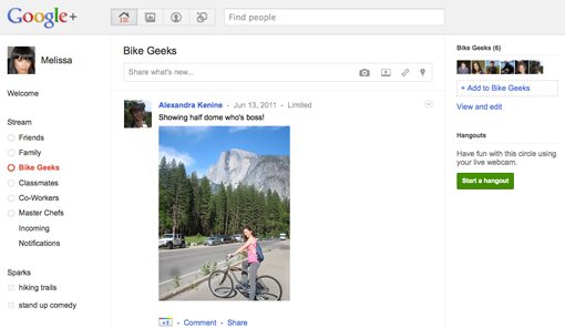
As you can see, it’s a fairly sparse experience with lots of whitespace. The layout organizes the content into three columns with a horizontal bar along the top for searching, adding photos, viewing your circles, etc. The layout here is actually quite reminiscent of Facebook’s current design.
The overall feeling is clean and simple, but also a bit cold and impersonal. This made the site easy for anyone to pick up and use but perhaps didn’t help much with the concept of making the page your own personal hub of communication.
The New Google+
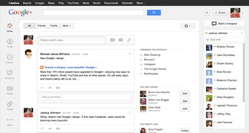
The new Google+ drastically cuts down on the whitespace and feelings of sparsity. By comparison, the interface seems loaded with features and buttons. They’ve kept the strong white personality but complemented this with a shade of gray.
This may seem like a trivial change, but it’s actually a very intentional attempt to create a strong visual hierarchy on the page. Where the old page was a sea of white with a single area of gray along the top, this page uses these two colors to clearly distinguish primary and secondary portions of content. Your eyes will float around the page, giving key significance to the lighter portions of the interface.
Layout
The layout is much more complicated this time around. It’s a modified version of the old three column layout with a bit of nesting in place. There’s still a wide main section flanked by two narrow sidebars, but that main section is now split into two strong sub-columns. All of the content on the page has a fixed position, only the main content area scrolls.
If we strip everything out and just look at the bones of the page, we see a fairly complex wireframe.

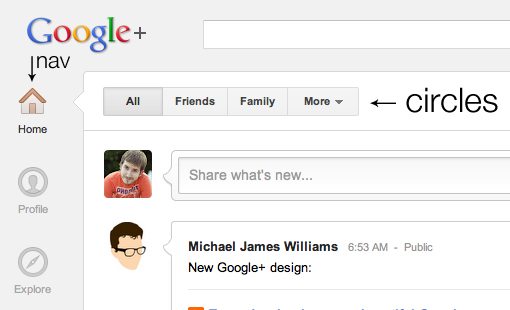
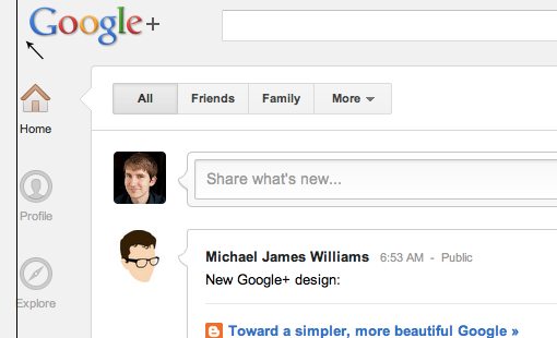
One of the most significant conceptual changes that has taken place is that the old layout contained your various friend circles in a vertical strip down the left side and your navigation icons along the top, while the new layout places the navigation in a vertical strip of icons down the left side and your circles in a horizontal bar across the top.
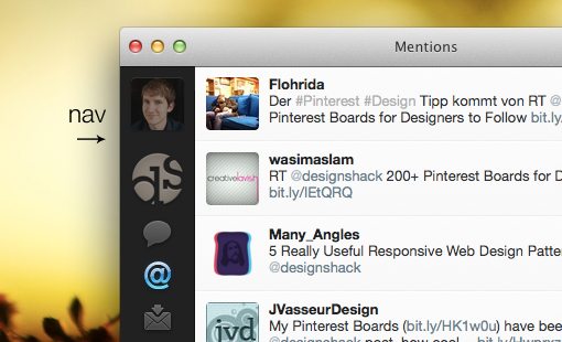
This left side icon-based navigation pattern is something that has become extremely popular in Mac UI design and we’re beginning to see it mirrored in web interfaces. One of the most significant proponents of this format was Twitter for Mac (formerly Tweetie), which has spawned a host of similar interfaces in apps such as Reeder, Sparrow, and Raven.
The new Google+ page comes with some vocabulary to learn. The strip down the left side is the “ribbon,” which contains various “applications.” The main content box is the “card” and the slide out area underneath each post with comments, +1s, etc. is the “activity drawer.”
Alignment Issues
The new layout goes a long way toward making Google+ seem like a more feature rich application and it definitely makes good use of contrast to highlight the important parts of the page. I don’t really have any issues with the overall layout schema, but I can’t help but notice some alignment issues that I think bring down the aesthetic.
For starters, the main content box and the hangout button are within a couple of pixels of being perfectly aligned along their top strokes. Unfortunately, to a nitpicker like me, a couple of pixels feels a mile off. There are few design quirks that annoy me faster than two things that are almost aligned. To learn more about this topic, check out “Why Almost Is a Dirty Word in Design.”
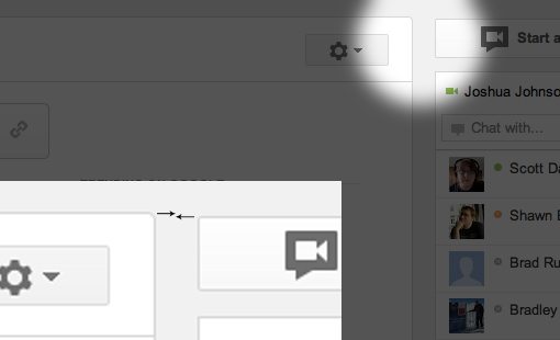
The effect is even worse if take a step back and look at all four of the elements in this area. The user email address, primary content box, hangout box and notification area all jut out at random lengths and seem to have no logic behind their placement.

This example isn’t an isolated incident, there are a few other cases where objects just miss a vertical or horizontal alignment. Check out how the Google+ logo below is awkwardly offset from the strong vertical line established by the navigation below.
Icon Design: Further From Simple
Historically, Google has always been known for its utter lack of design. Every product that rolled out seemed to be almost the simplest possible solution that you could imagine. The Google brand image represented a complete refusal to follow the glossy and gaudy web 2.0 visual style popular in the early 2000s in favor of letting the content speak for itself.
In recent years we’ve seen Google beginning to slowly distance itself from these ideas as its products show a subtle but ever increasing amount of complexity and design detail. The icons in the new Google+ serve as a perfect example of this notion.
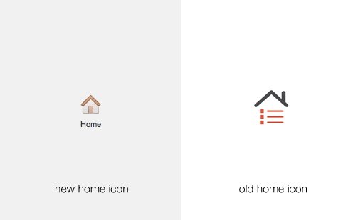
Notice how the simple abstract shapes and solid colors have given way to a more cohesive image of a house, which contains subtle strokes and gradients.
Repetition of Hover Effects
While we’re on the topic of icons, let’s take a quick look at some of the minor interaction aspects of the site, namely the hover effects. The general theme here is that icons are gray and contrast very little with the background. Then, on hover, the icon becomes full color. You can see this in action on the sidebar:
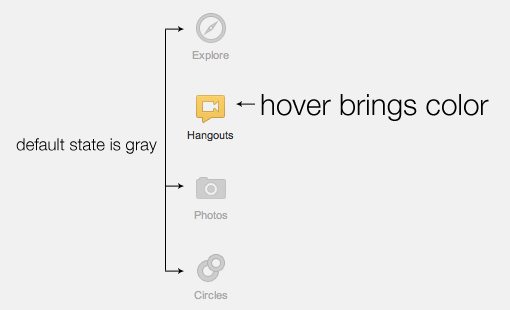
Repetition is one of your strongest tools as a designer and Google is wielding it well here. The same gray-to-color effect is repeated in a couple of more places throughout the page.
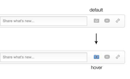
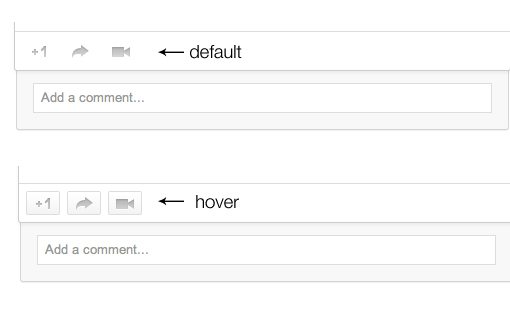
However, they’re a bit inconsistent with this effect. There are a few spots where I think it would’ve been appropriate to further the repetition, but they chose to go with another random effect. In the example below, the icons turn into button shapes on hover.
New Sidebar
To the right of the main content section, there’s a new sidebar with various features designed to help you make the most of Google+. Note that this is another place where we see the color on hover trick.
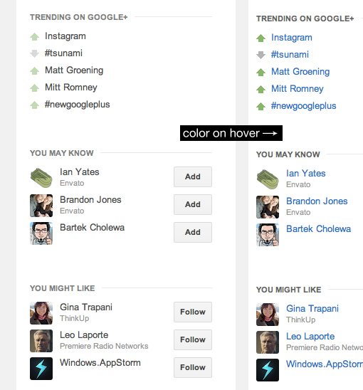
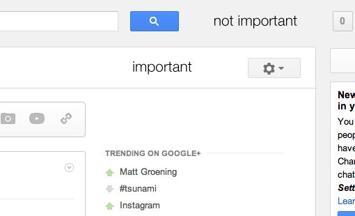
This area is very nicely designed with each section clearly organized and distinct. It’s interesting to see Google picking up an idea from Twitter in the form of a list of trending topics. You can see that users have already been adopting the hashtag syntax, a fascinating example of how we automatically transfer our behaviors across social networks whether developers account for that behavior or not.
It’s always important to both anticipate and observe the behavior of your user base closely and cater to actions that they seem to gravitate towards rather than attempt to change them. This will make your platform seem much more intuitive and easy to adopt.
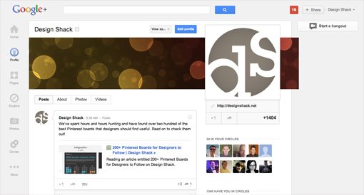
Profile
Taking a page from the new Facebook timeline playbook (and perhaps Path), the new Google+ profile allows for not only a main avatar image but a “cover image” (the same term used by Facebook) as well.
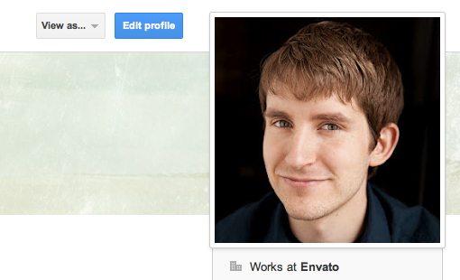
The part that’s a noticeable break away from Facebook is the undeniably huge profile pic, which resides on the right side instead of the left. Shown below at actual size, these images display at a whopping 250px by 250px, which is surely not coincidentally exactly double Facebook’s 125px square profile pics.
One thing that I find interesting is the fact that the cover image actually breaks out of the main content box. I usually appreciate it when designers intentionally pull off an unexpected trick like this but to be honest I find it quite distracting here. As soon as a profile page loads, my eyes jump right to the awkward overlap.
What’s The Verdict?
As of last month, Google+ reportedly crossed the 100 million mark for active users. No one can call this a small number, especially given the fact that Instagram just snatched a billion bucks from Facebook for its platform and 30 million+ user base.
Also, if you consider that Twitter has only 140 million active users, it seems that Google+ is rapidly gunning for the number two slot in social media. However, this definitely isn’t enough to come close to rivaling Facebook’s active user base, which is somewhere in the 800 million range.
The new design shows that Google has no intention to abandon this project like they have so many others in the past. They’re definitely attempting to craft a more enjoyable experience to lure you in and keep you coming back. The question is, will it work?
To answer that, we have to speculate as to what holds people back from adopting Google+. The obvious answer is that Google+ feels somewhat redundant when you already have a Facebook account, even more so if you’re active on both Facebook and Twitter. Another possibility is that while the old Google+ was certainly not ugly, it did feel perhaps a little sterile and void of personality.
Possible Goals Behind the New Design
From this we can venture a guess for at least two possible goals behind the redesign. The first would be to further differentiate Google+ from other social networks. Trying to claim that they’re simply better than Facebook at its own game isn’t the best option, the folks at Google have to establish a clearly unique conceptual cornerstone for why people should come to their site. As an example, Twitter has done an excellent job of staying away from replicating Facebook’s functionality and standing not as an alternative but as its own distinct product.
The second goal would be to reduce the sterility and begin to transform Google+ into a friendly, welcoming place that’s easy to navigate and even fun to use.
Did They Meet These Goals?
If we analyze the design in terms of these goals, we can better gauge whether or not it was a success. This exercise gives us clear points to compare against rather than blindly stabbing in the dark in an attempt to find what works and what doesn’t.
As far as the first goal, Google has made some progress in some areas and perhaps retreated a little in others. Overall, the new layout is a much further leap from Facebook than the old one. At a glance, a faithful user of either would never mistake one for the other, which is a good thing.
Further, little touches like placing the circle filters along the top and continuing to give prominence to hangouts ensure that Google’s few innovations are front and center. This progress is in contrast to other areas such as the new cover image, which actually make the social network feel more like a Facebook clone, not less. I would’ve liked to have seen them show some unique thought in this area rather than simply borrowing Facebook’s new format.
The second goal definitely seems to have been a main concern in the design refresh. The new Google+ creates a more inviting environment. Though it’s perhaps on the verge of being cluttered, especially when compared to the old version, it does feel like a more robust service with all of the stuff that’s happening on your home page.
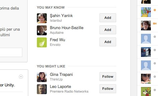
There’s a lot of increased emphasis on faces. It starts with your huge new profile picture and carries on through the home page where you see a big chat sidebar full of friendly faces in addition to suggestions for people that you might know and users that you might like. Google wants you to make friends, to get pulled into the experience enough to miss it when you’re gone. More friends means more interactions, which means more reasons to return.
What Do You Think?
Google+ seemed to me to be edging out of the spotlight in recent months. However, this perception was apparently flawed as in reality they were quietly but steadily climbing the charts with an impressive number of active daily users. Regardless, even if they were beginning to trail off in public interest, the new design was timed perfectly to get the whole web talking about them once again. Even if this was the only reason behind the refresh, it’ll likely pay off.
However, as I explained above, I think some deeper goals were at work here. Now that you’ve read my thoughts, it’s time for you to jump into the conversation. What goals do you think Google was trying to achieve with the new design? Did they effectively pull off these intentions?
Also, is Google+ ultimately doomed to go the way of Wave, Buzz and other failed social attempts or will it continue its steady growth and become one of the most important social networks on the web?