Web Design Critique #11: Scott Block
Every week we take a look at a new website and analyze the design. We’ll point out both the areas that are done well as well as those that could use some work. Finally, we’ll finish by asking you to provide your own feedback.
Today’s site is the personal portfolio of Scott Block, a web designer from Maryland.
2 Million+ Digital Assets, With Unlimited Downloads
Get unlimited downloads of 2 million+ design resources, themes, templates, photos, graphics and more. Envato Elements starts at $16 per month, and is the best creative subscription we've ever seen.


If you’d like to submit your website to be featured in a future Design Critique, it just takes a few minutes. We charge $24 for critiquing your design – considerably less than you’d pay for a consultant to take a look at your site! You can find out more here.
About Scott
“I live in Columbia Maryland, just a short drive from both Baltimore and the nation’s capital. When I was twelve, I combined my passion for the Baltimore Ravens with my growing interest in technology, and began making sites about the Ravens. Since then, I have diligently refined my skills, and now make websites for various individuals and organizations. I am now proficient in combining html with css, javascript, php, and ajax, to create beautiful, functional websites. ”
Here is the site’s homepage:
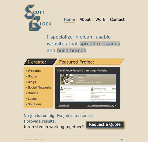
Though there is definitely some potential here, there are plenty of things I would fix on this page. Let’s look at them one by one.
Color Scheme
The colors used on Scott’s site create a fairly nice palette when stripped out individually as seen below.

However, I’m not crazy about the distribution of the colors. They seem implemented randomly in spots on the page simply for the sake of variation instead of being applied with purpose and logic. Think about each color choice you make and how it ties into the rest of the content on the page.
Logo
Its position in the top left of the site makes this logo the first thing users see when they visit the stage. You want to take this opportunity to make a strong first impression. Unfortunately, I feel this logo is coming up short.
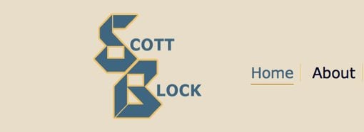
I can see how block shapes are being worked into the letters, presumably to tie into the designer’s last name, but it’s just not working. The SB has fairly poor readability and feels a bit dated.
Navigation and Header as a Whole
The navigation area is fairly simple, just some text with horizontal dividers and an underline to indicate the current page. I’m all for keeping navigation simple so I think this area is well done.
When you hover over a link in the navigation, an icon pops up under the Scott Block logo. This is a neat effect that I’ve never quite seen executed like this (with the hover effect so far away from the link).
When you take in the header area as a whole, there are a few notable issues that could use addressing. As I said above, the icon hover effect is neat, but it’s causing some problems. When you’re not hovering over a link in the navigation, there’s a big empty spot next to the header copy that makes you wonder why it isn’t aligned with anything.
A possible way to help this is to apply an icon to the default state that changes to another icon when you hover over a link and reverts to the original icon when the hover ends. Unfortunately, when the icon hover effect is present, the logo and the icon create an awkward vertical stack.
Overall, the negative space in this area could use a complete restructuring. Beyond the issue with the missing icon, the main logo just takes up too much vertical space and is creating strange gaps.
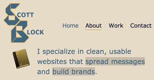
Featured Area
I like repetition in a design, and I can see how the angles in this section are mirroring that of the logo, but since it’s not really working in the logo, the same applies here. The slanted nature of the headings feels a bit odd as well as the crisscross pattern created by the colors here.
Subconsciously, your brain wants to connect the two items that are the same color, but here the two areas aren’t related.

Further, there are a number of hover effects on this area that serve no purpose. When you hover over a section, a drop shadow is created. The web has taught us to recognize such activity as an indication that what we’re hovering over is a clickable area. However, these areas are not clickable and causing them to feel as if they were only creates confusion for the user.
Footer
Th footer is fairly simple, but again we see that it could use quite a bit of refining.
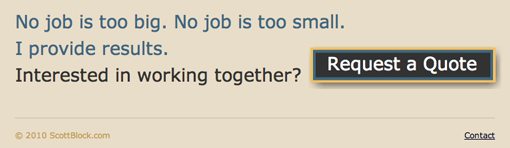
First of all, the button is in an awkward spot. When designing, always be wary of just sticking things in holes just because you have room. A strong left alignment is established here by the text but then ruined by the placement of the button.
Further, the button hover animation is a bit too much. An image sprite is used here and there’s an animation between the two button states where you can see one part of the image slide out as the other slides in. It’s not easy to tell what’s happening at first and it’s therefore a bit disconcerting.
Overall Recommendations
I presented quite a few harsh critiques above and I feel it would be best to try to tie it all together. Here are my suggestions:
To start, redesign the logo to something more modern and horizontal. Then establish a hard left alignment all the way down the page. Line up the navigation area and the block of copy under it to the left side of the page and perhaps move the new logo to the right.
Vary the size of text on the page to create clear headlines and supporting copy. Everything is currently very large. Remember: when you make everything special, nothing is special.
Throw out the current shapes in the featured section and the giant bulleted list (incorporate your services somewhere else). Create a single large featured project preview that stretches all the way across the content area.
Finally, rework the footer so that the left alignment above is honored. In other words, get that button out of the right hand corner.
Your Turn!
Now that you’ve read my comments, pitch in and help out by giving the designer some further advice. Let us know what you think is great about the design and what you think could be stronger. As always, we ask that you also be respectful of the site’s designer and offer clear constructive advice devoid of any harsh insults.
Interested in having your own site critiqued? You can find out more here.