Web Design Critique #12
Every week we take a look at a new website and analyze the design. We’ll point out both the areas that are done well as well as those that could use some work. Finally, we’ll finish by asking you to provide your own feedback.
Today’s site is the online gaming hub Casino Lemonade.
2 Million+ Digital Assets, With Unlimited Downloads
Get unlimited downloads of 2 million+ design resources, themes, templates, photos, graphics and more. Envato Elements starts at $16 per month, and is the best creative subscription we've ever seen.


If you’d like to submit your website to be featured in a future Design Critique, it just takes a few minutes. We charge $24 for critiquing your design – considerably less than you’d pay for a consultant to take a look at your site! You can find out more here.
About Casino Lemonade
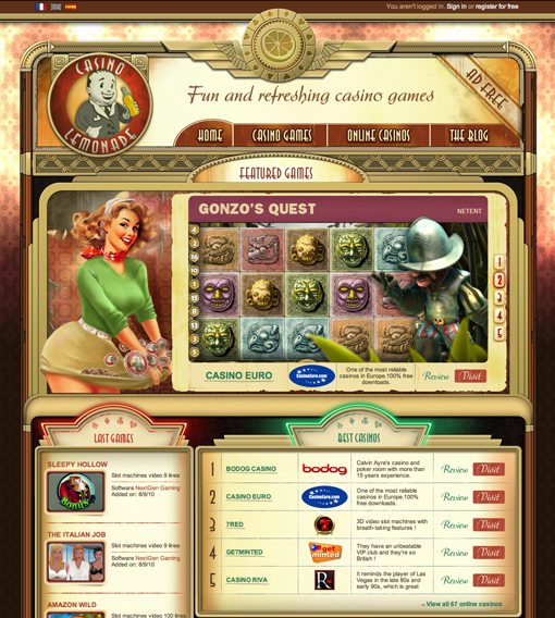
Casino Lemonade hosts a number of crazy browser-based casino games from various providers. I admittedly know nothing of the online casino gaming world but I do know that this site blew me away when I first saw it.
Here is a section of the homepage:
An Immersive Experience
Tons of websites try to create an overall theme but very few sites successfully pull off something that’s truly immersive. The designers here took a concept and stretched it over every facet of the site from the sidebar ads to the blog posts.
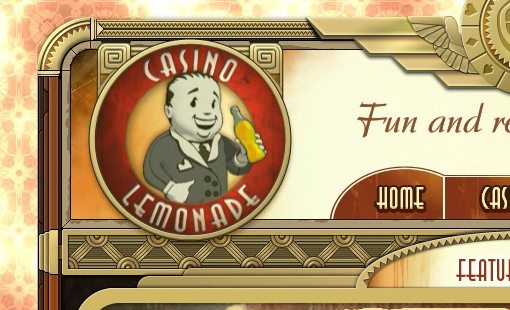
The retro feel here is outstanding. As soon as you load the page your eye is drawn to a wonderfully animated and friendly looking character that pops up and pulls out a soda bottle (or lemonade bottle I suppose). He’ll then wink at you any time you hover over him.
As you look around you can start to appreciate the profound amount of detail that went into this site. The brilliant background textures, the stunningly complex border treatments and the scattered lighting effects really highlight the amount of work that was put in here.
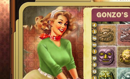
Character Illustrations
The character illustrations don’t stop at the lemonade man. Scattered around the site you’ll see friendly faces in a similar retro style. Some are impressively detailed and others are simplified to look more like the popular advertising illustrations of the time period.
Section Divisions
Without a doubt, the page is overflowing with content. There is simply a ton of stuff here. Normally this would be my first target in a critique but here the information is organized quite nicely into clearly defined sections that fit in perfectly with the theme.
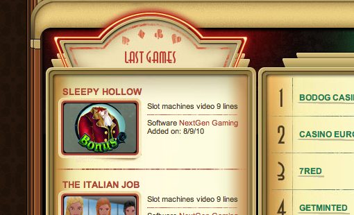
I love the old sign treatment seen in the mid-section of the page. Touches like these really give a high-class feeling to the aged theme.
The Footer
One of the few things I didn’t like about the site design was the mass of logos in the footer. There a million of these guys all thrown in down here.
However, I’ve engaged in plenty of corporate design in my day and realize that this was probably a non-negotiable requirement. If you have to stick nineteen logos somewhere it might as well be in the very bottom.
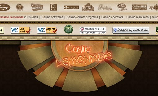
That said, I dig the huge neon sign that serves as a sign off for the site. It definitely helps to draw you attention from the logo mess. The page is long enough though that I found myself wishing that clicking the sign would shoot me to the top of the page.
Critiques?
I honestly have very little to suggest. Aside from the logo bundle there was really only one section that I didn’t like. There’s a Twitter section near the bottom that feels out of place and has really poor readability (the Facebook one isn’t great either).
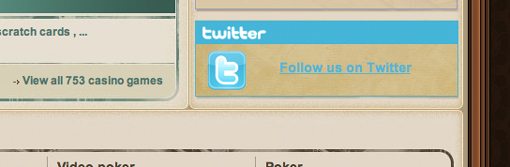
This is one of the few spots that really spoils the illusion of the theme. Though brand recognition is important, I think it would make a stronger statement to carry out the retro look even here. The overall feel could be something similar to a recently popular ad shown here.
Your Turn!
Now that you’ve read my comments, pitch in and help out by giving the designer some further advice. Let us know what you think is great about the design and what you think could be stronger. As always, we ask that you also be respectful of the site’s designer and offer clear constructive advice devoid of any harsh insults.
Interested in having your own site critiqued? You can find out more here.