Web Design Critique #14: WebAppers
Every week we take a look at a new website and analyze the design. We’ll point out both the areas that are done well as well as those that could use some work. Finally, we’ll finish by asking you to provide your own feedback.
Today’s site is WebAppers.
2 Million+ Digital Assets, With Unlimited Downloads
Get unlimited downloads of 2 million+ design resources, themes, templates, photos, graphics and more. Envato Elements starts at $16 per month, and is the best creative subscription we've ever seen.


If you’d like to submit your website to be featured in a future Design Critique, it just takes a few minutes. We charge $24 for critiquing your design – considerably less than you’d pay for a consultant to take a look at your site! You can find out more here.
About WebAppers
“WebAppers is a blog dedicated to share top quality open source resources for web developer and web designer daily. As a web designer, you’ll find some of the best free icons, stock photos, brushes, fonts and design inspirations. As a web developer, you’ll also find some of the best Javascript and Ajax components like modal windows, menus, galleries, tooltips, charts, calendars plugins and a lot more …”
Here is a section of the homepage:
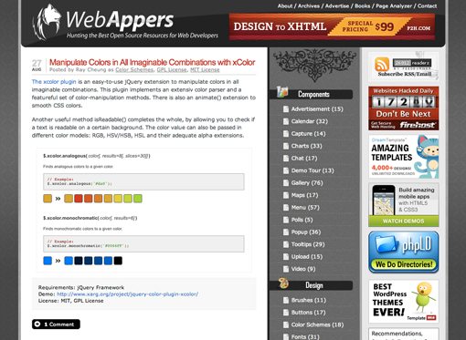
As you can see, WebAppers is a nice looking blog. It has a very content-focused design and takes you straight into large previews of the most recent articles. The color scheme is mostly grays and blacks which gives the site a classy feel when combined with the subtle textured background.
To give it a proper run through, let’s analyze the design piece by piece.
Header
The header for WebAppers is pretty minimal. It’s only about 80 or so pixels high and has a black glossy effect applied to it.

I like the big logo and the gloss, I think they go well with the theme of the site. I’m not sure about having a big ad in your site header though. However, I definitely realize that we need ads. It’s how design blogs stay open and I’m never going to critique a blog for using them (we have plenty ourselves!).
Here though the ad is setup in a visual competition with the site’s logo. The header is split about half way with the two graphics and it’s not immediately evident that “Design to XHTML” isn’t what WebAppers is all about.
I would suggest using the header to create a clearer visual message so that users immediately know that WebAppers is offering free, open source resources. Free is a magic word and saying it loud and proud in the header will help prevent the casual visitor from moving on to the next site before looking around.
Post Structure
Since this is a blog, it makes since to take a look at how posts are structured. Here’s a shot of the basic format:
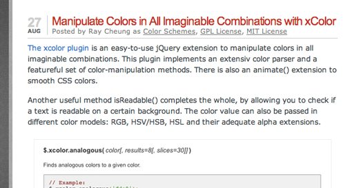
There’s not much to discuss here, but I like it. The text is nice and easy to read, I like the date callout, and the author is clearly listed.
My suggestion here would be to bump up the size of the post titles a bit so they contrast more with the rest of the text on the page. Do this in conjunction with adding a little breathing room here and it will drastically increase the ease at which users can scan your home page in search of interesting topics.
Sidebars
The right side of the site is occupied by two sidebars. The first holds an extensive category list headed up by a swirly vector shape and contains icons and headers to separate the different sections. The second is a basic ad area with a single vertical strip of ad spaces.
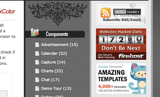
I like that there are so many post categories listed here. On a site that focuses on free content it’s important to be able to find what you’re looking for quickly and that’s definitely what is accomplished here. The numbers indicating how many posts are in each category go a long way as well.
The graphic at the top feels a little stock arty but it’s attractive and helps divert your attention to this area.
Search Bar
One of the areas that I think could use a bit of attention is the search bar. For one thing, you really have to hunt to find it so I wouldn’t be surprised if most of your users didn’t even know it existed.
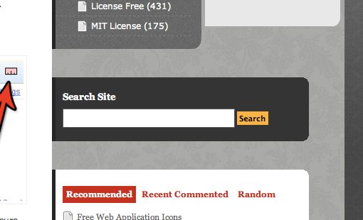
Also, I feel like the button is dwarfed a little by the search bar and could be larger. Finally, the font choice here doesn’t match that of the main content, which doesn’t match that of the categories, which doesn’t match the “Recommended” section under the search area.
I recommend choosing one or two fonts and then sticking to them throughout the entire design. Right now every area feels like it was designed individually rather than as a cohesive whole.
Footer
I like the idea of tossing in a couple of books down here, it’s a little random but helpful for any readers that venture down to the footer.
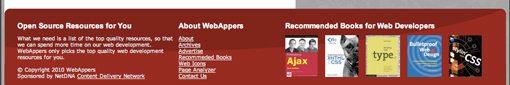
Other than that I think the area feels a little awkward. The inverted rounded corner bottom is a little funky and the second column of text is a little too close to the first and too far from the third. They don’t have to be evenly spaced but the first column could use a little of its width taken off.
Your Turn!
Now that you’ve read my comments, pitch in and help out by giving the designer some further advice. Let us know what you think is great about the design and what you think could be stronger. As always, we ask that you also be respectful of the site’s designer and offer clear constructive advice devoid of any harsh insults.
Interested in having your own site critiqued? You can find out more here.