Web Design Critique #21: Billy.com
Every week we take a look at a new website and analyze the design. We’ll point out both the areas that are done well in addition to those that could use some work. Finally, we’ll finish by asking you to provide your own feedback.
Today’s site is Billy.com, an online savings club.
The Ultimate Designer Toolkit: 2 Million+ Assets
Envato Elements gives you unlimited access to 2 million+ pro design resources, themes, templates, photos, graphics and more. Everything you'll ever need in your design resource toolkit.
If you’d like to submit your website to be featured in a future Design Critique, it just takes a few minutes. We charge $24 for critiquing your design – considerably less than you’d pay for a consultant to take a look at your site! You can find out more here.
About Billy.com
“Please allow me to introduce myself. My name is Billy, and I’m the guy behind of the Web’s Smartest Savings Club. Saving money is not just my passion, it’s my purpose. My job is to make sure my friends never pay full price again. With the help of my fantastic family, I negotiate great deals with retailers and service providers on behalf of my friends. It may be hard to believe, but behind my suave appearance and rugged good looks lies a power negotiator! I also compare offers and quotes from different vendors so my friends can find the most suitable product or service and still keep as much of their hard earned money as possible.”
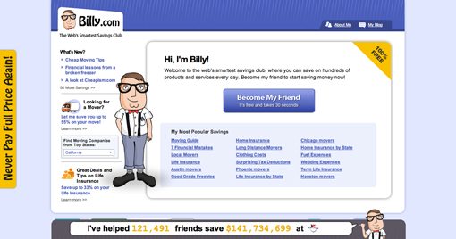
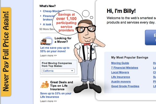
Here is a screenshot of the homepage:
Now we’ll break down various aspects of the design and discuss what’s working and what isn’t.
Overall Design
Right off the bat, my feeling was that design feels a bit dated. Some of the decisions made here reflect web design styles that were typical almost a decade ago. This includes the treatment of the header, the fonts and colors used and even to an extent the Sunday morning paper comic illustration style (we’ll discuss these in more detail below).
However, the overall layout is fairly functional. The sidebar is a good width and is organized nicely and the main content flows in a logical fashion.
Messaging
One of the things that I think the site nails is messaging. The term “savings club” is pretty vague and sounds like it may be a trap, but the copywriter made it quite clear that the club is entirely free. Just as important is the call to action, “Become My Friend,” with a reassuring statement about how it only takes 30 seconds.
Sometimes signing up for a web service seems easy but quickly leads to an involved process that users desperately want to avoid. The 30 second statement is a strong encouragement and no doubt is a primary reason behind many users signing up.
I also like that under this area is a list of popular savings. This is another step that clears up just what the site is for and what kind of deals you can expect to receive.
Typography
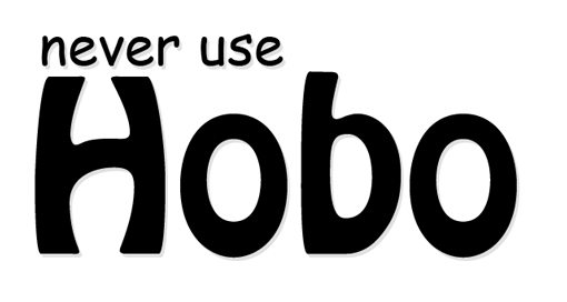
This one is going to sound a little harsh, but trust me, following these simple steps will improve your designs drastically. The first rule of design is “Never use Comic Sans.” Billy.com passes the test on this front, but a very similar and lesser known rule is “Never use Hobo.”
There’s simply no nice way to say it, Hobo is an ugly font. If you want to use a fun font on certain items, you certainly can, just look for some that have a little more style and class. FontSquirrel is a great place to start your search. Stopping by the site and almost picking something at random I came up with the image below (the font is called Japan). I’m sure you could do much better if you invested some real time and effort into the search.
Billy
Let’s talk about Billy for a minute. When you first load the site, Billy is nowhere to be seen. Then out of the abyss you hear the sound of footsteps and up walks Billy waving, nodding, holding up signs and making lots of cartoony sound effects as he goes about his business.
Don’t get me wrong, he’s a fun character. He looks nerdy and friendly and brings a personal element to the site. It’s fun to hover over him with the mouse and see him smile and wave. However, I think he’s a bit misused.
I almost always suggest that any site with sound effects offer users a way to turn them off. Include a button somewhere that kills the sounds completely, or better yet, make users press the button to turn sounds on (leaving them off by default).
I also think that Billy is poorly positioned. As he holds up signs to tell you about the site and get your attention, he actually covers up the content in the sidebar, which makes for some pretty poor usability if you’re actually trying to read or interact with that content.
I would suggest moving BIlly off to the right side of the page. Since the content in the main box is fairly far to the left, he wouldn’t be covering up anything vital to the functionality of the site.
A Modern Design Overhaul
It’s never fun to hear someone suggest that you redesign your site. And in all honesty, Billy.com is functional just the way it is and could improve a lot with the simple suggestions above. However, if you do decide to give the site a visual overhaul sometime in the near future, I suggest taking a look at some popular character-driven sites on the web today.
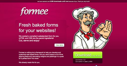
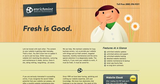
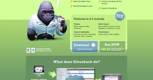
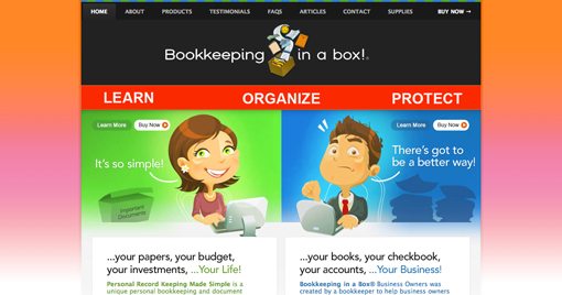
The sites below all use beautiful modern web design styles with great color schemes, illustrations, textures, etc. I’m not suggesting that you ripoff any of these sites but rather present them as inspiration for how to interpret my suggestions for bringing Billy.com up to date visually.
Formee
Enrichment
Silverback
Bookkeeping in a box
Your Turn!
Now that you’ve read my comments, pitch in and help out by giving the designer some further advice. Let us know what you think is great about the design and what you think could be stronger. As always, we ask that you also be respectful of the site’s designer and offer clear constructive advice void of any harsh insults.
