Web Design Critique #29: MadeFreshly
Every week we take a look at a new website and analyze the design. We’ll point out both the areas that are done well in addition to those that could use some work. Finally, we’ll finish by asking you to provide your own feedback.
Today’s site is MadeFreshly.
The Ultimate Designer Toolkit: 2 Million+ Assets
Envato Elements gives you unlimited access to 2 million+ pro design resources, themes, templates, photos, graphics and more. Everything you'll ever need in your design resource toolkit.


If you’d like to submit your website to be featured in a future Design Critique, it just takes a few minutes. We charge $24 for critiquing your design – considerably less than you’d pay for a consultant to take a look at your site! You can find out more here.
About MadeFreshly
“A shopping cart with taste. Trends change and so should your online store. MadeFreshly offers you a fresh design for your shopping cart.”
Here is a screenshot of the homepage:

First Impression
Right off the bat, I can say that I really like the design of MadeFreshly. There are several cool design ideas and quirks here that we’ll talk about below. I definitely have a few suggestions for improvement but for the most part, it’s a great looking site created by very talented designers.
My biggest qualm is probably from a conceptual point of view. This is definitely a subjective critique so feel free to completely ignore it, but I find it odd that the site’s visuals contradict the metaphor set in place by the site’s name. “MadeFreshly” could imply a number of things: Food in general, baked goods hot out of the oven (this is where my mind goes), something nature-inspired, or even something new and shiny.
However, the designer has chosen a slight grunge look for the site. The background is an aged texture and the headlines likewise have some grunge applied to them. Again, this makes for a great looking page, but it’s at odds with the concept of “Fresh.”
Content should always precede and determine design. Designing around, or at the very least not in contradiction to, the name and pre-established metaphor for a site helps everything tie together and simply feel “right.”
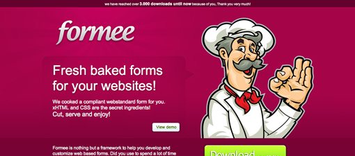
As an example, check out a very similar situation in the site “Formee,” which delivers “fresh baked forms.” The visual is a friendly chef character that reinforces the tagline.
Don’t copy this idea, but you might consider how you can also tie in the concept of “fresh” to the visuals on the page.
The Logo
I think the MadeFreshly logo is great. The typeface is quite attractive while still feeling unique and the neat creased sticker effect adds a sense of depth to the site. Great work!
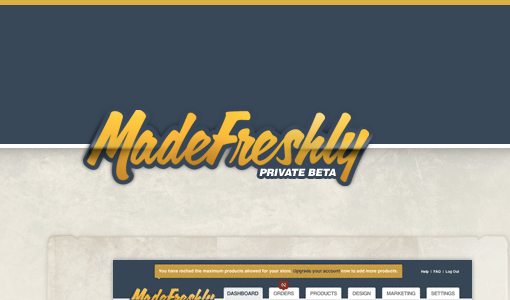
The Header
The header is nice and simple with a plain text navigation and an easily-noticeable login tab. Stop by and look at this area full size though and you’ll see that there’s just a lot of space floating above that logo.

I don’t mind whitespace and even encourage designers to use it quite liberally, but a big empty area is an awfully awkward way to start off the site. The solution here is dead simple, simply reduce that space by about half and it should look great. You’ll still retain plenty of space, just not so much that it’s distracting.
Another problem I see here is that the logo is in a strange horizontal position. The content on the right side of the page all lines up on the right, suggesting not a centered but a justified layout. However, the logo doesn’t line up with the content on the left, nor is it centered over the element below it (another justifiable position). Instead, it’s awkwardly floating to the right of being left-aligned and to the left of being center-aligned.

The simple fix here is to scoot the logo to the left so that it lines up with the content below it. It’s almost there already and just needs one more good shove.
The Featured Section
The section below the header, which I’m arbitrarily referring to as “the featured section,” is the part of the page that really grabs your attention. It has more visual weight than the content around it so it feels more important and your eyes are almost immediately drawn to it (all good things).

The “create store now” button is nice and bright and serves as a strong call to action. After you see the button, if you have another look around, your eyes are drawn back to it by the arrow, a nice touch that brings even more attention to one of the most important elements on the whole page. You might consider adding a hover effect to the button just as a bit of a UX boost but otherwise it’s a solid design.
My one quandary here is the headline text. One one hand, it’s attractive and brings some nice repetition to the text used in the logo. On the other hand, it’s simply not a quick read simply because of the complexity of the typeface.

This is one of those situations where aesthetics and readability are at odds. If you changed the font here I firmly believe the site would be less attractive for it, but you might double the number of users that actually read the headline.
You might consider experimenting with leaving one word of the headline in the script and converting the rest to something a little more readable. So for instance, “a shopping cart with” could be smaller and in a plain sans-serif font while “taste” could be highlighted through both a larger size and use of the script font.
Ultimately, it’s acceptable how it currently is and these are just suggestions to consider. It would be great to run some AB testing on this element to see if making it more readable has any measurable effect on conversions. If not, then definitely keep the script.
Three Up Section
The bottom of the page depicts three screenshots with the words fresh, easy and efficient. This is catchy and memorable and the section looks awesome. I love that the background texture ends and the thumbnail frames overlap into the new area. Again, the designer is adding a little more depth to his design to make it feel that much more real and diverse.

All Bold Paragraphs
Normally we stick to the homepage for Design Critiques, but this time I poked around a bit on the other pages. One thing that I think is worth pointing out is the paragraph text on the “Tour” page.

The decision to make the paragraphs all bold just isn’t working out. The letters look like they’re crammed against each other and are quite difficult to read. Further, by bolding the body copy you reduce the impact of a bold header (contrast is key). I would recommend giving this text the same styling as the non-bold text under the three thumbnails on the homepage.
Your Turn!
Now that you’ve read my comments, pitch in and help out by giving the designer some further advice. Let us know what you think is great about the design and what you think could be stronger. As always, we ask that you also be respectful of the site’s designer and offer clear constructive advice void of any harsh insults.