Web Design Critique #36: Sticker Mule
Every week we take a look at a new website and analyze the design. We’ll point out both the areas that are done well in addition to those that could use some work. Finally, we’ll finish by asking you to provide your own feedback.
Today’s site is Sticker Mule.
The Ultimate Designer Toolkit: 2 Million+ Assets
Envato Elements gives you unlimited access to 2 million+ pro design resources, themes, templates, photos, graphics and more. Everything you'll ever need in your design resource toolkit.


If you’d like to submit your website to be featured in a future Design Critique, it just takes a few minutes. We charge $34 for critiquing your design – considerably less than you’d pay for a consultant to take a look at your site! You can find out more here.
About Sticker Mule
“Sticker Mule is the easiest way to buy custom stickers & skins. We fix artwork problems for free and provide free shipping to anywhere in the US. Our products are made using the best printing technology. The result? Full color sticker printing at really low costs. Whether you need 50 or 500,000 stickers, nothing beats the mule.”
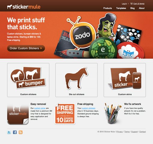
Here is a screenshot of the homepage:
Initial Impression
Sticker Mule has a beautiful site. The color scheme and graphics are excellent and work together really well. Also, the name in conjunction with the simple white borders around the images immediately communicates the idea that stickers are being sold here. You don’t have to hunt around or read lots of content, as soon as the page loads you can tell that this is a sticker store.
That may sound like an obvious and easily attainable goal, but you’d be surprised how many sites we critique that miss the simple idea of making it apparent what a site is and who it’s for.
If you browse around the site, you can see that the tone and quality of the design are consistent throughout. It’s fairly common to see a business create a beautiful and clean homepage only to have a cluttered and unusable store, but Sticker Mule stayed strong throughout the design process.
Let’s tear apart the homepage a little and analyze it piece by piece.
Header

The primary section of the homepage is divided into two sections. At the top, there is a bar with the logo and some navigation. Notice how minimal the navigation elements are in terms of design. They’re easy to spot if you’re looking for them, but don’t necessarily grab a lot of attention. This is great because there are other, more important elements on the page to draw in your attention.
The headline is clever but straightforward “we print stuff that sticks” and reinforces the graphic of a pile of stickers. At this point you might wonder what kind of stickers they sell and this question is answered right away in a nice, big call to action button “Order Custom Stickers.”
Always try to look at your designs from the viewpoint of a complete outsider. Show your site to someone who knows nothing about it and see how long it takes them to figure out what the site is for. Here we can tell fairly quickly that this is a site that we can use to order custom-printed stickers.
There’s no long sales pitch about the company’s history, superb materials and how they’re better than the competition, this page doesn’t need all that fluff (it’s where it belongs on the about page). Just a simple message presented in a simple, yet attractive way. What more could you want?
Header Suggestions
The one thing that I think I would work on here is adding a decently different hover state to the order button. Whether or not it’s needed is arguable since the element is obviously a big button, but it’s often nice to reinforce this idea with something that goes beyond a simple cursor change.
Content and Footer

The layout of this section is perfectly simple, just two rows of three items. One of our biggest downfalls as designers is that we over-think layout and try to come up with something complex and different when the goal is really to simplify the presentation of information.
Sticker Mule separated their entire product line into three categories: custom stickers, die cut stickers and custom skins. If they really thought about it, they probably could’ve come up with ten or more sub-categories to place here, but they didn’t. They kept it simple. Once you select an option at this basic level, then you are presented with more options.

Shopping for stickers isn’t an every day task for most people. Hitting them with too much information right out of the gate would confuse and intimidate them. However, Sticker Mule gently walks you through the process, holding your hand the entire way.
Back to the homepage, they also condensed all of their messaging into three important notices. First, the stickers can be easily removed, second, shipping is free, and third, they fix sub-par artwork free (all represented by amazing icons). Business owners are always going to be tempted to overload customers with information on the homepage. As a designer, it’s your job to get at the heart of the key information that is most relevant and to convince the site owner that anything else can be placed on a secondary page.
Suggestions
As with the section above, there’s only one thing that I would change here, and that’s the gradient on the sticker image that discusses ease of removal. It just feels awkward to fade the graphic out like that when the icon could easily be reworked to be a whole sticker with a large peeled portion. The gradient just makes it feel like the designer was lazy and didn’t want to design something that fit into the space properly.

Other Pages
Normally we stick to the homepage, but this site is really worth looking around, especially if you’re considering opening an online store. As I mentioned above, the style and strong sense of ease and simplicity stay consistent throughout the entire experience.

One thing that I really like is that the clickable areas are really large on every page. If you want to make someone that anyone from 12-85 years old can use, make the on-screen options nice and big. It seems friendly, is easy to use, and can even look great in the hands of the right designer.
I also really like the individual product pages. The options are dead simple, the information that you need to know is split up into small chunks with attractive icons just like we saw on the homepage, and the buttons to continue through the process are huge.

On the whole, I think Sticker Mule really knocked it out of the park in terms of both design and usability. There was a time when buying custom-printed products online was a nightmare and companies with websites like this have really transformed the entire process into something that normal, non-technical people can handle quite easily.
Your Turn!
Now that you’ve read my comments, pitch in and help out by giving the designer some further advice. Let us know what you think is great about the design and what you think could be stronger. As always, we ask that you also be respectful of the site’s designer and offer clear constructive advice void of any harsh insults.