Web Design Critique # 37: Aaron Storry Photography
Every week we take a look at a new website and analyze the design. We’ll point out both the areas that are done well in addition to those that could use some work. Finally, we’ll finish by asking you to provide your own feedback.
Today’s site is Aaron Storry Photography.
2 Million+ Digital Assets, With Unlimited Downloads
Get unlimited downloads of 2 million+ design resources, themes, templates, photos, graphics and more. Envato Elements starts at $16 per month, and is the best creative subscription we've ever seen.


If you’d like to submit your website to be featured in a future Design Critique, it just takes a few minutes. We charge $24 for critiquing your design – considerably less than you’d pay for a consultant to take a look at your site! You can find out more here.
About Aaron Storry Photography
Aaron is a professionally trained and highly experienced photographer located in Higham Ferrers, Northamptonshire. His expertise is largely in wedding photography, portrait, landscape and candid situation photography, however he’s also highly experienced in HDR (High Dynamic Range Imaging) & Tilt-Shift.
Here is a screenshot of the homepage:

Initial Thoughts
If you’ve been following our Design Critiques for a while, you may recognize this site. Aaron Storry was also Web Design Critique #5! Back then I stated that I really like the site, and the statement is even more true today. Here’s the original home page design.

As you can see, by comparison, the old version feels much plainer and a little empty. The new site feels like a lot more work was put into both the content and the aesthetics. It’s not often that I praise a designer for cramming more content onto their homepage, but in this case I definitely think it needed it.
I really like that Aaron decided to keep the essence of the old design, while really taking it to the next level. If you were a customer familiar with the old site, the new one wouldn’t shock you, it would feel more like an update than a full on redesign.
Let’s take a look at each chunk of the homepage and see how/if it has improved and whether or not we think further improvements can be made.
Navigation
The old site had a navigation bar that ran down the side. Some people love side navigation, others hate it, but this one was implemented fairly well. The reason it worked is because it was fixed so that when you scroll, the navigation came along for the ride, making it easy to switch pages from anywhere.

However, this functionality wasn’t present in the places that needed it the most: the long gallery pages. This inconsistency was a major downfall of the previous site. The new site ditches the sidebar altogether and opts instead for a top-side navigation.

Whether or not a top navigation is inherently better than a side navigation is a discussion for another day, but in this case, I definitely think it’s an improvement. First of all, the sidebar was eating up a lot of the page width, which as we see now had a lot of potential to showcase other content. Sticking the navigation up top has reduced the footprint of this piece of the site while still placing it in a logical location. What I mean by that is when someone goes looking for the navigation, they’re going to start at the top of the page.
As far as possible improvement, I’m not sure I’m crazy about the repeated shape behind the navigation dropdowns. I think a simple dark box might provide more contrast and feel less awkward.
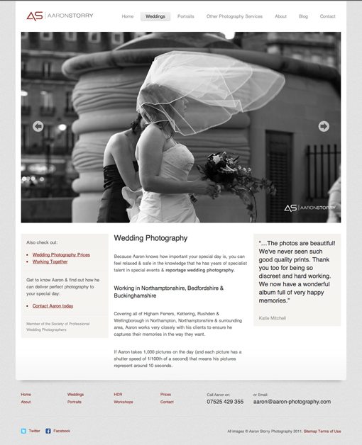
Slideshow
I can’t say enough about this area. Moving the navigation up to make more room for the slideshow is the single best decision that was made in the redesign. Photographers need to showcase one thing above all on their sites: their photos.
This is 99.9% of how you will be judged by potential customers and nothing makes a good impression like a huge photo slideshow showcasing your best work. If you’re a photographer, you should definitely seek to emulate this on your site. In fact, we recently published a tutorial on creating a full-screen slideshow for your homepage.

Beyond just the size of the slideshow, the implementation is solid. For starters, it’s JavaScript instead of Flash, which is always a bonus. The controls are also simple but easy to spot and use.
Informational Content
The second big improvement for this site is the inclusion of lots of helpful information right on the homepage. Before, users had to dig a lot deeper into the site to learn about Aaron and his services, which isn’t ideal for curious first time visitors. Now, his services are clearly stated with links to each section of the site.

The organization of this information is really great. So many of these critiques include criticism of how information is presented on the homepage because it’s so easy to make it look like an unorganized mess. Here however, we have clearly separate sections with an easy to follow flow of information and strong alignment principles being put into practice. I particularly like the use of gray boxes to separate the content on the left from that on the right, a nice touch!
Other Pages
The great design doesn’t stop at the homepage. The layout established here is carried out very well across the site. Remember that it’s perfectly acceptable to reuse a modified version of your homepage layout for your other pages, you don’t need to reinvent the wheel every time! Here the designer set up a predictable and familiar pattern, which aids usability as you quickly get used to the basic layout.
Even when the designer had to completely rethink a layout, as in the case of the store page, he really knocked it out of the park. The grid-based layout is super solid and works perfect here. Other nice touches include the hover effects and clean, functional sidebar.

Your Turn!
Now that you’ve read my comments, pitch in and help out by giving the designer some further advice. Let us know what you think is great about the design and what you think could be stronger. As always, we ask that you also be respectful of the site’s designer and offer clear constructive advice void of any harsh insults.