Web Design Critique #46: Jean Claude Van Damme and DVD Amnesty
Every week we take a look at a new website and analyze the design. We’ll point out both the areas that are done well in addition to those that could use some work. Finally, we’ll finish by asking you to provide your own feedback.
Today’s site is DVD Amnesty.
The Ultimate Designer Toolkit: 2 Million+ Assets
Envato Elements gives you unlimited access to 2 million+ pro design resources, themes, templates, photos, graphics and more. Everything you'll ever need in your design resource toolkit.


If you’d like to submit your website to be featured in a future Design Critique, it just takes a few minutes. We charge $34 for critiquing your design – considerably less than you’d pay for a consultant to take a look at your site! You can find out more here.
DVD Amnesty: Hello JCVD
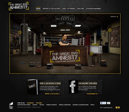
DVD Amnesty is definitely one of the more interesting sites I’ve ever had the privilege of critiquing. As you load the page, here comes Jean Claude Van Damme! He then delivers a short message and sits down at a desk in a worn-down gym that looks straight out of one of his movies. The room is your typical “immersive” interactive website environment.
Here is a screenshot of the homepage:
First Impression
Normally, I hate these kinds of “browse the room for navigation” sites, but this one admittedly didn’t really bug me. Admittedly, much of this was due to me being intrigued by the man the site is centered around, whom my father and I watched in countless horrible fighting movies when I was young (and loved every one of them).
The site does a fairly decent job of getting right what these types of sites typically get wrong. For starters, the clickable points are clearly marked by bright circles. Normally, room-based websites have you hunting all over the place with your mouse on a scavenger hunt for links, which can be frustrating when you just want to get through the site quickly.
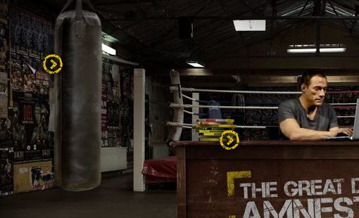
There’s also a level of fun engagement here. As you hover over the links, JCVD stops typing on his computer and snaps his neck to see what prompted his punching bag to move. If you leave him alone for a while, he starts nodding off or throwing knives at the wall.
So basically, despite breaking most of the rules that I usually outline in these critiques, I liked the site. It’s definitely not all great though, let’s take a look at what works and what could be better.
Design & Art Direction
One thing that this site gets right is overall design and aesthetics. Sites based on a realistic environment are always super cluttered and ugly. This one by contrast keeps things simple outside the scene, which is perfect for drawing your attention to the proper places.
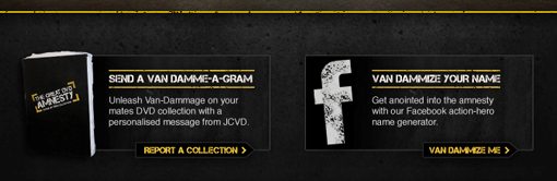
I also really like the general art direction. The black and yellow grunge textures work well and are quite attractive. The two clickable areas near the bottom look great and have both have a clear call to action.
The typography is nice and the design theme is consistent across the pages. Everything fits into the environment perfectly and adheres to strong layout principles.
Message Clarity
The part where I really feel this site fails is the clarity of the message on the home page. I simply don’t get it. The site makes almost no effort to explain itself and makes the all-to-common assumption that you understand what’s going on. I’ve been really railing on designers in recent critiques on this, and for good reason. If your visitors can’t tell what your site is for, they lose interest fast because they don’t know if the content is relevant to them.
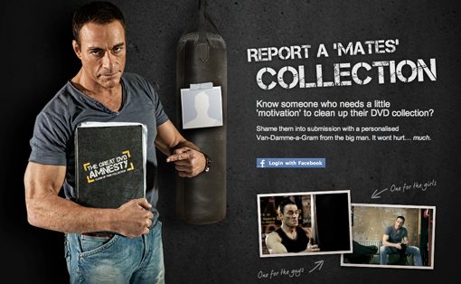
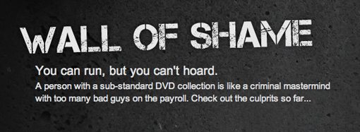
The phrase “The Great DVD Amnesty, Clean Up Your Collection” to me suggests something to do with piracy. Perhaps JCVD is encouraging me to not pirate movies? Other indicators such as the “wall of shame” and “report a collection” reinforce this idea. However, as I browse the site, I start to think maybe the site is just condemning poor movie choices. JCVD has a bunch of suggestions for movies that will make my collection better, interestingly enough this part is filled with girly feel-good movies that JCVD would likely never watch.
To further obfuscate just what the heck is going on, there’s a sign above JCVD with numbers and a vague message about how there is this many of something still left to claim.
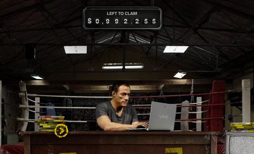
What are we claiming? After poking around the site for quite a bit, I confess that I still don’t know. The simple solution here is to add in another link that pops up a brief paragraph that tells the visitor what he/she is supposed to know. What is this site? Who is it for? How should I proceed? What is being claimed and how? These questions need answering!
Conclusion
There’s really not much more to say here. Overall, it’s a fairly simple site that I think, for the most part, is really well done as far as Flash-powered immersive experiences go. As I look around the site on other pages I continue with the same impression: the design looks great but the messaging in unclear. For instance, the “Report a Mate’s Collection” page still feels like something to do with piracy, especially when phrases like “shame them into submission” are used.
However, when we jump over to the wall of shame, it seems like the primary offense is merely a “substandard” DVD collection.
If this site’s goal is to make me buy DVDs, I’m not sure if it’s meeting it, simply because I’m distracted by having JCVD possibly accusing me of piracy (there’s even a piracy link in the footer). Likewise, if the site’s aim is to raise awareness of piracy, the cheesy movie ad placement feels a little awkward.
Bottom line, the site looks good but someone needs to make it clear why Jean Claude Van Damme is mad at me and how I can fix it!
Your Turn!
Now that you’ve read my comments, pitch in and help out by giving the designer some further advice. Let us know what you think is great about the design and what you think could be stronger. As always, we ask that you also be respectful of the site’s designer and offer clear constructive advice void of any harsh insults.