Web Design Critique #56: Ray Cheung
Every week we take a look at a new website and analyze the design. We’ll point out both the areas that are done well in addition to those that could use some work. Finally, we’ll finish by asking you to provide your own feedback.
Today’s site is the homepage of Ray Cheung, self-described simply as an Online Entrepreneur.
2 Million+ Digital Assets, With Unlimited Downloads
Get unlimited downloads of 2 million+ design resources, themes, templates, photos, graphics and more. Envato Elements starts at $16 per month, and is the best creative subscription we've ever seen.
If you’d like to submit your website to be featured in a future Design Critique, it just takes a few minutes. We charge $49 for critiquing your design – considerably less than you’d pay for a consultant to take a look at your site! You can find out more here.
About Ray Cheung
“Rather than making websites for clients, I love working on my own projects; Starting from an idea, designing from scratch with some inspiration along the way, coding, and then spreading it around the world gives me a great sense of accomplishment. Currently I am managing self-started websites with about two million visitors per month – all with the aim to share useful resources to people.”
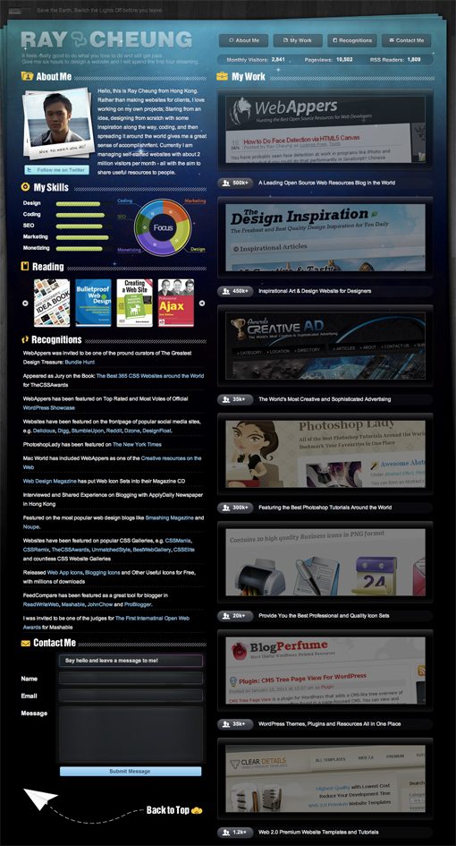
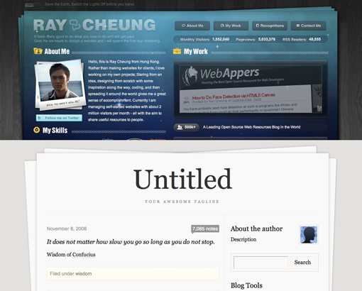
Here is a screenshot of the homepage:
Initial Impressions
Ray Cheung is a man who needs very little design instruction. He has not one but several very successful web ventures, all of which look great and his homepage is no exception.
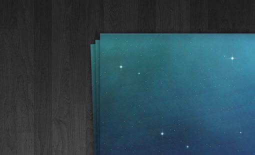
The overall theme is pretty interesting: a wooden background with a stack of papers to hold the content. However, instead of using a paper texture, Ray went with a star field background. It sounds crazy but the overall effect is quite nice! I love it when designers do something unexpected rather than just running with a trend.
The stacked page effect is reminiscent of a popular Tumblr theme, but the similarities really stop there as overall layout and design is fairly different.
At a glance I really like what Ray has done here. Let’s dive in and take a closer look at some of the sections.
Texture and Color
As I mentioned above, the space and wood textures are an unlikely combination, but both are very well designed and seem to work perfectly together. I like the dark color palette that results from the two:
Fonts
When you have a fairly bold visual theme, it can be overwhelming to combine it with some crazy typography. The general idea is that you don’t want too many objects competing for attention.
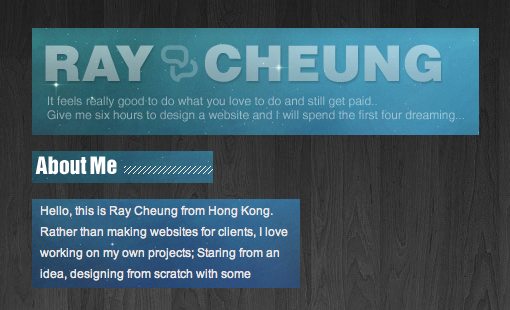
In light of this, Ray made a solid choice in being conservative with his fonts. All of the typography is comprised of easily readable sans-serif typefaces. The main site header is bold, followed by an ultra light variant (perhaps too light). These and the bold condensed section headers are images with the live body copy in Arial. It would be great to see some @font-face integration to bring some of this type live, but the images are pretty tiny so I don’t really think it’s a big deal (though whipping up a sprite or two wouldn’t hurt).
Navigation
Between these critiques and our design gallery, I’ve taken a close look at a ton of website designs over the years. It’s not often that I see a trick that I’ve never come across before. Ray’s navigation though genuinely surprised me. I don’t believe I’ve ever seen this particular effect.
The design of this section is simple and works beautifully with the overall page. I love the contrast of the slightly extruded buttons and the inset section under them.
When you click on one last two buttons, the page automatically scrolls to take you to that section, a pretty typical idea. However, the other two buttons link to two sections that are already at the top of the page so when you click these their respective sections actually shake back and forth in a smooth animation. It’s a pretty simple effect that makes the site seem more dynamic and almost alive and friendly.
Sections
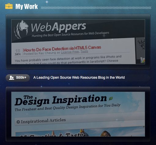
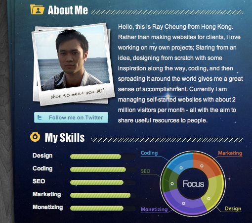
The page is broken up into two vertical columns. On the are the various projects that Ray has worked on and on the left are miscellaneous small sections of content: About Me, My Skills, Reading and Recognitions.
Each section is topped with a header and a little icon, another little feature that instantly makes me think of Tumblr.
These sections are clearly distinct and easy to hone in on individually. Each has a unique design but they tie in together well. One small thing that I would consider on the “My Skills” section is coloring the horizontal bars to match their respective portions of the circular graph. This would help the consistency of the two graphics and immediately communicate how they’re connected.
Intelligent Scrolling
Another thing that I really like about this site is how Ray thought through the scrolling functionality. The left column ends at the contact form and the right column is significantly longer. As you scroll down the page, the entire page scrolls uniformly as you would expect right up until you hit the contact form. At this point, the left column stops scrolling and the right column continues.
Touches like these just show how much time was spent thinking about how to make the site more user friendly.
Lights Off!
One of the few things I wasn’t quite sure about on the site was the switch near the top to turn the lights off. I expected that once I hit this switch, the theme would change somehow. Maybe the wood background would fade into black revealing more stars or something else equally interesting.
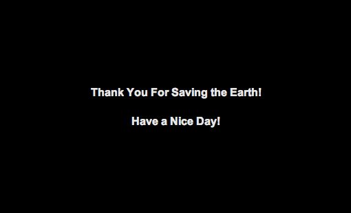
However, when you hit the switch, this is what you get:
I understand the message here: save energy by turning off the lights. However, the implementation is a bit awkward. This page gives you no way to go back to the site in the case that you were just pressing the button to see what it did, nor does it direct you anywhere else such as one of Ray’s other projects or some resources on saving energy. Another confusing element is the “Battery is running low” message in the site footer. This may be connected to the message in the header, but it’s pretty unclear.
I think the intentions are good here but the result is bringing down my perceived quality of the site and I think if these are going to be kept they need to be rethought.
Conclusion
In closing, I think Ray has created a great web page here to introduce you to himself. The page clearly states who he is and what he does and looks great doing it. The layout is logical and easy to follow, the design is unique and interesting and the content is, for the most part, relevant.
Your Turn!
Now that you’ve read my comments, pitch in and help out by giving the designer some further advice. Let us know what you think is great about the design and what you think could be stronger. As always, we ask that you also be respectful of the site’s designer and offer clear constructive advice void of any harsh insults.
