Web Design Critique #68: Oasis Christian Center
Every week we take a look at a new website and analyze the design. We’ll point out both the areas that are done well in addition to those that could use some work. Finally, we’ll finish by asking you to provide your own feedback.
Today’s site is Oasis Christian Center & Retreat. Let’s jump in and see what we think!
The Ultimate Designer Toolkit: 2 Million+ Assets
Envato Elements gives you unlimited access to 2 million+ pro design resources, themes, templates, photos, graphics and more. Everything you'll ever need in your design resource toolkit.


If you’d like to submit your website to be featured in a future Design Critique, it just takes a few minutes. We charge $49 for critiquing your design – considerably less than you’d pay for a consultant to take a look at your site! You can find out more here.
About Oasis Christian Center & Retreat
Here at Oasis we believe in “hassle-free” retreats. We go the extra mile to set ourselves apart by providing modern and comfortable lodging, delicious meals and most importantly a private place for your group to rest, relax and restore in God’s peaceful countryside.
Here is a screenshot of the homepage:
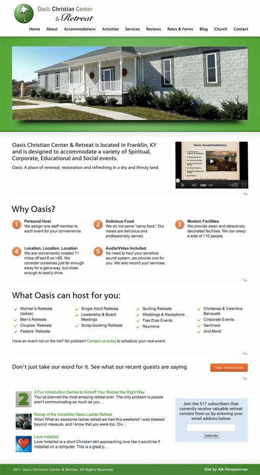
First Impressions
Oasis is definitely off to a decent start. The underlying template for the site is a little generic, but it’s clean and has information organized into clear and understandable sections.
Overall, the biggest problem with the design is that it seems rough around the edges. There’s an unrefined quality to it that suggests that the design and content were created separately instead of synergistically. There’s nothing wrong with using a template, you just have to make sure you invest the time and energy to really make it work with your content. Let’s take a look at how to do this better.
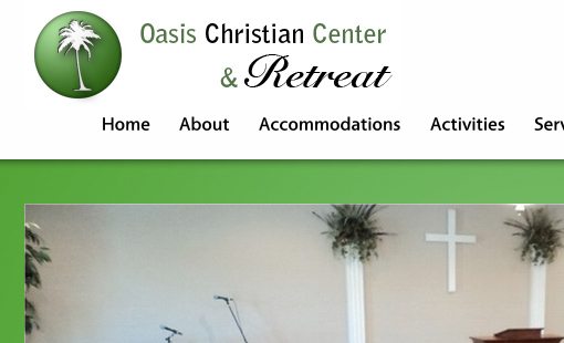
Logo

The very first thing I see on the site is the logo, and it doesn’t make a good impression. Logo design is a super difficult practice so I hate to be critical about it, but this simply doesn’t look like it was created by a professional designer. Both the imagery and the typography have a Microsoft Word clipart aesthetic to them.
The right alignment on the type is awkward, the script and relative sizing of the second line feel all wrong and the green sphere looks dated. Further, a palm tree is not the best representation of a Kentucky retreat facility. The logo should be honest, simple and strong.
I strongly recommend checking out some galleries like LogoPond to see some examples of really strong logos from professional designers. Find five or ten logos that really idealize an aesthetic that you’d like to go for and use them as inspiration for a unique creation for your business. I picture something simple but bold for your site, like this landscaping logo from user trickyninja.

Navigation
Another area that could use an update is the navigation. This is a little rough both from an aesthetic and functional point of view.
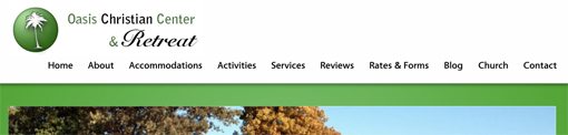
For the aesthetic side, the navigation is breaking the justified alignment that exists all throughout the rest of the page. This is mostly because of the odd way the logo encroaches upon the space that the navigation should be occupying on the left.
From a functional user experience point of view, there are a few issues as well. For starters, there isn’t a noticeable hover effect on the links. Slightly changing the color on hover would go a long. More importantly, the menu simply seems to have too many items. Some of the items are dropdown menus, but none of these contain more than a single option.
As a general rule, a dropdown menu shouldn’t exist if you’ve only got one item to throw into it. Here’s what I suggest doing: Try grouping some of the menu items under one header, this will both make the menu eat up less horizontal space and allow for dropdowns that are justifiable. For instance, Accommodations, Activities, Church and Services could all be grouped under one dropdown.
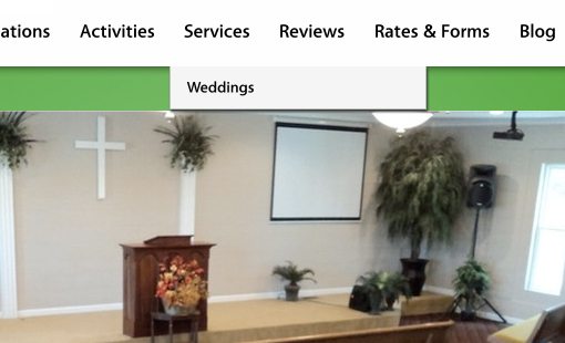
Slider
Continuing our journey down the page, the image slider needs a few simple tweaks. For instance, the slider should have a seamless feel where the photos bleed right off the edge, but I can’t help but notice a tiny white border. I’m not sure if this is intentional or accidental, but somehow it feels like a mistake. Even if it’s supposed to be there, I recommend ditching it.
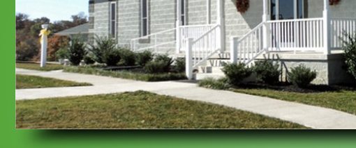
Also, the photos in the slideshow don’t seem to be of the highest resolution. They have the look of small photos that were stretched to fit this size. I recommend going back to the large original files straight out of the camera and resizing them to these dimensions.
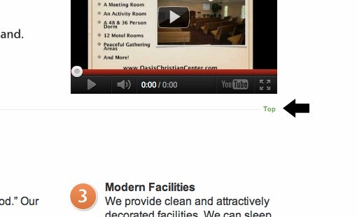
Main Content Area
I like the clean look of the content area with its generous use of whitespace, overall I think this area is fairly complete. Some changes I would recommend include ditching Cufon (the font is generic looking and won’t suffer from switching to something more user friendly) and considering changing the numbered icons to something a little friendlier and more indicative of the copy.
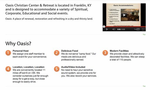
Also, it’s a pretty insignificant complaint but I find the “top” links to be annoyingly distracting. In general I don’t have a problem with links that take you to the top of a page but this is a really small page and it contains four of them! I like the dotted lines, but I’d ditch the useless links.
Headlines
My last piece of advice is to take a quick look at some of the copy on the page and consider how to make it more concise and browse-friendly. The simple solution here is to create some good strong headlines. Right now there are a few areas with big chunks of text, which is fine, but these would work better as body copy under a good headline:
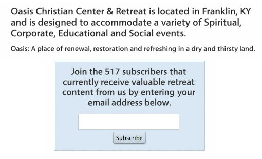
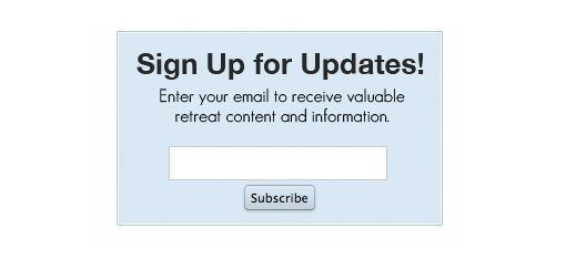
Here’s a quick and dirty example of the newsletter box reworked to have a headline:
Your Turn!
Now that you’ve read my comments, pitch in and help out by giving the designer some further advice. Let us know what you think is great about the design and what you think could be stronger. As always, we ask that you also be respectful of the site’s designer and offer clear constructive advice void of any harsh insults.