Web Design Critique #74: Pergola Farmhouses
Every week we take a look at a new website and analyze the design. We’ll point out both the areas that are done well in addition to those that could use some work. Finally, we’ll finish by asking you to provide your own feedback.
Today’s site is Pergola Farmhouses. Let’s jump in and see what we think!
The Ultimate Designer Toolkit: 2 Million+ Assets
Envato Elements gives you unlimited access to 2 million+ pro design resources, themes, templates, photos, graphics and more. Everything you'll ever need in your design resource toolkit.


If you’d like to submit your website to be featured in a future Design Critique, it just takes a few minutes. We charge $49 for critiquing your design – considerably less than you’d pay for a consultant to take a look at your site! You can find out more here.
About Pergola Farmhouses
Pergola Farmhouses was founded in 1997 when Julian started renovating old farmhouses into holiday villas. His wife, Doris, became the one responsible for bookings and the general running of the farmhouses, while Julian focused on renovating new houses of character. With over fifteen years of experience in farmhouse and villa rental gained with different people from many origins, Julian and Doris are always here to help and to make your holiday as comfortable and memorable as ever.
Here is a screenshot of the homepage:
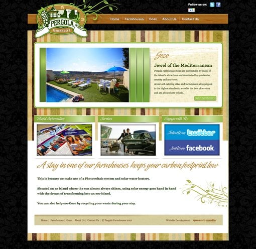
First Impression
The Pergola Farmhouses site has a solid, functional base that I think will serve them well. However, from an aesthetic standpoint I think it could use an update. We’ll talk about how the overuse of a few outdated trends has led to a site that feels dated.
Following Dated Trends
One of the most difficult topics to comment on regarding a given site is the nature of using timely trends in a design. Sometimes you know immediately when you look at a site that it seems a little dated, but it’s hard to pinpoint why. This is especially true when, like this site, the design intentionally has a vintage aesthetic.
Further, to a non-designer, this may seem petty. However, it’s a lot like wearing clothes that have long gone out of style, like it or not, people will judge you for it. Plus, as a visitor if I feel that the graphics are out of date I start to wonder if the information is as well.
As I just mentioned, this site is intentionally aged in its aesthetic, but you have to consider that over time even vintage and retro design styles evolve. The troublesome areas that are easiest to spot are those that don’t really fit with the aged theme to begin with. For instance, the use of Photoshop style bevel and emboss effects:
This style has simply come and gone and tends to look cheesy these days. You can’t justify it with the retro argument either, given that this particular style suggests an origin from the early 2000s while the rest of the site suggests a much older time period.
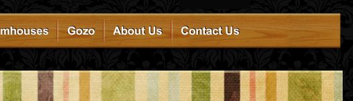
Another thing that’s not quite working for me is the extremely heavy use of texture. The background wallpaper print, busy stripes, repeating patter next to the slideshow and the wood in the navigation all come together in a decidedly busy and overwhelming sort of way (especially the stripes). Texture trends today tend to gravitate more towards subtlety.

The Logo
One element that I think successfully pulls off the vintage motif is the logo. It’s a gorgeous piece of illustration work nicely situated into an oval seal. It’s very reminiscent of the Letterheads style, which, though dated, can still be super attractive when approached with tact. I think the added vines in the back might be unnecessary but otherwise this is a great piece of design.

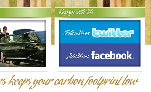
Social Links
While we’re looking at the top of the site, there’s one quick thing worth mentioning. The layout of the social logos is quite odd:

There’s simply no reason for the Google+ logo to be on its own line. This is awkward and distracting and makes it feel like an afterthought. I’d bet that it was a recent addition (given that it’s a fairly new site) and someone just didn’t invest the necessary time to make this logo really flow with the rest of the layout.
The SlideDeck
The slideshow used on the Pergola homepage is the popular SlideDeck jQuery plugin, of which I am a big fan. SlideDeck makes it super easy to build an attractive and interactive way to feature lots of content in a small space.

Though I like the concept of SlideDecks, I’m not crazy about the implementation here. The gradients here and elsewhere are another one of those touches that seem like a Photoshopped look that isn’t very popular anymore. Further, it’s odd seeing the vertical bars empty. These are meant to hold text content relating to the slide. Empty, they feel like they’re just eating up space for no reason. Plus, you’re missing out on an opportunity to provide simple bits of information about each slide: Beautiful sea-side views, Full service staff, etc.
Typography
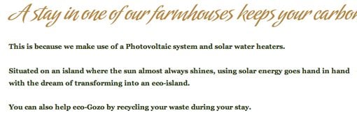
The last area that I’d like to discuss is the typography on the page. I’m a stickler for good type and maximum readability and I can’t help but think that the designer has gone overboard here with the cursive headlines:
The typeface by itself is a pretty interesting script so I can see why it was chosen, but the trick to implementing scripts with any degree of success is to use them sparingly. For instance, this typeface looks good for the single word “Gozo” headline near the top of the page, but the rest of the time it’s simply too ornate and makes for an unnecessarily difficult reading experience.
Further, the paragraphs near the bottom of the page have some pretty awkward whitespace distribution. It looks like there was a huge gap and a little content and the two didn’t quite come together well. I’d recommend cutting out some of the unnecessary line breaks.
Conclusion
Looking around the site, I think there’s a good measure of functionality here. As a potential visitor, I don’t really have any trouble navigating around and finding the information that I need. This is a huge plus that shouldn’t be overlooked. Most visitors will care about this above all else.
That being said, from a design perspective, things could be better. The site feels a bit like an old house that could use some updating. You want the old style aesthetic to remain in place, but some of the fixtures should be replaced to bring it up to par with modern standards.
Your Turn!
Now that you’ve read my comments, pitch in and help out by giving the designer some further advice. Let us know what you think is great about the design and what you think could be stronger. As always, we ask that you also be respectful of the site’s designer and offer clear constructive advice void of any harsh insults.