Web Design Critique #75: Income Diary
Every week we take a look at a new website and analyze the design. We’ll point out both the areas that are done well in addition to those that could use some work. Finally, we’ll finish by asking you to provide your own feedback.
Today’s site is Income Diary, a blog that offers simple, practical advice for how to earn money online. Let’s jump in and see what we think!
2 Million+ Digital Assets, With Unlimited Downloads
Get unlimited downloads of 2 million+ design resources, themes, templates, photos, graphics and more. Envato Elements starts at $16 per month, and is the best creative subscription we've ever seen.


If you’d like to submit your website to be featured in a future Design Critique, it just takes a few minutes. We charge $49 for critiquing your design – considerably less than you’d pay for a consultant to take a look at your site! You can find out more here.
About Income Diary
“I launched IncomeDiary back in 2009 after a conference I attended in Washington DC in March that year. Before this, I had been running websites successfully for around 4 years and one of the major things I took away from meeting like minded entrepreneurs was, you got to give back! This is what this website is all about, educating and helping internet entrepreneurs, no matter what level they are.”
Here is a screenshot of the homepage:
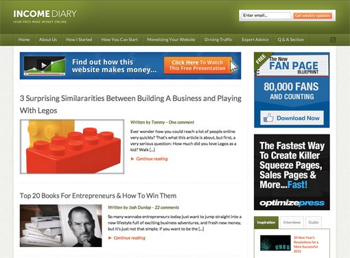
First Impression
Income diary isn’t breaking any barriers in blog design. It’s a very straightforward design that utilizes a layout seen on a million other blogs around the web. Is this a negative thing? Not in the least. In the same way that newspapers eventually all fell into a similar and predictable format, it’s perfectly natural that blogs would land on a few standard layouts that work well.
The benefit is that new visitors are immediately comfortable with the format and know how to get around from the second the site loads. Innovative layouts are great too, but there’s a common misconception in design that something that isn’t innovative isn’t good, and that’s simply not a true statement.
That being said, there are a lot of solid design choices made on this site. Aesthetically, it doesn’t blow me away, but it is fairly attractive and functionally solid. The primary question that I always ask for any design critique is, “Does the design accomplish its purpose?” In this case, think the answer is yes if the purpose is to successfully educate people on how to make money online. Let’s explore why this is true.
Color Scheme
If you’re familiar with our design critiques, you should already know what I’m going to say about this color scheme. It uses the simple color scheme trick that you almost can’t go wrong with:

First, the designer chose a main color, in this case green. Green is a solid choice, not because of anything aesthetic but because of the psychological correlation that we inevitably make: green = money. This site is about making money so there’s no color more appropriate!
Next up, a few different shades of this color were chosen. This provides a decent way to have subtle variation throughout the design: gradients, different header bars, etc. Finally, one color was chosen that complements but stands out from the main color. This technique provides an incredibly safe route to choose a color scheme that is neither monotonous nor overly busy.
Logo

Like everything else, the logo takes a very safe and predictable route. This is something important that is worth discussing. Is this a boring, generic logo? Yep. Is it better than a non-designer attempting to create a complex logo? Absolutely. The bottom line is that not everyone who creates a website is a professional designer. If this is the case with you, don’t feel bad about typing out your website name in a simple manner and calling it a day. One day when you have the budget (though arguably this site should right?), you can hire a professional to create a unique identity for you.
One thing that I think this site needs to rework is the tagline on the logo. It’s simply too thin and tiny and doesn’t read well. A simple solution might just be to increase the size of this line so that it has the same horizontal width as the line above it.
Navigation
The navigation area is a classic CSS nav format with big blocks defining each link. One thing that I’m constantly criticizing designers for in these critiques is link hover effects that are so subtle that you can barely tell that one exists, especially if you happen to be a color blind user. Fortunately, that’s not the case here.
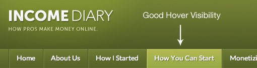
As you can see, the difference between the hover and non-hover states is quite dramatic and can clearly be seen by all users. This may seem small, but small mistakes can ruin a design so it’s important to get this stuff right.
Information Hierarchy
Creating a solid informational hierarchy cuts to the very core of what your goals are in a web design. If you write down all the things that you want to accomplish with a web design, this should always be near the top of the list.
One of the most solid aspects of this design is how all of the information on the page is structured. For instance, notice that the most recent post in the home feed is given more visual importance than the other posts in the form of a larger preview image.
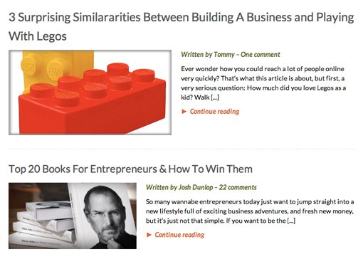
We use this same trick on the Design Shack homepage to an even greater degree. It’s a bit subtle on Income diary and I would even suggest that the designer find an additional way to make it stand out even more (different background color, larger headline, etc.).
There’s yet another level of differentiation as well. As you scroll down the post list, there’s a section with a few products that you can purchase. This is where that other color comes in that we discussed before:
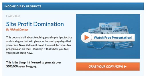
This content is thrown into a nice minimal box with solid text and image layout and plenty of whitespace. It’s a great way to set this content apart from the main feed.
Now, though I like the design of this little box area, I’m a perfectionist so there’s one thing that drives me crazy:
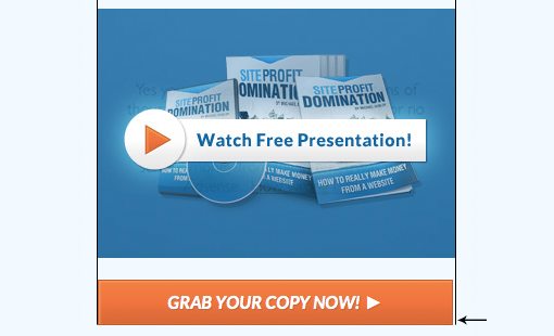
The button below the product preview is almost the same width as the image above it, but not quite. It’s literally a manner of a few pixels but I can’t help but be distracted by it. Either make it the same width or make it much narrower, anything else looks like a mistake.
Footer
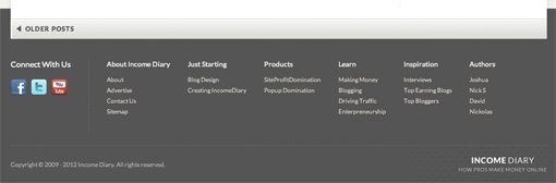
We’ll end this critique off with a quick look at the footer, simply because I like the way it looks. I love how the content breaks the footer line, the transition from gray to white when you hover over a link, the clean, minimal presentation of the social icons, and the oh so subtle hint of texture behind the logo. In my opinion, this is the best looking part of the site. A strange conclusion to be sure, but I’m just a big fan anyone that doesn’t slack off and toss on an ugly footer as the last step of a design.
Your Turn!
Now that you’ve read my comments, pitch in and help out by giving the designer some further advice. Let us know what you think is great about the design and what you think could be stronger. As always, we ask that you also be respectful of the site’s designer and offer clear constructive advice void of any harsh insults.