Web Design Critique #86: WPMU
Every week we take a look at a new website and analyze the design. We’ll point out both the areas that are done well in addition to those that could use some work. Finally, we’ll finish by asking you to provide your own feedback.
Today’s site is WPMU.org, a site for WordPress enthusiasts. Let’s jump in and see what we think!
2 Million+ Digital Assets, With Unlimited Downloads
Get unlimited downloads of 2 million+ design resources, themes, templates, photos, graphics and more. Envato Elements starts at $16 per month, and is the best creative subscription we've ever seen.


If you’d like to submit your website to be featured in a future Design Critique, it just takes a few minutes. We charge $49 for critiquing your design – considerably less than you’d pay for a consultant to take a look at your site! You can find out more here.
About WPMU
“WPMU.org is the number one source on the web for WordPress news, tips, plugins, and theme reviews. We feature several new posts each day by the team at Incsub, the same group behind the oldest (and second largest) WordPress Multisite on the web, Edublogs.org, and the largest premium plugin and theme community, WPMU DEV.”
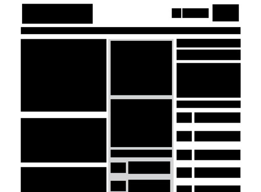
Here is a screenshot of the homepage:
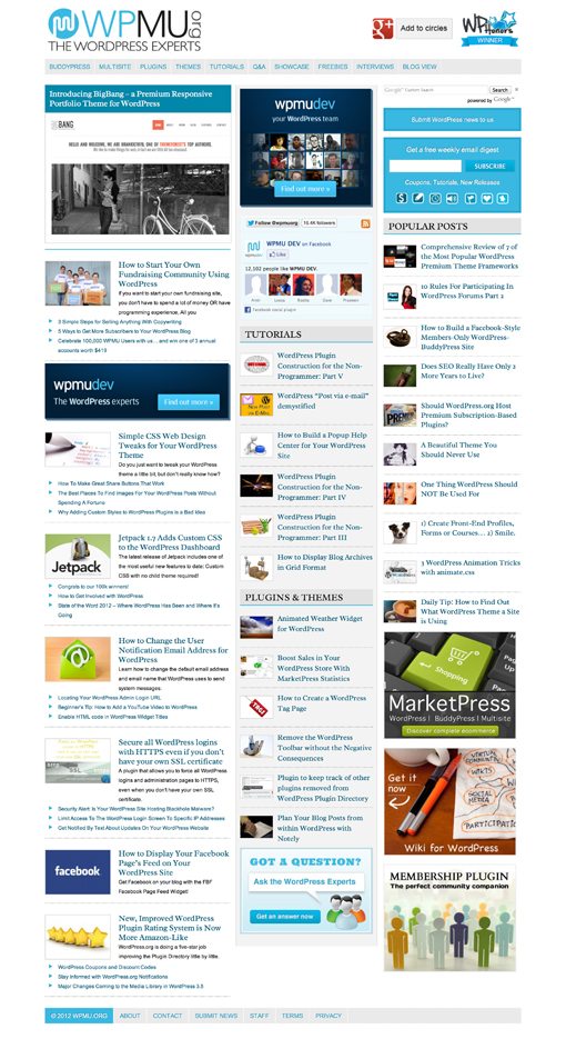
First Impression
WPMU seems to be a great resource of information for WordPress developers. There’s a ton of content here on the homepage, which is both an asset and a liability from a designer’s perspective. The site looks very clean and well designed, and yet even within the highly organized structure they seem to be fighting clutter.
The site is in fact responsive, and this early in the game I’m still giving props to anyone who’s at least attempting to make this jump. Few, if anyone, have pulled off a complex responsive design with absolute perfection, and this page is no exception to that rule. Still, I think the issues here shouldn’t be too difficult to resolve.
Overall, the designers have produced something great here. Let’s dive in closer and see where we can suggest some changes.
The Logo
The very first thing that I see on the site is the logo. It’s a relatively large object in the top left corner so your eyes naturally gravitate towards it.

Unfortunately, I find it to be a little rough around the edges. The concept isn’t necessarily bad, but from a designer’s perspective, the size relationships are all off. The current logo is a big chunk of text, all of which is fairly large. The problem with this is that, rather than harmoniously playing on each other, each piece of text feels more like its competing for attention.
Contrast is one of your most powerful tools as a designer and you’ll find that it helps beef up any design that feels a little lacking. With the idea of contrast in mind, I made the icon larger and the tagline much smaller so it’s not competing with “WPMU.” I then dropped off the terribly awkward rotated “org” altogether because I think it’s entirely unnecessary.

Now we have a simple two color logo with one large piece of text, one small piece of text and a big, eye-catching icon off to the left. It is now much more balanced and feels less cluttered.
Other Logos
If we jump over to the other side of the header, we find two other logos, this time from third parties.

In my opinion, these are a little too large. Again we run into this idea of visual competition. As a designer, you have to make tough decisions about what’s most important. If you try to make everything large and in charge you trash the hierarchy of information.
Further, the alignment of these two logos is a tad bit off. The irregular shape of the WPHonors logo makes it feel like the Google+ logo is too high, even if it’s close or even dead on centered. Sometimes “visually” centering two objects can lead to a more harmonious layout than actually centering them.
Ultimately, this area needs a five minute fix. Take the logo sizes down slightly, not dramatically, and bump the Google+ logo down a few pixels.
Desktop Layout
We’ll get to the responsiveness of the layout a little later, for now let’s just focus on the layout of the site as seen on a desktop or laptop (the large version). Basically, we’re looking at a three column layout.
On the left, you have what appears to be recent articles, the center is primarily occupied by a list of tutorials and the left holds a list of popular posts. Conceptually, this sounds about right, but the execution is actually not so great. Consider the following screenshot:
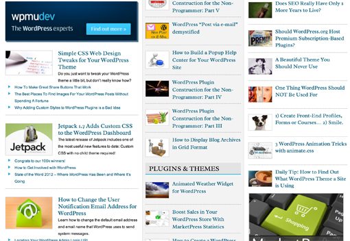
The problem that I’m having with this site is that, as I scroll down the page, I become completely overwhelmed. There’s just so much content here and it’s all very similarly formatted and sized so that it sort of blends into one big mess.
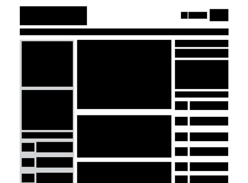
In situations like these, where layout is becoming cluttered and messy, I like to strip away all of the distractions and focus purely on the size and spacial relationships of the objects on the page. To do this, I strip the content back to a wireframe like so:
Rethinking the Columns
Now we can really get a feel for what’s going on with this page. One thing that I notice right away when I look at the page like this is that same old problem we keep running into with the relative sizing of objects being far too similar.
Here I think this problem is playing out in the column width. Though the leftmost column is the widest, it isn’t so by much. There’s no clear “featured” column as I scroll down this page. I don’t have a good sense of what the main content is, instead, everything is screaming at me at the same volume.
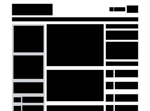
To rework this, let’s try moving the leftmost column to the center and adjusting its width relative to the others (widen the center column, narrow the others). While we’re in there, let’s fix some alignment issues and reduce the size of those header logos. That brings us to the following layout.
As you can see, we’ve now established a much clearer focal point as your scroll down the page: the center column. The other content is secondary, there if you want it, not too distracting if you don’t.
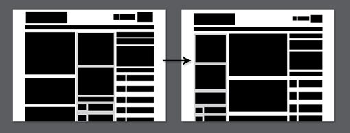
Airing Out the Layout
Now, despite the fact that we’ve helped the situation by introducing a clearer hierarchy of information, we’re still heavily struggling with clutter. I simply think that there’s too much on the page at any given time. We don’t have to remove a ton of content, but we can make the page a lot better with a few reductions and some more size tweaks.
Now go back and compare this with the wireframe that we started with. The difference may seem subtle, but trust me, if you implemented these changes on the layout the impact would be huge. The content footprint would be much more impactful and spacious with a clearer path for the users to follow as they scroll down the page.
Responsive Layout
On the whole, the layout responds fairly well as the viewport narrows. The popular posts column drops down to the bottom and the main area is occupied by the other two columns. The spacial relationship here seems perfect, much better than what we were seeing before.
Unfortunately, during all of this, the header is full of problems. Most notable is how poorly the navigation responds to a reduction in width. At one point, it features an awkward break into two lines.

This is slightly annoying from an aesthetic standpoint, but once you go even narrower things really fall apart. The header becomes a huge, empty gap with an ugly, unstyled list of links floated to the left.

Once you view the site in a narrow window, then expand back to full size, the header doesn’t return to its original layout but instead gets all weird with extra whitespace. I know that this is a fringe use case (only nerd developers change the size to watch the results), but it’s still indicative of a problem with the layout.

It Ain’t Easy Bein’ Responsive
Bottom line: responsive layout is a tricky, fickle beast. Hats off to the developers here for giving it a shot at all. That being said, there are obviously some issues that need to be addressed.
The navigation is the main area that’s having troubles, it might be helpful to take a look at our walkthrough of building a responsive navigation menu.
Summary
WPMU is a good looking site. Though a bit generic, it does represent a strong attempt to organize and present a ton of interesting content. Most designers would struggle with this task and I think these guys have done a bang up job.
That being said, the areas above are those that I think genuinely require addressing. My advice constitutes a complete rethinking of the layout, but as long as you’ve built the site on a strong, flexible grid then reflowing this content shouldn’t be equivalent to starting over. If you’re not using a strong and customizable underlying grid system, I suggest you start!
Your Turn!
Now that you’ve read my comments, pitch in and help out by giving the designer some further advice. Let us know what you think is great about the design and what you think could be stronger. As always, we ask that you also be respectful of the site’s designer and offer clear constructive advice void of any harsh insults.