Web Design Critique #89: Discoveries Magazine
Every week we take a look at a new website and analyze the design. We’ll point out both the areas that are done well in addition to those that could use some work. Finally, we’ll finish by asking you to provide your own feedback.
Today’s site is Discoveries Magazine, a medical research publication. Let’s jump in and see what we think!
2 Million+ Digital Assets, With Unlimited Downloads
Get unlimited downloads of 2 million+ design resources, themes, templates, photos, graphics and more. Envato Elements starts at $16 per month, and is the best creative subscription we've ever seen.
If you’d like to submit your website to be featured in a future Design Critique, it just takes a few minutes. We charge $49 for critiquing your design – considerably less than you’d pay for a consultant to take a look at your site! You can find out more here.
About Discoveries
“Discoveries Magazine is Cedars-Sinai’s flagship publication about medical research and its impact on patient care. Published twice a year, Discoveries showcases the excitement of scientific discovery and the men and women who benefit from it.”
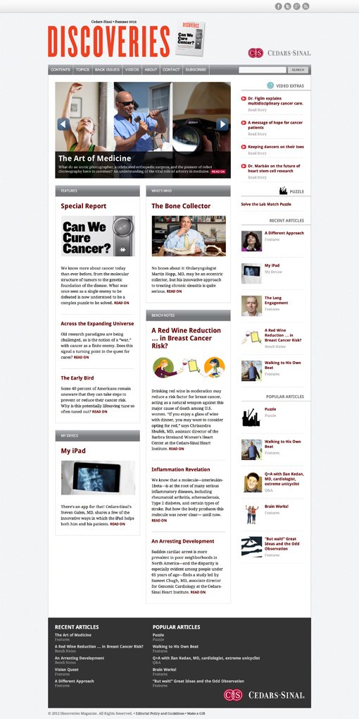
Here is a screenshot of the homepage:
Now that we’re familiar with the site, let’s dive in and discuss the merits of the design.
The Good
There’s a lot that I like about this design, so let’s start by discussing all of the things that went right in the design. What are its strong points? What can we learn from it as designers?
Clean Design
The first thing that I notice about Discoveries is that the design is extremely clean. The colors of the site’s background and structure are muted and understated, which allows the content to really shine. I’m not distracted in any way, my eyes shoot straight to the content. This is an impressive feat that lots of designers struggle with when working on a content heavy site like a magazine.
Layout Awesomeness
A big part of the “clean” character of this site is the layout. It has plenty of whitespace, and the content is nicely organized in a clearly hierarchical fashion. Instead of everything competing for my attention, there’s a clear path of communication. It’s a beautiful thing.
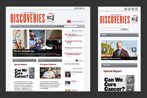
The best part: it’s responsive. The site effortlessly adapts as the viewport changes. We start with a static grid at full desktop size, which hits a breakpoint, drops the far right column, then switches to a two column fluid grid. One more breakpoint is used to bring that down to a single column fluid grid. So simple, so effective. I love it.
Custom Illustrations
I think my favorite thing about this site is the (seemingly) custom illustrations that are scattered throughout the articles. Stock photos are one thing, but illustrations like this have a way of giving your site a personality and a brand. It’s one of the reasons I’ve always loved A List Apart so much.

To a visual guy like me, illustrations like this bump your publication up in standing. You must have a decent budget if you’re commissioning custom artwork, this stuff can be really expensive!

These illustrations all seem to be quirky and unique. I’m not sure if they’re from the same artist or not but they all have a very similar feel. Keep them coming.
Highlighting Important Content
I hit on hierarchy in a previous section, but it’s crucial to point out how effective it is to highlight important content. This site’s designers do that in the same simple but effective style that they’ve used for everything else.
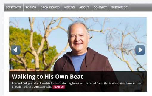
I’m a huge fan of image sliders and this one is exactly what an otherwise very basic page needs to grab the user’s attention and add in a little engagement.
The Bad
As you can see, I really like the look of this site. There’s a lot that the designers got right. However, this is a critique is it not? Let’s jump into the areas that could use a little improvement.
Generic Design
There’s a fine line between bold minimalism and generic design, and it’s really tricky to fall on the former side of that equation. For all the praise that I’ve given for the layout and “clean” look of the site, I can’t shake the feeling that it all looks a little boring and generic.
There’s something about it that just screams, “I grabbed the most popular template from a WordPress gallery.” There are some sections that fight this feeling, such as the header:

This looks great. The font is unique and has character (like the illustrations) and you’ve got a nice splash of color. But this is where it stops. Repetition is the key to good design, but I don’t see this style repeated anywhere. Use that color to grab my attention in other places around the page and toss in some headlines with a tall, condensed font.
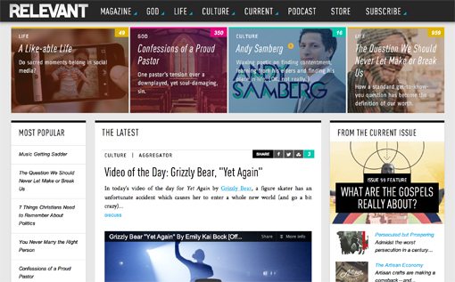
The best way to get a feel for how to battle generic design is to look around at similar sites that have successfully pulled off a strong personality and brand. One such site is Relevant Magazine, a publication with designers that I’ve admired for years.
As with Discoveries, Relevant features a clean design with great hierarchy and plenty of whitespace. But unlike Discoveries, the site is overflowing with repetition and little design touches that fight off any ideas that the site is based on a template.
Pagination
Looking around on the site, I came across an issue that’s hotly debated in online publications: pagination. Every site owner loves page views. We want as many as we can get.
One day, someone realized that they could boost their page views dramatically with a simple technique: just spread your content out over several pages! That’s what seems to be happening on this site:
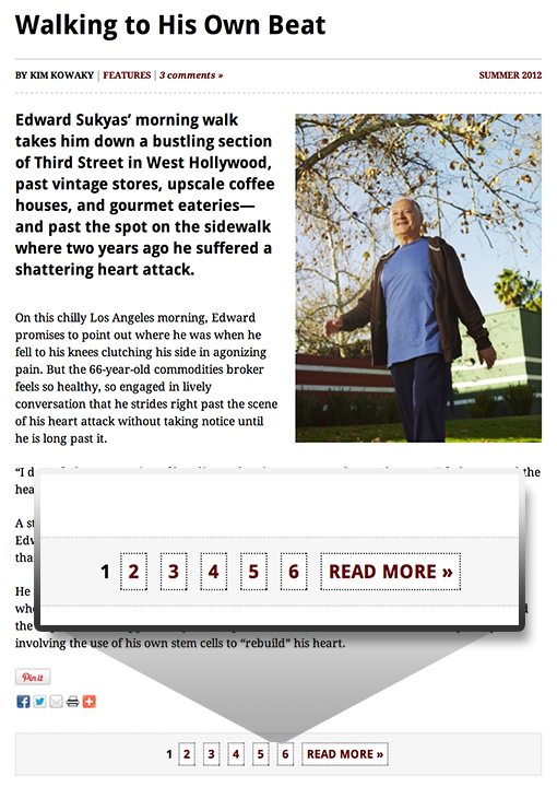
As you can see, this article is divided up into a whopping six pages (most were actually nine or ten!). Each page isn’t super long and contains only about six paragraphs. This makes for tons of page reloading as you’re reading through content on the site. I can perhaps see someone making an argument that splitting up the content like this is somehow good for the user, but I really don’t think that applies here.
If you’re really dead set on this pagination tactic, at the very least, toss in a button that makes it possible to see the content all on one page. This gives the users the power to decide what’s best for them.
Closing Thoughts
Ultimately, I think Discoveries Magazine has an awesome start to work with. They have solid content (I got sucked in a few times while writing this critique), and their organization for that content is awesome.
The two main areas that they need to focus on is fighting the generic template feeling in the design with a stronger branded presence and improving how content is presented in specific posts.
Your Turn!
Now that you’ve read my comments, pitch in and help out by giving the designer some further advice. Let us know what you think is great about the design and what you think could be stronger. As always, we ask that you also be respectful of the site’s designer and offer clear constructive advice void of any harsh insults.
