Web Design Critique #91: Photofolio
Every week we take a look at a new website and analyze the design. We’ll point out both the areas that are done well in addition to those that could use some work. Finally, we’ll finish by asking you to provide your own feedback.
Today’s site is Photofolio, a Drupal theme by More Than (just) Themes. Let’s jump in and see what we think!
2 Million+ Digital Assets, With Unlimited Downloads
Get unlimited downloads of 2 million+ design resources, themes, templates, photos, graphics and more. Envato Elements starts at $16 per month, and is the best creative subscription we've ever seen.


If you’d like to submit your website to be featured in a future Design Critique, it just takes a few minutes. We charge $49 for critiquing your design – considerably less than you’d pay for a consultant to take a look at your site! You can find out more here.
About Photofolio
Photofolio is a responsive, customizable Drupal theme with a ton of great features: multiple font schemes, superfish menus, slideshows and a lot more.
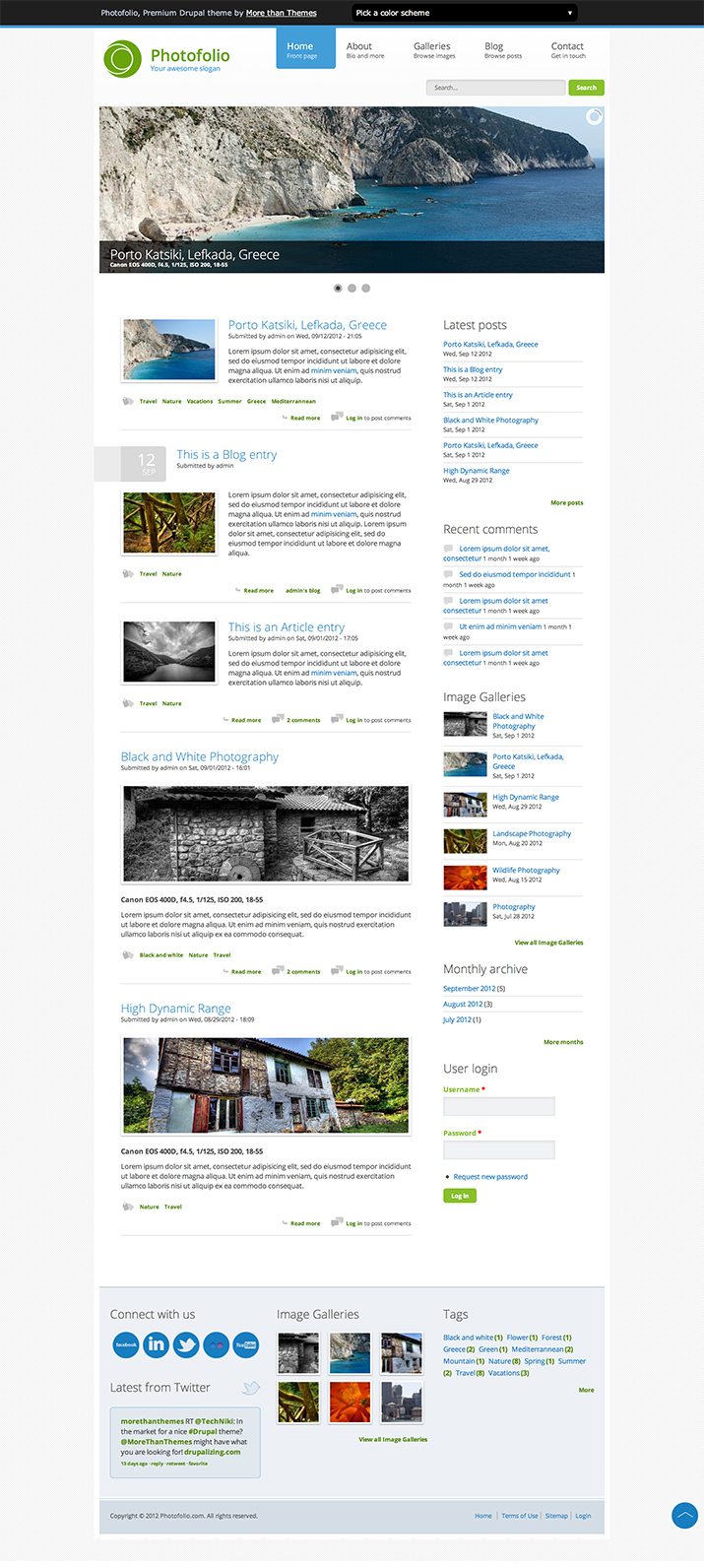
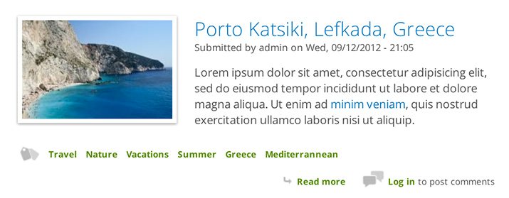
Here is a screenshot of the homepage:
First Impression
My initial reaction here is quite positive. Photofolio is an attractive theme that gets a lot right, both visually and functionally. It admittedly feels a tad bit on the generic side from a design perspective, but given that it’s a template, that might not be such a bad thing. Let’s take a look around and see what we can discover.
Layout
Layout is one area where Photofolio really knocks it out of the park. The layout is clean and simple. There are a ton of content slots so you can fill the pages with as much as you need, but it’s all perfectly organized in a logical and straightforward manner.
As I mentioned above, this theme is fully responsive and looks great at just about any viewport size I can throw at it. This is great because it lets me know that they’re designing for all possible viewport sizes, not just a few popular devices.
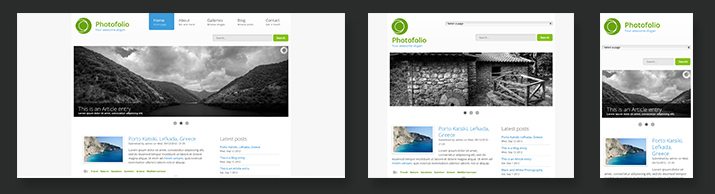
The site has a static width in the two largest media queries, then once you start getting down towards a mobile layout, things go fluid. This works really well for the content.
Alignment
One thing that I find a little distracting is that the alignment feels a little bit messy in the header. At a glance, you might not even notice it, but if you really take a close look you can see that the various elements could placed a bit better relative to their surroundings.
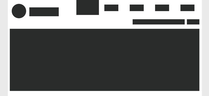
Above you can see the basic wireframe of the header elements. It’s a subtle change but I would suggest tweaking this until you have something closer to the following:
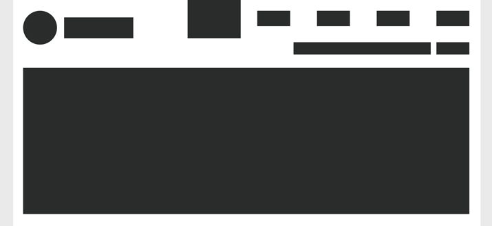
Here I’ve just infused a little more consistency with both the vertical and horizontal alignments in addition to adding a little more breathing room around the content frame.
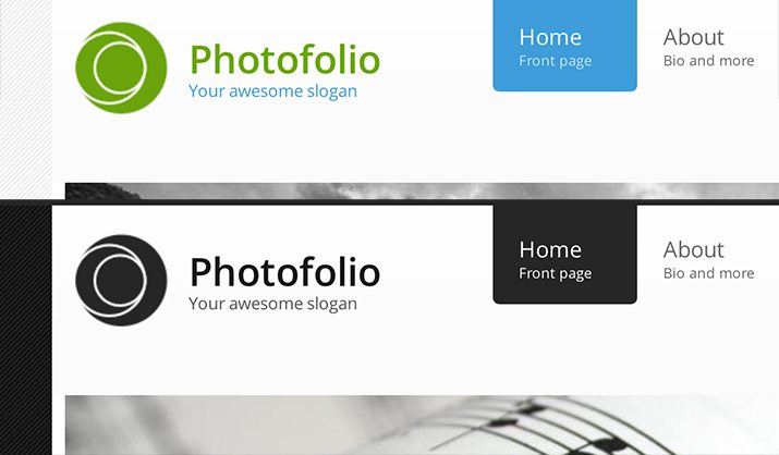
Color Schemes
Another really great thing about this theme is the customization options. For instance, there are a whopping seven different color schemes to choose from.
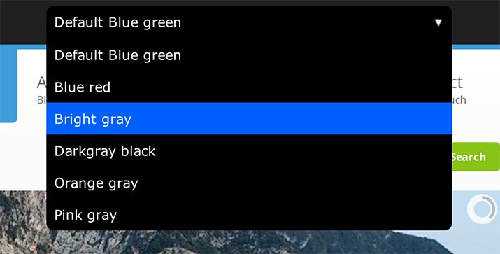
All of the color schemes are quite sharp looking and well implemented. I really appreciate how drastically different color schemes change the personality of the site. Whether you’re looking for a fun or formal look, this theme can work for you.
Type
By default, the type for Photofolio is a casual, thin typeface that feels perfect for the light aesthetic. The line-height and words per line feels about right throughout the theme as well. This sounds small but it’s actually a very big deal, you never want to buy a theme with sloppy type!
Open Sans is the primary font used here. This is of course a Google Web Font, and the Drupal is awesome enough to give you access to other great Google Web fonts in case you want to swap anything out (the theme has a few different prebuilt sets to choose from). Combine this with the color scheme options above and you’ll find that you can really tweak this theme to suit your personal style.
Browser Compatibility
Photofolio is billed as fully cross-browser compatible, and indeed it worked well in every browser that I tried. However, there does seem to be an interesting Safari quirk. When I hover over anything with a transition, there’s a weird flashing bug.
I recorded a screencast of this effect. You can watch it here.
Is the Design Successful?
We’ve already established that the design is both attractive and highly functional, but these aspects alone don’t necessarily make for a successful design. The success of a design is always based on the goals that it seeks to achieve. Whether you’re creating a Drupal Theme or a social network, you must establish a set of goals and keep them in mind.
Photographer Appeal
So what goals does Photofolio have? I would assume one major goal would be to appeal to photographers. As a photographer myself, I definitely see a lot here tailored to my needs. Photo slideshows and multiple gallery layouts to choose from along with a solid blog means that I can pretty much run my entire site from here. I can effectively show off my work and post about individual events.
More Than Photos
I think another major goal for the design would be to not tie it too exclusively to photographers. The features and design are such that this site could easily be used for a number of creative niches such as web design. The gallery examples are currently full of photos, but it would be easy enough to fill them with website screenshots instead.
Versatility
Templates are an interesting beast. Normally, design is all about decisions. You have to choose between those two fonts that you like and whether you want to be casual or professional. Your job is to target the design very specifically to one purpose, which depends of course on the client.
With templates though, the opposite is true. The idea here is to build one thing that can be used in many different ways by many different people. Instead of making hard choices, you spend your time piling on more options. The goal here is versatility. People want to know that if they purchase your product, it’s going to suit their needs, even if those needs change down the road.
In this area, Photofolio is quite successful. The responsive nature of the site means that, no matter where your audience tends to access the web from, they’ll get a stellar experience. This is of course in addition to multiple layouts for several of the pages, color choices, font schemes, and even some manual layout reordering options.
Your Turn!
Now that you’ve read my comments, pitch in and help out by giving the designer some further advice. Let us know what you think is great about the design and what you think could be stronger. As always, we ask that you also be respectful of the site’s designer and offer clear constructive advice void of any harsh insults.