Web Design Critique #92: Oomph
Every week we take a look at a new website and analyze the design. We’ll point out both the areas that are done well in addition to those that could use some work. Finally, we’ll finish by asking you to provide your own feedback.
Today’s site is Oomph. Let’s jump in and see what we think!
2 Million+ Digital Assets, With Unlimited Downloads
Get unlimited downloads of 2 million+ design resources, themes, templates, photos, graphics and more. Envato Elements starts at $16 per month, and is the best creative subscription we've ever seen.


If you’d like to submit your website to be featured in a future Design Critique, it just takes a few minutes. We charge $49 for critiquing your design – considerably less than you’d pay for a consultant to take a look at your site! You can find out more here.
About Oomph!
“Oomph is the go-to place for plastic cards with aplomb. Working with some of the world’s most popular brands, our little plastic gems have reached more than 20 million people – not bad going in five years. Whatever card you’re looking for, we can help. And if you can’t find the perfect card design in our gallery, get in touch. The possibilities in plastic are endless and we love trying something new.”
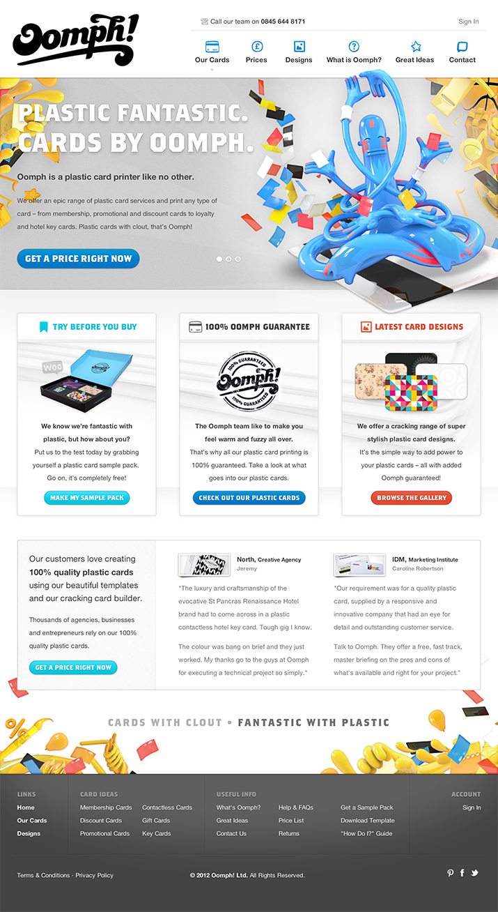
Here is a screenshot of the homepage:
Aesthetic
Right away I can see that I love the aesthetic of this site. It’s wild, crazy and fun while perfectly conveying the idea behind the cards.
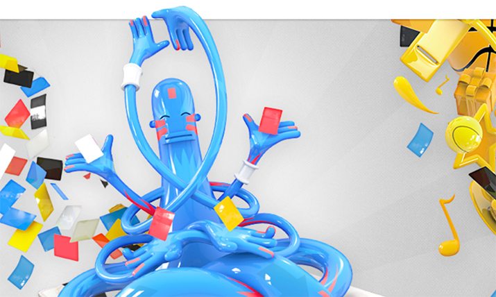
As you can see, there are all of these crazy, glossy, colorful graphics that really push the idea that plastic cards are something cool and exciting. This could just as easily have been a very clean, Apple-looking site with an emphasis on dramatic card photos, but this makes the product a little more personal and approachable.
Type
Another thing that I really like about this site is the typography. The main headline font is called “BrothersBold,” shown off below with WhatFont.
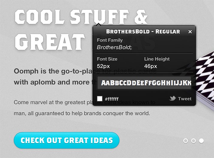
There’s a lot to like here. The typeface is perfectly readable and conveys a bold, masculine feel. Further, the chopped off curves communicates a sort of “cut out” feel that is perfect for a business that essentially die cuts plastic.
Aside from this, just about everything on the page is Helvetica. This is good because such a unique, interesting headline font requires a complementing typeface that is so simple and plain that you read it without thinking about it. Helvetica fits this description as the most ubiquitous and perhaps most invisible typeface on the planet.
The Grid
The Oomph home page is very clearly laid out on a strict grid. The grid is 1,020px wide and is fairly consistent from the top to the bottom of the page.
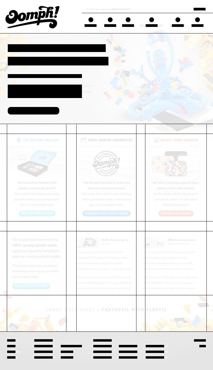
As you can see, the primary construct here is the three column layout that occupies the center of the page. Remember, three is a magic number, so this makes the layout feel perfectly balanced and presents just the right amount of content.
One thing to really notice here is how balanced the whitespace is throughout the design. Obviously, a grid system is going to give you nice spacing horizontally, but you have to then be intentional about matching that rhythm vertically.
Non-Responsive
Though the site loads and looks find on a mobile device, it’s not in any way optimized for mobile viewing. On my iPhone, I have to do a ton of pinching and panning to figure out what’s going on.
Given that the site adheres to such a nice, strict grid, it’s definitely an ideal candidate for responsive design. A year ago, I was merely assigning responsive designs bonus points for extra effort, but now it’s quickly beginning to be something that I expect to see, at least on some level.
Responsive design is tricky business, but the real headaches come from content heavy publishing sites. For a static site like this, responsive or at least mobile-optimized design is less of a tall order and more of a baseline expectation.
Communication Hierarchy
Just as critical as the visual design of the page is the structure of the communication and how it is presented. In fact, this is really the core of what design is and why we have it. Good design structures information in a logical and attractive way.
The Oomph site has very well structured communication. Right away, when I load up the page, this is the first headline that I see:
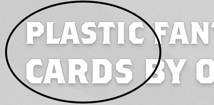
Notice that there’s a nice little visual trick here. The headline says “Plastic Fantastic. Cards by Oomph,” but at a glance, the word grouping that I see is “Plastic Cards.” This is exactly what Oomph is all about so this is a home run in communication design.
Questions Begged
Once you’ve had that initial look around and get the idea that this is a plastic card company, your first inclination will be to jump to some questions:
- What types of cards do they make?
- How much do they cost?
- Who is Oomph? What’s the story there?
All of these questions are readily answered in the first place that you’ll look: the primary navigation.
This is critically important to your design. Always try to predict the questions that you users will have and then try to decide the first place they’ll look to find them.
Shopping Experience
The shopping experience here is really smooth as well. The site doesn’t at all feel like a typical, cluttered online store. It feels like I’m just browsing the product offering and before I know it, I’m on step two of the purchasing process. The path to purchase is so natural and everything is presented so well: no secrets, no hidden prices or costs, etc.
Overall Opinions
On the whole, I think Oomph has a really solid site. The visual aesthetic is gorgeous, the layout is perfect and the communication hierarchy is top-notch. The only real complaint that I have is the lack of mobile optimization. Other than that, it’s definitely one of those sites that I spend the entire article complementing rather than critiquing!
Your Turn!
Now that you’ve read my comments, pitch in and help out by giving the designer some further advice. Let us know what you think is great about the design and what you think could be stronger. As always, we ask that you also be respectful of the site’s designer and offer clear constructive advice void of any harsh insults.