Web Design Critique #96: SuccessInc Drupal Theme
Every week we take a look at a new website and analyze the design. We’ll point out both the areas that are done well in addition to those that could use some work. Finally, we’ll finish by asking you to provide your own feedback.
Today’s site is SuccessInc, a Drupal theme from More Than (just) Themes. Let’s jump in and see what we think!
2 Million+ Digital Assets, With Unlimited Downloads
Get unlimited downloads of 2 million+ design resources, themes, templates, photos, graphics and more. Envato Elements starts at $16 per month, and is the best creative subscription we've ever seen.
If you’d like to submit your website to be featured in a future Design Critique, it just takes a few minutes. We charge $49 for critiquing your design – considerably less than you’d pay for a consultant to take a look at your site! You can find out more here.
About SuccessInc
“Most themes are built to look simple, clean, minimal. This one is built to help you impress. On both desktop and mobile. Success Inc. adjusts optimally to the width of the browser it is viewed on. As a result, it looks awesome, regardless if it’s a desktop computer, smartphone or tablet your visitors are using.”
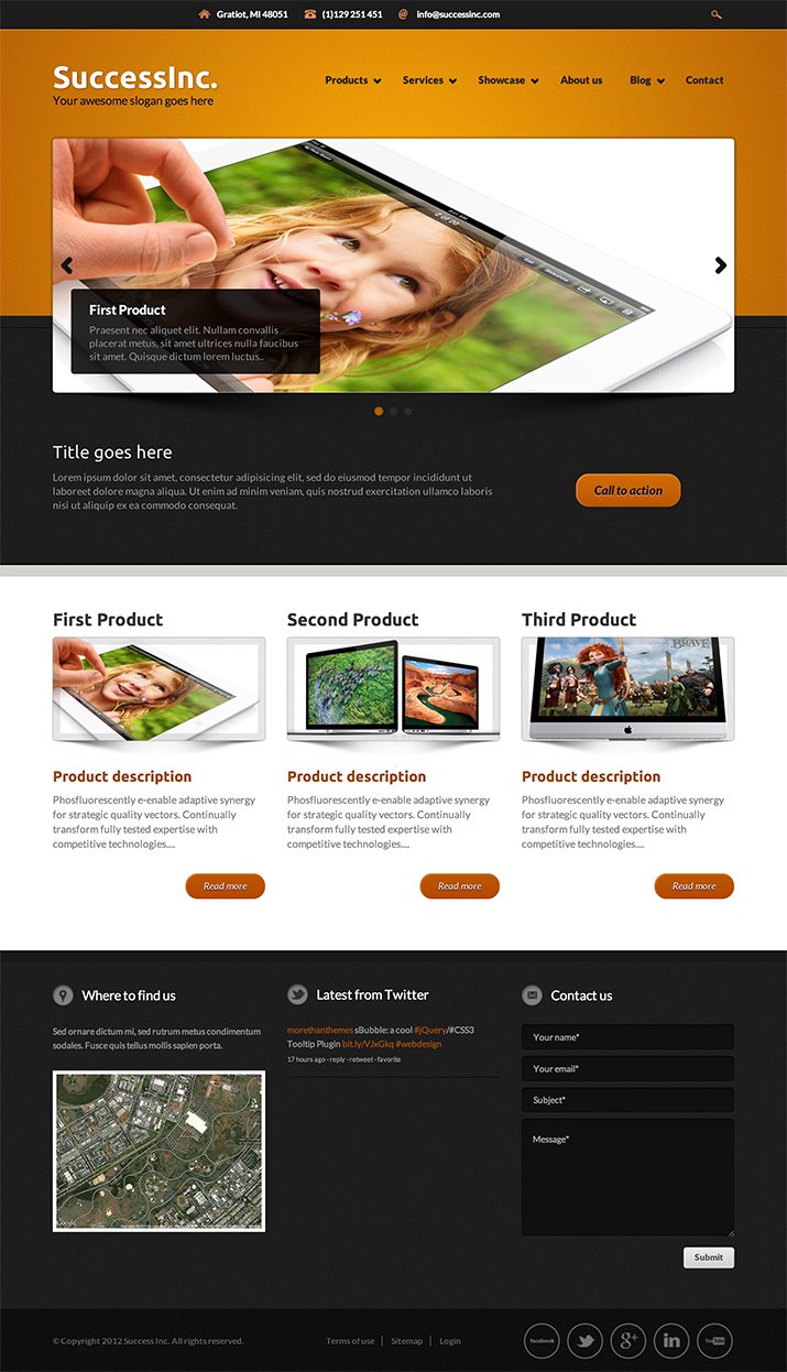
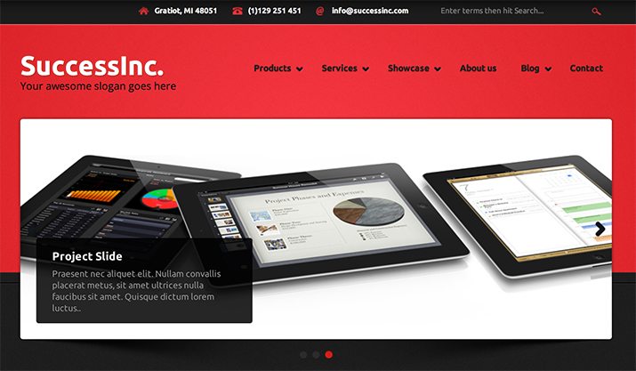
Here is a screenshot of the homepage:
First Impression
My initial impression of SuccessInc is quite positive. It’s a very attractive theme that looks to have plenty of top-notch features and customizable content areas. I love that it’s responsive and appreciate all of the easily-tweakable options that are built in. Let’s take a look at each section individually and see what we think!
Color Scheme
One of my favorite aspects of this theme is the bold color scheme. The bright highlights are starkly contrasted against the black, making for an eye-catching experience that feels classy and modern. The orange that you see above is simply the default color scheme, you can easily switch it up in the settings.
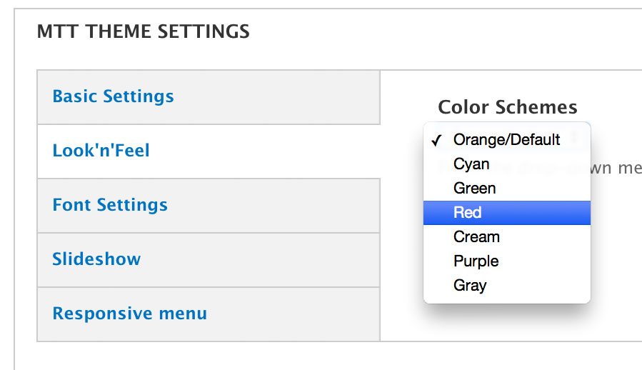
Changing the color scheme is as simple as clicking a drop-down menu and choosing the option that you want. You can choose one of seven schemes: orange, cyan, green, red, cream, purple and gray. Just hit the “Save” button and the new scheme will instantly be applied.
All of the color choices that they’ve included look great, making the theme fairly dummy-proof in terms of visual aesthetics.
Contact/Search Bar
The very top of the site has a little bar that holds some basic contact information along with a search bar. Here’s an up-close shot of what this looks like:

There are a number of different types of websites where the user’s primary reason for stopping by is to find some sort of contact information. For these types of sites, this is a great little design element. Users don’t have to hunt around for a contact page or form, the information that they’re really after is one of the first things that they see.
As you can see in the shot above, there’s also a search field in this bar. The field itself is invisible, but is denoted by some placeholder text followed by a little search icon. When you click on this text, it becomes more of a traditional search field.
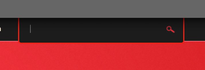
This is a cool piece of design, but I’d be interested to see if users really respond to it that well. We tend to look for visual cues before we read, so it might take someone a while to figure out how to run a search. One quick route a user might take is to see the magnifying glass icon and click on it, which simply runs a useless empty search.
Further, the hint says to “Enter terms and hit Search…” but there is no button that says “Search” so again, it’s easy to see how this might confuse a user. Obviously, anyone half way competent with the web will figure this out quickly enough, it’s still a good idea to identify potential user road blocks and frustrations though.
Navigation
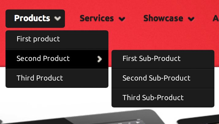
The navigation is provided by a rock solid Superfish menu. It works perfectly, has smooth animations and multiple levels, and looks pretty slick. Later one we’ll take a look at what happens when you downsize it for mobile devices.
Slideshow
Moving down the page, next up is the slideshow. It’s a nice, big and animated content area that brings some interest to the top of the page. There are a few features here that I’d like to point out as well that you should consider when you create a slideshow.
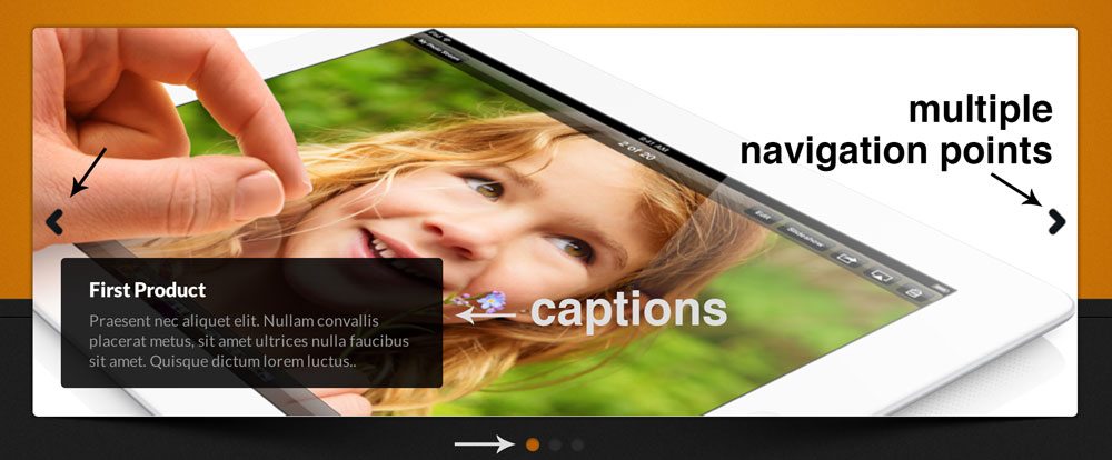
First, there are multiple navigation points. Both the arrows and the dots at the bottom serve to advance the slideshow or jump to a specific point. Further, the dots provide a reference point to where you are and how many slides are present. Finally, there are captions that allow you to add in custom messages.
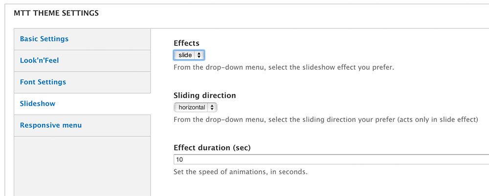
Ultimately, these aren’t just nice features. They increase the effectiveness and usability of this piece of UI, making it more than simple eye candy. If you’re all about options, you can even go into the settings and change up the transitions or slide duration.
Content & Footers
The rest of the page is pretty basic. It starts with a secondary content area and moves down to a footer, both of which are laid out in three columns.
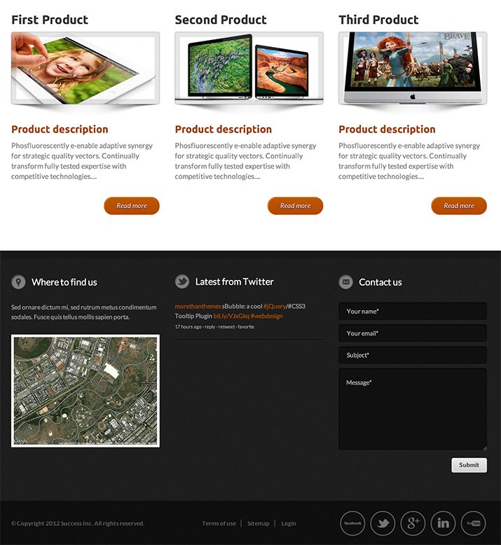
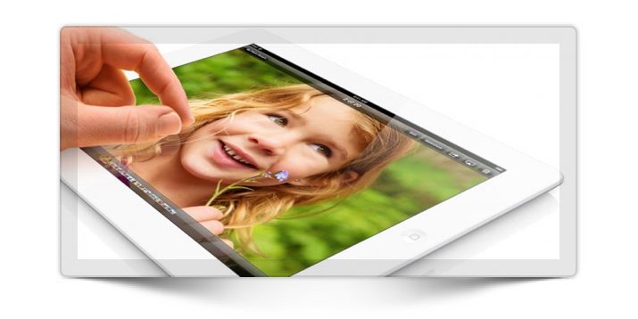
First, you have three content areas, each of which holds an image with a description and a button. I particularly like the shadow placed on the thumbnails here. It’s a nice illusion that gives some depth to the design.
If the contact information in the header wasn’t enough, the footer provides some really nice functionality. There’s a place for a map, a Twitter feed and a contact form. This in addition to a sort of secondary footer that holds various social icons. These tend to be a cluttered mess thrown into a design as an afterthought so I really appreciate how well integrated into the design these are.
Responsive Layout
The layout for the site starts as static, then when the viewport is reduced to a certain width, it becomes fluid. Here’s a look at a few of the steps for the design as the viewport changes:
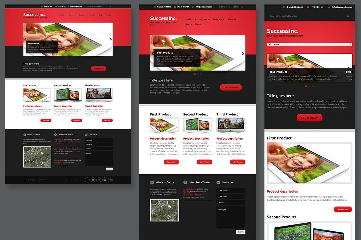
I love that this theme is responsive, I think this has become a necessity rather that a nicety. The thing that they really knock out of the park is that they layout seems to be fairly device-agnostic. Try as I might, I wasn’t able to break the layout in any significant way while experiencing with different widths. Everything, right down to the search bar, reformats nicely no matter what screen size you throw at it.
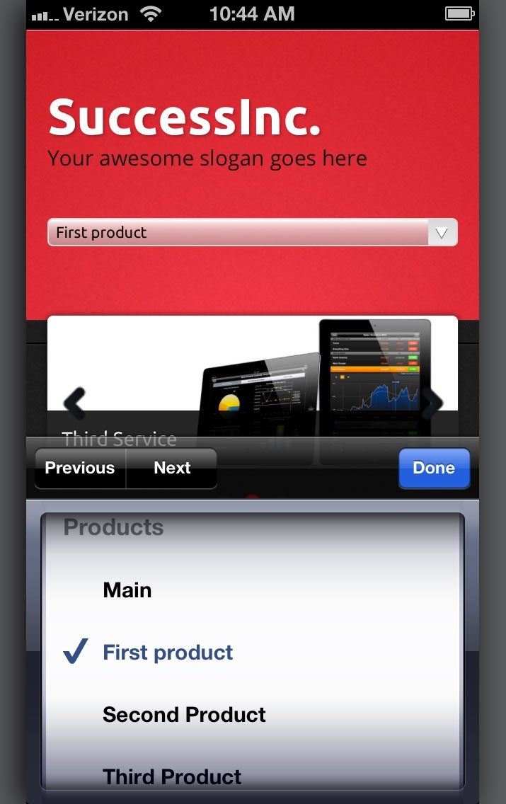
On mobile devices, the navigation turns into a select box. This is easy to use, familiar and keeps all of the original options in place. There are some good alternatives to this strategy, but this is one of the more functional solutions.
Closing Thoughts
We’ve seen before that More Than (just) Themes does great work. My main complaint last time around was that the theme wasn’t responsive, but they’ve definitely addressed that concern with SuccessInc. Overall, it’s a great theme and I can see it working really well for lots of different types of sites.
Your Turn!
Now that you’ve read my comments, pitch in and help out by giving the designer some further advice. Let us know what you think is great about the design and what you think could be stronger. As always, we ask that you also be respectful of the site’s designer and offer clear constructive advice void of any harsh insults.
