20 Awesome Responsive Templates and Themes (Free and Premium)
Responsive web design is all the rage at the moment, but as a full-time designer it’s hard to make time to pick up on new trends no matter how useful and perhaps even necessary they may be.
Pre-built themes and templates provide you with a quick and easy way to get started with responsive web design. Many of them do all the work for you and provide a simple plug and play workflow, others just take care of the heavy lifting by taking care of the media queries and give you complete control over design. This post contains 20 free and premium templates, all of which are fully responsive right out of the box.
2 Million+ Digital Assets, With Unlimited Downloads
Get unlimited downloads of 2 million+ design resources, themes, templates, photos, graphics and more. Envato Elements starts at $16 per month, and is the best creative subscription we've ever seen.


Responsive Layout: Fad or Necessity?
There’s been a ton of discussion about responsive web design lately. Many hail it as the future of web design and even go so far as to say that you’re simply not doing web design the right way if your sites don’t conform to their specific formula for maximum compatibility. Others contend that this is just another toy in a long line of fads that come and go.
The answer is likely somewhere in between the two. The truth is, web design has indeed hit a major obstacle with the wealth of different screen sizes that now access the web regularly. Many sites can neither afford to leave out large portions of mobile users nor can they build custom sites perfectly tailored to every smartphone, tablet, laptop and desktop on the market.
Responsive design, be it trend or not, is currently the best answer to this problem. If media queries fall out of favor it will simply be because a better solution has come along, not because the problem ceases to be important.
I can’t say how we’ll be developing sites ten years from now, but you can bet that screen sizes will only continue to become more fragmented as everything with a battery or plug is quickly becoming capable of accessing the web. If we define “responsive” web design as a set of techniques used to ensure maximum compatibility across as many devices as possible, then we are definitely not looking at a fad but the current and future standard for professionals in our industry.
Some complain about the added effort and development time but it’s really not as bad as you might think and once you’ve pulled it off a couple of times the impact on your workflow can be quite minimal. The tools in this post make it even faster, taking most of the pressure off you when it comes to the responsive elements.
20 Responsive Templates & Themes
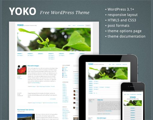
Yoko – Free HTML5/CSS3 WordPress 3.1+ Theme
“Yoko is a modern and flexible WordPress theme. With the responsive layout based on CSS3 media queries, the theme adjusts to different screen sizes. The design is optimized for big desktop screens, tablets and small smartphone screens. To make your blog more individual, you can use the new post formats (like gallery, aside or quote), choose your own logo and header image, customize the background and link color.”
Skeleton
Skeleton is a boilerplate that successfully makes developing responsive websites a breeze to accomplish. We’ve written about it a few times on Design Shack and really love its simplicity. Along with the download you of course get a demo file, which can easily be used as a starting template to build your own work on.

Responsive Twenty Ten (WP Theme)
Responsive Twenty Ten is a child theme of the default WordPress theme with lots of great features like flexible images. The authors give you permission to “download, take, use, change, and do whatever you want with it.”

Onextrapixel Responsive Web Design Template
A very basic but solid free template/tutorial for responsive web design. This is perfect if you just want to dig around and see how a simple responsive template works without all the fluff.

The Novelist: Responsive WP Theme for Writers
A very unique looking theme with a simulated open book interface that scales nicely when you resize the browser. Perfect for personal writer portfolios.

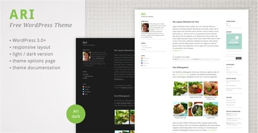
Ari WordPress Theme
Ari is a very minimal blog theme that is super attractive in its simplicity. It’s built for WordPress 3 and up and features both a light and a dark theme. You’ll definitely want to give this one a look.
Golden Grid
Like Skeleton, Golden Grid is more than a template, it’s a framework for building responsive sites. Self-labelled as a folding grid for responsive design, “the 16 columns can be combined, or folded, into 8 columns for tablet-sized screens, and into 4 columns for mobile-sized ones.”

Good Minimal – A Responsive HTML5 Template
“Good Minimal is a clean and minimalist style template that is good for portfolio, blogs and businesses.” Very similar to the previous template in many regards but with a bolder, more unique design. I really like the look of the typography in this one.

iTheme2 (WordPress)
iTheme2 is a gorgeous free blog template that has a responsive layout and tons of great features like a customizable feature slider, a social media widget, two theme skins and more.

Folio Two
“Folio Two is an advanced portfolio, a practical and usable template designed with HTML5 + CSS3 and using jQuery to enhance an awesome user experience.”
This template features a really nice big grid of images that morphs smoothly as the browser window resizes. The grid looks great both small and large!

Grido WP Theme
Grido is an awesome and impressive feat of web layout tricks. It features both a masonry-like layout and a responsive system that readjusts that layout for several screen sizes. It comes with multiple color schemes, a lightbox gallery, seven skins and more.

Flexible WordPress Theme
“Flexible is a WordPress Theme that helps present your content and display it to fit different screens sizes, with a design of your own. It also provides a really easy integration with Facebook and Fan Gate option, a must have if you are running a website.”

Constellation WordPress Theme
This theme has it all. Not only is it responsive, it’s built on HTML5 Boiler Plate and contains both a horizontal grid and a pixel perfect vertical rhythm that scales nicely across devices. This is the perfect starting point for your next WordPress project.

Seamless Responsive Photo Grid
A nice little experiment from Chris Coyier that you can download and use. It’s basically just a big grid of photos that instantly adjusts to difference browser window sizes.

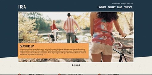
Tisa WP Theme
Another great looking and responsive Themify theme with lots of big images, a beautiful color scheme and six theme skins.
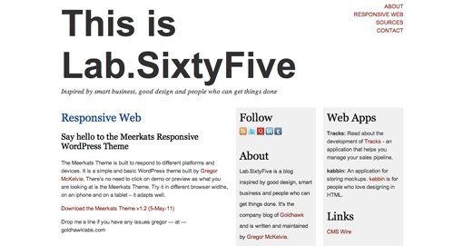
Meerkats Responsive WordPress Theme
“The Meerkats Theme is built to respond to different platforms and devices. It is a simple and basic WordPress theme built by Gregor McKelvie. ”
Whiteboard Framework
“Whiteboard framework for WordPress was developed to speed up the process of developing a WordPress theme. Whiteboard does so by eliminating the time spent on code common to all WordPress themes and includes non-intrusive code that improves the overall WordPress theme in many ways – including SEO, speed, usability, and mobile support.”
Built on the Popular Less Framework, Whiteboard utilizes both HTML5 and CSS3 and gives you a nearly unbeatable starting point for developing perfectly responsive WP themes.

Conclusion
With these twenty amazing resources, you should be fully armed to begin creating responsive web designs in both straight HTML/CSS and WordPress. No matter what your budget is, there are several themes and templates here that are perfect for you.
Leave a comment below and let us know if we missed any. Have you come across any great responsive templates and themes? We want to see them!