Design Trend: Open Concept Layouts
If you watch any home improvement shows on television, the most repeated phrase might be “open concept layout.” Did you know you can DIY your way to an open-concept layout in website design as well? This design trend is more than just a home improvement idea.
Open concepts are a fun, and functional, visual pattern that can help users navigate your website while controlling digital clutter. Here’s how you do it with 10 mini case studies and examples!
2 Million+ Digital Assets, With Unlimited Downloads
Get unlimited downloads of 2 million+ design resources, themes, templates, photos, graphics and more. Envato Elements starts at $16 per month, and is the best creative subscription we've ever seen.


Open Concept Primer
In home design, an open concept layout is one where multiple spaces come together in a way that has a flow that maximizes space from room to room, such as one large floorplan for a kitchen and living space.
In web design, the concept is very much the same. An open concept layout creates excellent flow between elements in a bright and airy way. The design will maximize use of white space and use simple elements with plenty of harmony, balance and a simple flow.
Use of color can be bold or streamlined and pages can include a short or long-scroll.
These layouts often work best with a detailed plan and flow for the design that ends in a single call to action. Trying to mix and match too many elements and pieces can result in a jumbled design. The key thing to keep in mind when working with an open concept design trend is that the visual flow must be obvious to users so they know exactly what to do with the design and how to navigate it.
GrowX
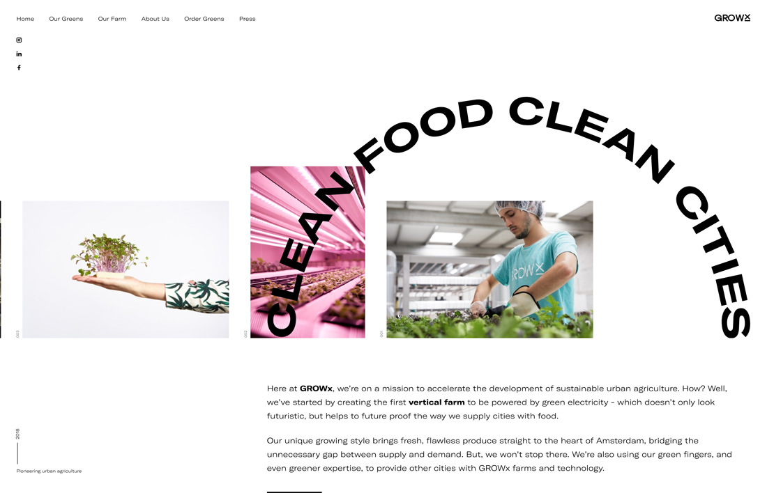
GrowX uses a great combination of white space, clean images and text and an interesting feature with an arched headline to mix elements in an open space.
The layering effect used here with text and images is a common technique with open concept designs. Using layers can help draw the user from one element to the next and keep the visual flow moving.
The caution with open concept designs is that users can get lost in the space. Thanks to a clever “trick” and layered elements, users know just where to look on this website.
NooFlow
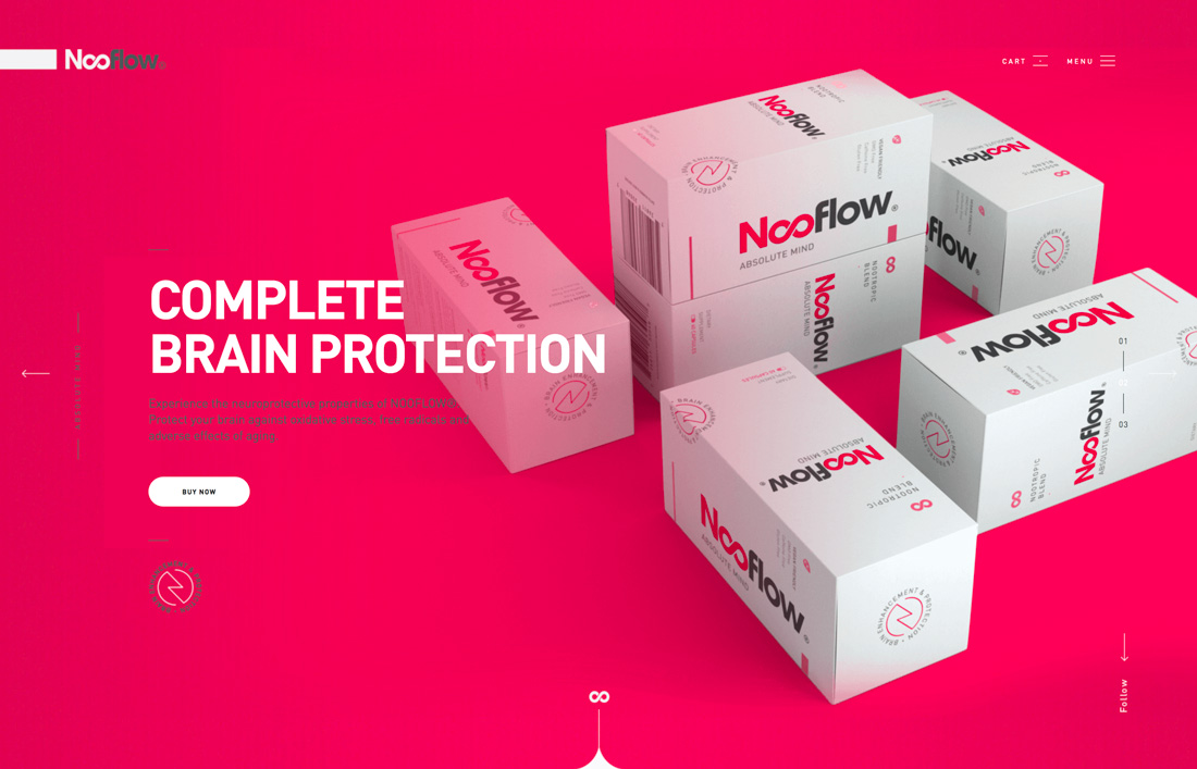
While most open concept ideas make you immediately think of white space that’s actually white, NooFlow proves that color can be equally stunning.
The design mixes elements with a balanced text versus image design in an almost split-screen aesthetic. What brings it all together is that while bright, the color palette is simple. By eliminating other hues, the open design has a flow that feels simple and encourages users to move through the design.
Open Wear
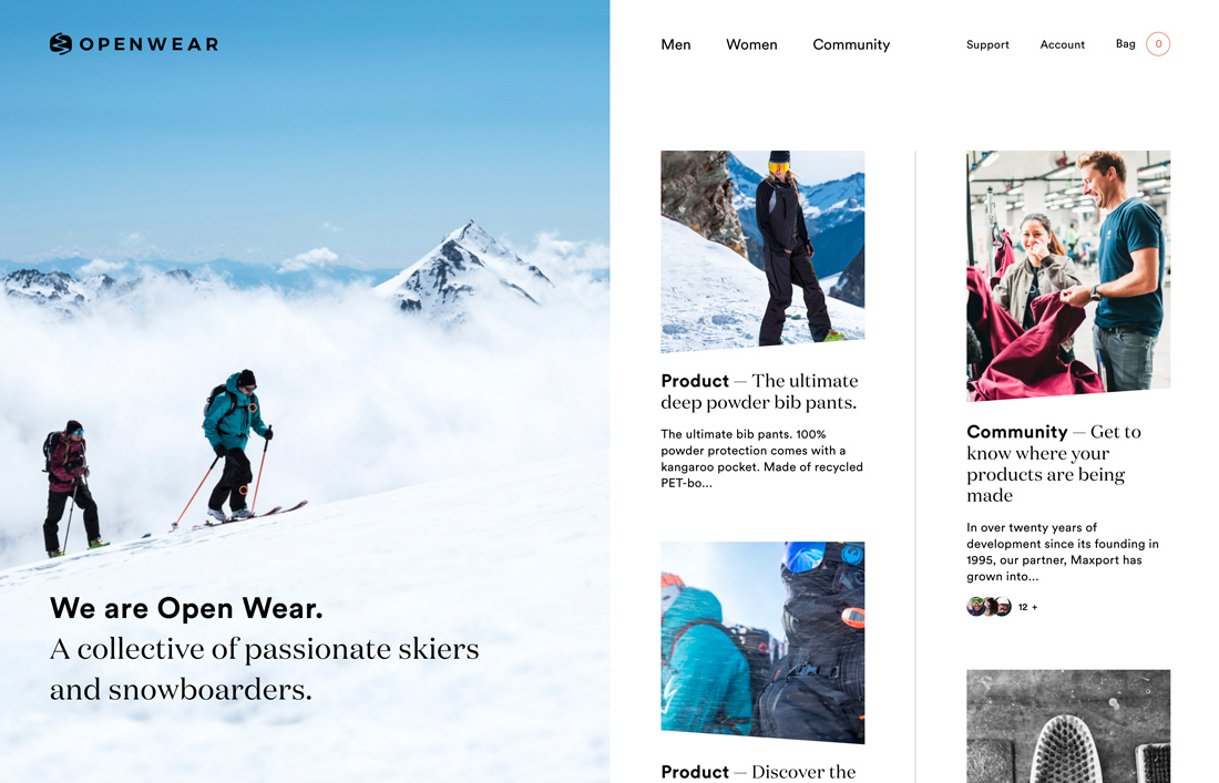
Open Wear uses a full split-screen concept but with directional imagery that pushes users in the direction of content.
This design looks even more open thanks to photo choices. The content here lends itself to plenty of white in the images which balance the white background. Overall, the visual outline feels airy and fresh even though there are a lot of elements and visual entry points.
Think about this same design with a left photo that’s mostly dark. It would change the whole design concept and flow.
Brightscout
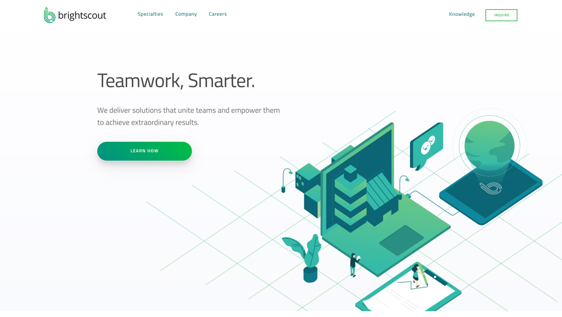
Brightscout creates flow in a diagonal manner from logo and navigation to text elements to an image (or vice versa, depending on where your eye goes first).
The open concept here looks and works much like the floor plan of a home using the design technique of the same name. There are distinct points of entry with imaginary lines that tell the user where to go next.
And the call to action is accented with a large button and color. Functionality is obvious and easy.
Duotix
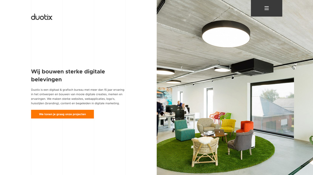
Exaggerated use of space is a common theme when it comes to open concepts. Space tells the user where one thing ends and another begins.
Duotix uses this pattern of space throughout the design to create visual distinction between content blocks, each with their own calls to action. Further, on the scroll, white and colored backgrounds alternate to help keep the user moving. (That’s where the open concept flow comes in.)
PopularPays
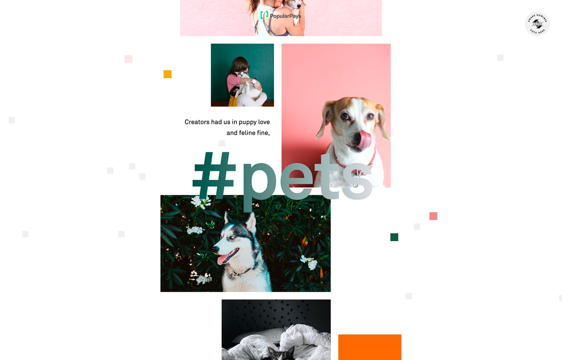
With parallax scrolling and, simple animation and extreme margins, PopularPays, creates multiple spaces for content while establishing functionality.
The images and text are engaging, particularly when paired with animated effects.
What’s nice about this design is it shows that multiple trends can work in concert to create something that’s not overwhelming but has a distinctly modern feel. It takes the right kind of content to pull off a design using multiple trends, and generally simpler content plans work best.
Abel
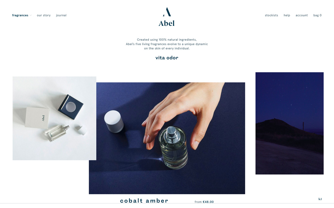
Like some of the other examples, Abel layers elements to keep the eye moving from item to item. What’s nice about this version of the open concept plan is that much of the space is at the top of the page with heavier items below.
The same visual theme continues on the scroll with space above and below elements to create separate spaces in the open concept design.
This example shows that not all e-commerce sites have to have a full and cluttered feel to be effective.
Hampshire Light
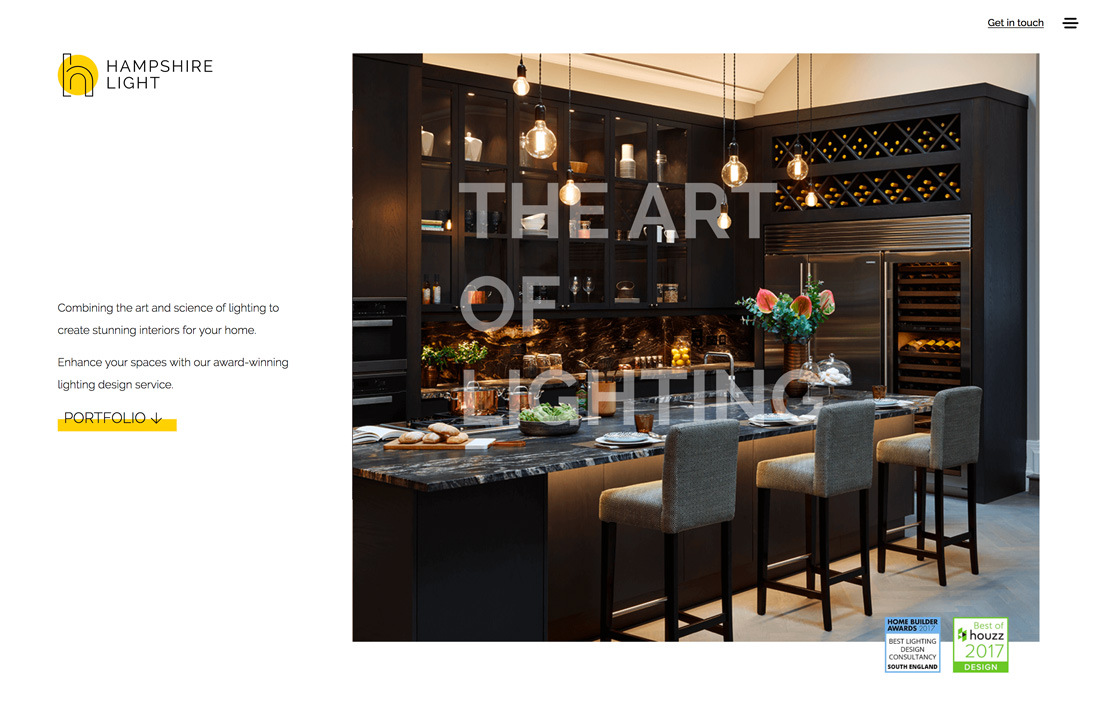
The beauty of the Hampshire Light design is that it uses an open-concept web layout for a home design product. (Talk about trends that move from the digital to physical realms!)
What makes this design work is the use of asymmetrical space and bright color. Everything about the design implies an open and airy feeling, from yellow accents to transparent typography over the image to the open “h” logo.
Another key detail in this design is exaggerated line spacing. The lighter sans serif typeface could have been a risky choice, but thanks to short lines of text and spacing, it contributes to the overall feel of the open concept design.
Walking Men
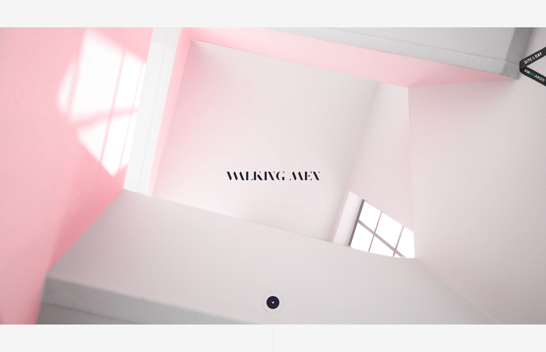
With subtle animation, soft color and plenty of space, Walking Men might make you think of high ceilings and possibilities. The simple design structure includes one content element per page with a fun click-to-scroll feature.
The aesthetic is open and constant and the user has a feeling of moving from space to space, even though they are standing still (theoretically) in the one-page format.
Crux
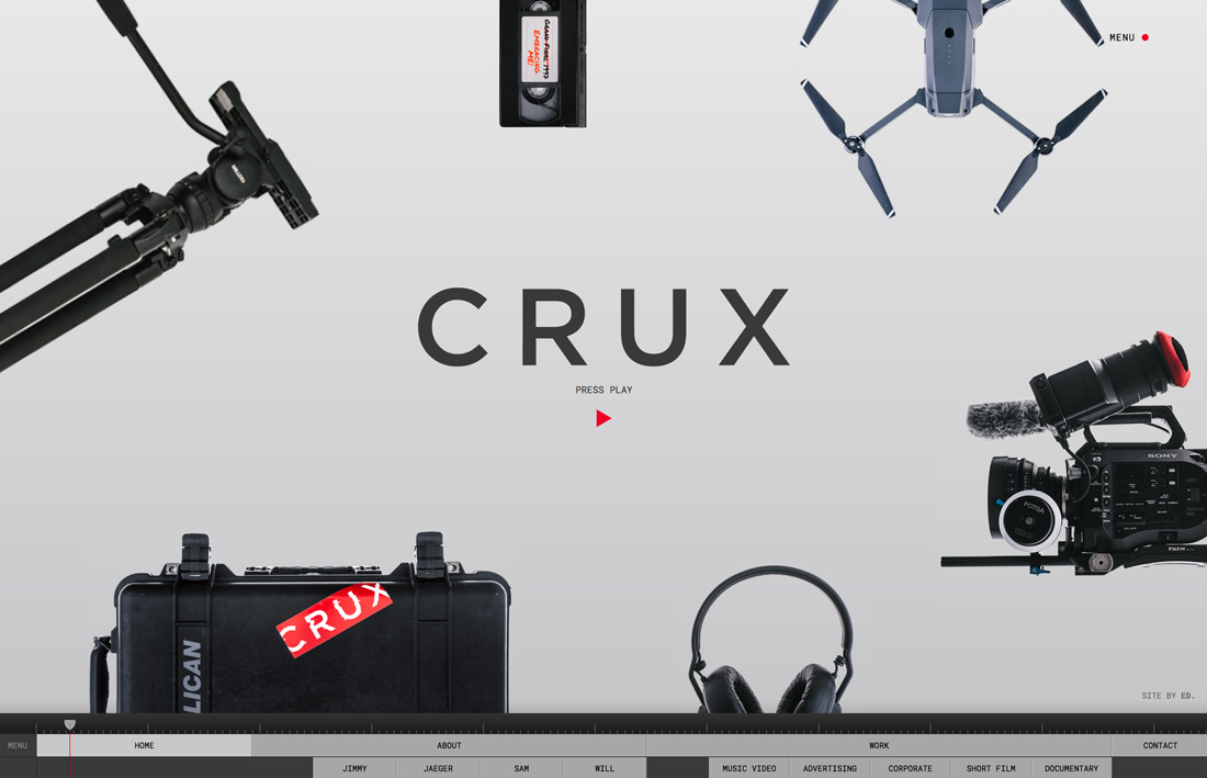
Crux might embody the open concept floor plan of my own home, with the heaviest design elements pushed toward the outward edges.
The center logo and call-to-action provides an obvious focal point so that the other elements don’t appear cluttered or out of place. The down-page navigation pulls it all together as a roadmap of sorts for the pen design that could be a little difficult for some users to navigate with its almost round shape with no distinct entry or exit points.
Conclusion
There’s a good chance that you might already be incorporating some open-concepts into your designs. Is this a trend that you like?
We see the open-concept design trend as something with some staying power because it is rooted in design theory. Layouts that use space well will never go out of style (even if what we call them tends to change over time).