Optimising Front End Performance for Mobile Devices
Most front-end developers will be familiar with at least some of the options available to them when it comes to enhancing front end performance. Performance in this sense is not referring to the speed at which a given page loads, but instead how smooth and responsive it feels when a user interacts with it. A specific example would be the frame rate a user experiences when scrolling down your home page; if it’s consistently high, then performance is considered good.
There is a chance you may not have experienced a need to address performance issues before. Maybe you haven’t worked on a site that has suffered from such issues, or maybe removing that small bit of lag or recovering those dropped frames just isn’t at the top of your priorities. Either way, with the increasing amount of animation and complex styles being built into modern websites coupled with the adaptation of responsive design, there is a high chance you’ll run into sluggish mobile performance at some point. This article will suggest a few things to consider when working on websites and web apps that need to balance complexity and performance when running on less powerful mobile devices.
The Ultimate Designer Toolkit: 2 Million+ Assets
Envato Elements gives you unlimited access to 2 million+ pro design resources, themes, templates, photos, graphics and more. Everything you'll ever need in your design resource toolkit.


“It Runs Smoothly on My iPhone 5”
Does it really? Well that’s great! Here are some recent statistics provided by the W3Schools (not to be confused with the W3C) that illustrate the most active mobile operating systems.
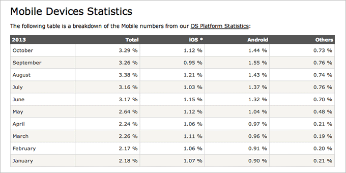
Obviously our use of this data is limited. It’s only explicit about two operating systems; iOS and Android. This leaves Windows Phone, Blackberry and other even less popular mobile OSes out of view.
What we can see is that Android’s market share is a somewhat larger than that of iOS. Again, we’re missing further specifics here such as version numbers and device names, but it gives us a good start when determining where our support is most needed.
No only does Android hold the highest market share of active devices, it also suffers enormously from device fragmentation. Recent data shows that in 2013 alone 11,868 distinct Android devices have been spotted in the wild (out of a sample size of 682,000 devices). On these devices, eight different versions of the Android OS were being used.
The point being that when it comes to assessing the performance of your site you have to test on a suitable range of devices. Exactly which devices can only be determined per website, and should be based around real visitor data (if you can get hold of some) that relates to your target audience.
In a perfect world, we would have our sites running fluidly on every single device. In reality, this is not possible due to the usual constraints of time and finance. It’s up to you to decide where to draw the line and to choose what is acceptable.
Common Causes of Poor Performance
Here are a couple of things to look out for when debugging performance issues on mobile devices.
1. Large, Complex CSS Declarations
For all the awesomeness that CSS3 brings to the world of front end development, all these fancy new style declarations are forcing our CPUs to work harder than ever before. Juriy Zaytsev wrote a great article on CSS profiling and optimisation which covers this nicely, however do note this piece was published in January 2012.
The profiler that Juriy uses is Opera Dragonfly’s Profiler, but you can now profile your styles more easily using Chrome DevTools by simply visiting Profiles in the DevTools nav, and select your preferred option.
To see the impacts of CSS for yourself, run a big fancy site through the DevTools Profiler (if you have time, profile your paint times too) and you will see the performance issues I’m talking about. Let’s take a look at an example.
“I can run Battlefield 3 on ultra settings (a very large image), but the Green Man Festival home page scrolls at 24fps. What’s up with that?”
What’s up with that indeed?

As beautiful as the site looks, the developers have had to sacrifice performance somewhat to achieve the visual look and feel they were going for. The performance loss is small. However, if a site like this can slow down performance on a powerful desktop computer, then what can we expect on a mobile phone running on a 1Ghz processor?
Of course, most sites with fancy desktop features will quite rightly provide a more simplified experience when viewed on mobile devices.
In the case of Green Man, mobile browsers will have smaller images to deal with, fewer or more simplified animations, and a reduced amount of dynamic content. As a result, it scrolls perfectly smoothly and looks great.
If your site feels sluggish on mobile, the first thing to look at is your CSS declarations. In terms of finding the culprits, combinations of text-shadow, box-shadow, border-radius, gradients, transparency and other similar properties spanning multiple elements on a page can increase the amount of repaints the browser is required to carry out and as a result make your website’s UI appear sluggish and unresponsive. These repaints will certainly be more apparent on mobile.
It’s down to you to determine what styles you are willing to keep and which you can comfortably drop. It all comes down to whether the performance increase is sufficient to warrant a slight simplification in visual styles. More often than not, dropping performance heavy declarations can work in favour of the overall experience your users will receive.
2. Complex JavaScript Animations
jQuery is now a standard library used by many developers who want to integrate animation into their designs. The main reason being it’s so easy to use. You don’t really need to know JavaScript to use jQuery. Of course it’s easy to see why this can lead to problems. Poor JavaScript can be one cause of jagged animations, which is why it’s important to make sure your scripts are as optimised as possible.
If JavaScript isn’t leaving you with the results you want, you might want to turn to CSS 3D transforms, support for which is already pretty good in the mobile market.
Using 3D transforms allows for smooth transitions not always capable by libraries such as jQuery. Why? Because they allow you to trigger hardware accelerated rendering which while not a magic solution for all your animation issues, can be used to good effect in certain scenarios. Check out this comparison demo to see just how much performance can differ between the two.
For anyone who hasn’t used 3D transforms before, let’s take a look at a code example to get you started. Here’s some basic CSS you might use to animate the vertical position of an element on hover.
CSS Example
.translate-me {

    transition-property: transform;

    transition-duration: 0.2s;

    transition-timing-function: ease-out;

    transform: translate3d(0, -85px, 0);

}

    .translate-me:hover {

        transform: translate3d(0, 0, 0);

}
I’ve set up a live demo on CSSDesk with all the vendor prefixes included. Please note that some prefixes may no longer be required by the time you read this. If you have time, Flickr’s dev blog contains a great case study surrounding this topic and is well worth a read.
3. Progressive Enhancement Vs. Graceful Degradation
Here we have two “not so new” terms (progressive enhancement is currently celebrating its 10th anniversary, after being coined in 2003) that still hold a lot of relevance today. Both concepts are particularly relevant when developing responsive websites and as the number of devices and OSes available continues to increase, progressive enhancement in particular is going to be a must on many projects.
Aren’t They Both the Same Thing?
Almost. The key difference here is the order in which you approach your design. Planning features to function on all devices and then adding some sparkles for those that can handle it is an example of progressive enhancement. Creating a fancy JavaScript only feature and proceeding to bolt on a alternative at the end; graceful degradation.
Which method should you employ? In my experience progressive enhancement almost always results in a better and cleaner solution. Chris Heilmann has written a pretty good summary on this which now sits over at Web Platform Docs.
What Next?
The ideas in this article are basic but will get you on the right track when it comes to sniffing out causes of poor performance.
If you want to learn more, the best place to start would be to learn the ins and outs of how a web browser works at a technical level. After all, it’s the browser that’s parsing the code you write. If you can understand what it needs in order to be able to run your site smoothly, you’ll be able to factor your code to work with it.
How Browsers Work: Behind the scenes of modern web browsers is a fantastic and comprehensive article that goes into a great amount of detail on this subject. Good luck!