5 Reasons to Avoid the Desktop Hamburger Menu Icon
A hamburger icon as the only source of navigation on a desktop website sucks. It’s frustrating, confusing, and violates unwritten rules of navigation and user flow best practices. Why would you do it? Other than to maintain or establish a certain aesthetic, it’s hard to find an answer that makes any sense.
The often-debated hamburger icon can be a great complement to website navigation or even for small screens, but it shouldn’t be the only option for desktops. You are doing yourself – and the website design – a huge disservice if this is your only menu option.
Take note of the different desktop menu styles throughout this post. Some of the best uses of the hamburger icon come with other menu items.
The Ultimate Designer Toolkit: 2 Million+ Assets
Envato Elements gives you unlimited access to 2 million+ pro design resources, themes, templates, photos, graphics and more. Everything you'll ever need in your design resource toolkit.


1. Miscommunication and Misunderstanding
Navigation menus are a gateway to your website, telling visitors what to expect, how to interact, and what the site is about.
With so many different looks for a hamburger icon, from the number of lines to color to size and shape or placement – there’s not enough of a directly established user pattern to make this wholly effective.
Menu items should include links to the most important information on your website. And there’s a fine line between providing valuable information and overload. Stick to four to six menu items, any more than that will crowd the space and might not help users make a decision about what link to choose.
Pages that are linked in a menu are seen as the most important content on the website. Without these links, pages might feel less relevant to users.
On the other hand, giant mega menus can be just as confusing as no menu at all.
Here’s what navigation menus should do on desktop websites to contribute to the overall user experience:
- Communicate what a website is about
- Provide easy access to top content or products
- Provide easy access to things you want users to see or engage with
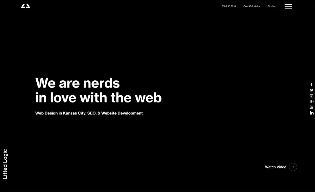
Lifted Logic (above) uses several layers of navigation, including a hamburger icon for information.
2. You’ll Miss Out on Useful Data
Do you have a good idea of what people are looking for when they land on your website? What information do they want to see next?
Tracking – using clicks or heatmaps – can help you better understand how people are using menus to move through the website design. Even users that don’t click a navigation element may look at the options before making a decision about what to do next with the design.
It’s true for many websites that the Contact and About pages are some of the most-visited on the entire site. For most designs, these are not pages that are linked through calls to action. Users navigate to them from menus. Would you want to miss out on those clicks from people who might call, email, contact, or visit your business?
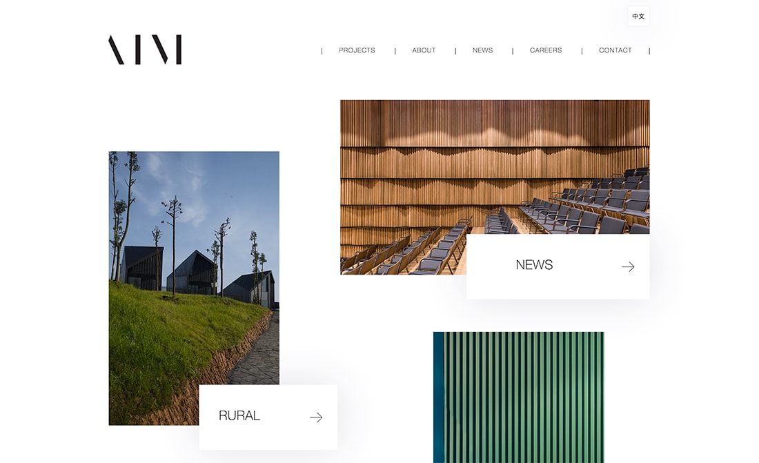
Aim Architecture (above) plays it straight with a simple, easy top menu.
3. User Frustration
Depending on the type of website you have, menu options are expected by users and can lead to serious frustration, including leaving the site.
This frustration is most evident with users who move around the site and will often return to main navigation menus to get back to certain content, find a blog or specific information, or help search for something.
Menus hidden in hamburger icons have lower overall engagement than those that are right out in the open. That can be an indication of frustration or inability to find the menu at all. (Depending on the demographics of your target audience, they might not even know how or why to use those three lines at the top of the screen.)
This frustration is backed up by research as well. The Nielsen Norman Group found that hamburger icons cut content discovery by about half and “task time is longer and perceived task difficulty increases.”
Thank about it, do you know what to do next with the website example above?
4. Missed Opportunity for Conversions

Without clear user paths, there’s plenty of room for missed opportunities and conversions.
Ecommerce websites are a good example of where menus are important; namely for easy access to the cart or checkout buttons. If navigation is hidden or users can’t get to these links quickly and intuitively, it can lead to a missed sale.
Keeping the cart visible is a key strategy when it comes to reducing abandonment and getting from online shopper to online buyer. What better place than an always visible main menu on desktops? (This gets a little trickier on mobile. But most mobile shoppers are still making a quick impulse purchase while desktop buyers are buying more items and comparison shopping between tabs.)
The same is true of other types of websites as well. Imagine you sell insurance. There are different types of agents for individual or business insurance, home or auto, event, or liability. The menu can help assure users they are in the right place and find information that’s made for them.
5. Extra Clicks are Inefficient

Users are kind of lazy (it’s true, you can admit being lazy when visiting websites yourself) and if you have to click too many times to get to something, chances are that you’ll give up. Putting menu items behind an icon adds one more click to any user journey involving navigation.
If a user is only going to click three times and leave the website, do you want accessing the menu to be one of those clicks?
That might sound oversimplified, but it really is that easy.
Crisp (above) does something interesting. The navigation starts without a hamburger and collapses into one on the scroll.
But, Hamburgers Are OK on Mobile
But here’s the thing: For the mobile responsive version, you’ll probably want that hamburger icon. It’s not an inherently bad design option.
- It’s efficient and saves real estate on the screen.
- Mobile users are more used to how it works.
- This menu style can be easier to tap without hitting inadvertent buttons.
- The myth about hamburger icons killing search engine optimization is dead. Google actually ranks mobile-first when indexing websites and will read these menus.
Conclusion
Hamburger icons and menus do have a place in website design. Generally, designers have come to accept them and many users do understand their use and purposefulness.
That doesn’t mean they are an end-all when it comes to navigation. While some elements are OK tucked behind a menu, this may not work for certain websites, industries, or user groups, particularly on desktop devices. If you are going to use a hamburger icon on a desktop, consider it for a secondary menu or with labels to ensure that users know exactly what those three lines are intended for.