This Week in Design: Jan. 23, 2014
Most of what you do as a designer probably starts digitally. The design is drawn with a tool such as Photoshop or InDesign or Illustrator. There aren’t many ways around it. So this week in design, we are looking more at digital and web design … and a bit of what’s next.
Every week, we plan to a look at major product releases and upgrades, tools and tricks and even some of the most popular things you are talking about on social media. And we’d love to hear what’s going on in your world as well. Have we missed anything? Drop me a line at [email protected].
2 Million+ Digital Assets, With Unlimited Downloads
Get unlimited downloads of 2 million+ design resources, themes, templates, photos, graphics and more. Envato Elements starts at $16 per month, and is the best creative subscription we've ever seen.


’Designing Inside Out’
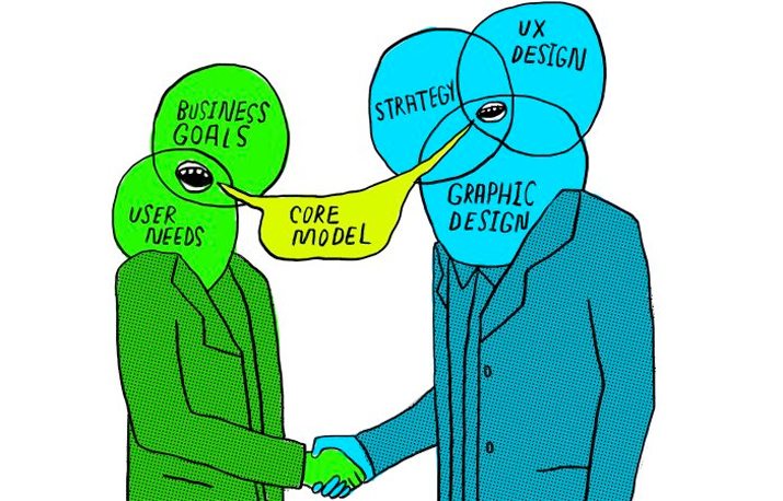
“Nobody comes to your website just to look at your homepage or navigate your information architecture. People come because they want to get something done.” – Ida Aalen in “The Core Model: Designing Inside Out for Better Results” for A List Apart issue No. 411.
Now, we can get started. But as designers, it might be time to think about a different starting point. Why? To create better and more workable user experiences. The place to start a design project is not in the information architecture or wireframe, it’s in the way users will interact with the design.
Aalen does a great job explaining the importance in the article. (You should go read it for sure.) Here are the highlights so you can start thinking a little differently.
- Use a different starting point. Plan projects using the core model, a concept that has been around since 2007, where you design websites from the inside out, with a focus on what users need to do with your design.
- Think about business objectives and user tasks first, and frequently. They are the key points to understanding.
- Plan for paths that users will take.
- Determine the core content of the site. What do you need for users to achieve goals?
- Create paths so that users can move forward.
- Consider mobile.
- Turn the thoughts and sketches into a plan of action … and then website.
A core workshop might be an option for your team to learn to think and plan a site in this way. Head over and read the post for ideas on how to put that plan into action.
Can We Make Responsive Faster?

There’s a myth that responsive is not always lightning fast (particularly on smaller devices), but it is just that a myth. A few recent website designs are proving that responsive sites can be faster with better performance than we are used to.
Brian Krall, a UI developer creator of Side Project, looked at a few redesigns and how they are changing the what we think about responsive design in “A Look at the Current Responsive Design Landscape (And How to Speed it Up).”
Here are three examples of sites that underwent redesigns in July and their load times. (You can find more examples and an even better picture in Krall’s analysis.)
- New Yorker: Page size 3.3MB, load time 4.24 seconds
- Adobe: Page size: 970.4KB, load time 2.69 seconds
- Harvard Law Review: Page size: 2.2MB, load time 1.29 seconds
Imagining iWatch Apps
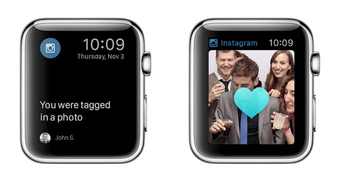
I am ready for the iWatch. I am excited about the concept. And even more excited about the design possibilities. I just can’t get enough of it. So I loved Fast Company’s piece with design agency Huge, where common apps are reimagined for the device.
While none of these designs are anything more than imagination, it’s fun to image what’s next. Are you already starting to plan for wearable design? (You should be.) Are you thinking about all the new features that need to be a part of the user interface? (Elements such as the taptic engine, which provides feedback to the skin; voice commands; the wheel, because a watch is too small to pinch and scroll on-screen.)
There’s a lot tot think about, and all of it centers around designing apps that are made wearable devices, and are not just smaller versions of mobile apps.
The Huge project broke down possibilities for popular apps and tasks: Uber, Foursquare, Chase, Fandango, Instagram, The New York Times, beacons, personal budgeting and finance, to-do lists, sports and fantasy, navigation and kitchen work. You’ll have to head over to Fast Company to see them all, but here’s what Huge had to offer about Instagram.
- Possibilities: “Notifications of new interactions; photo browsing with the digital crown” (scrolling mechanism).
- How it will work: “It will be difficult to edit photos on such a small screen, so Instagram will have limited functionality on the watch. But users will still benefit from instant alerts, messaging, and viewing.”
Social Media Update
It seems like you need a new cheat sheet every year to keep up with the changing sizes and specs for all of your social media profiles. SetUpABlogToday created a great infographic that details all of those sizes – by network – for you.
The cheats include all the image guidelines and specs for Facebook, Twitter, Instagram, Pinterest, Tumblr, LinkedIn, Google+ and YouTube. While some of the numbers are familiar, a lot of the specs have changed recently. (Did you actually upload a LinkedIn header?)
So if you haven’t updated your social media profiles in a while, this is your chance.
Just for Fun
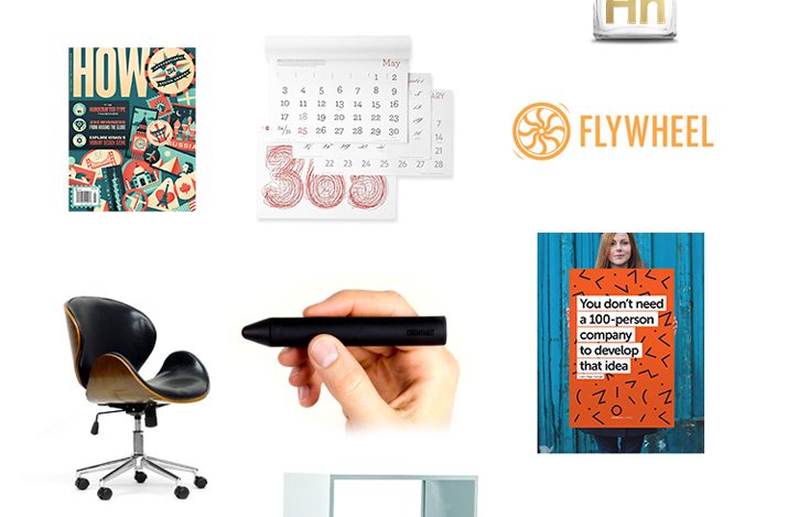
Almost everyone loves free stuff – especially free design stuff – right? Then enter the 28 Days of Design giveaway, happening now through Feb. 9.
Giveaway sponsor Flywheel has more than $10,000 in design tools and products from 28 of the best brands in the business, including Creative Market, HOW Magazine, Skullcandy, Studio Neat, Invision and more, and will give away something each day. Plus, one lucky winner will take home more than $2,500 in products from every brand in the giveaway.
It’s easy to enter. Submit your name and email address in the form, share the prize link on social media and cross your fingers. Good luck!