This Week in Design: March 21, 2014
Sometimes your eyes really do play tricks on you. While you may be looking at one thing, but think you are seeing another. Many users might have noticed this recently with Google and a change to the way search results display. We also are thinking about how you look at things with a study that shows what makes people remember infographics, plus a few easy-on-the-eyes goodies.
Every week, we plan to a look at major product releases and upgrades, tools and tricks and even some of the most popular things you are talking about on social media. And we’d love to hear what’s going on in your world as well. Have we missed anything? Drop me a line at [email protected].
The Ultimate Designer Toolkit: 2 Million+ Assets
Envato Elements gives you unlimited access to 2 million+ pro design resources, themes, templates, photos, graphics and more. Everything you'll ever need in your design resource toolkit.


Google Tweaks Design of Search Results
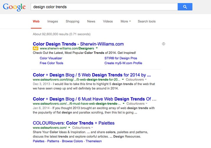
Your eyes are not deceiving you. Google search results do look different on desktop computers these days. The web giant has rolled out a design update to most users that includes a few significant changes.
The tan or pink boxes around paid search returns in Google have disappeared and have been replaced with paid search results that look much more like organic search results. The only difference? A small yellow “Ad” designation in the top left corner.
There are plenty of other subtle design changes as well. The famous underline that denotes a link is also missing and the font size has been increased a few points.
The change in design is the second phase of this aesthetic, which has been used on mobile devices for a few months. The new look is more conducive to touch screens and tapping but also works for clicks.
Whether the change is welcome or not is debatable. While some users like the new look, others are not so happy and a handful of hacks to help users go back to the old look are making the rounds on social media. One of the most popular hacks is from Slate. Which look do you prefer?
The Secret to Creating Successful Infographics
The web is flooded with infographics thanks to tools such as Visual.ly that make them quick and easy to create. But what makes this marriage of text and images effective?
A recent study by a group of Harvard researchers shows that there are some elements that can make an infographic more successful. This study, one of the largest visualization studies ever conducted, asked “What Makes a Visualization Memorable?”
The answers were some things we already know (and maybe a few that aren’t so common). The top takeaways are that the best elements are not necessarily charts and lines but recognizable elements, color is important, images with clutter were much more memorable and images with circles and round images ranked high.
You can find out more details about the study from Webdesigner Depot.
Trend: Hand Drawn Wedding Designs
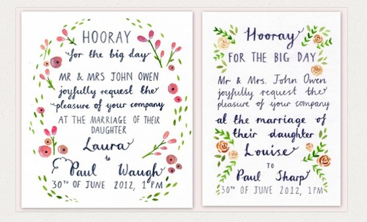
Wedding season is just about to go into high gear. From planning the big day to creating a website or sending out invitations, one of the trends in wedding design is hand lettering and illustrations, according to a recent article by Creative Market.
Hand drawn invitations can be a personal and possibly less expensive option for couples. From pops of flowers to bold banners to woodland creatures or hipster themes, hand-made styles can vary dramatically and offer something to suit almost any taste. Plus, something this customized can really showcase the personality and desire of the couple.
So get your DIY on and try your hand at this trendy item. Even if you don’t have a wedding job to do, it might be something fun and creative to add to the design portfolio.
More Reasons to Adopt Responsive Design
We’ve been talking about responsive design here at Design Shack a lot for some time now but if you are not convinced that it is for you, Web Design Ledger and Genetech Solutions put together “Top 5 Reasons to Adopt Responsive Web Design in 2014.”
They are on to something. Responsive design, which allows a single website design to work on a variety of devices, is the most talked about design technique out there. And more and more sites are adopting responsive site design everyday.
Here’s are the top reasons why from WDL:
- Google recommends it
- Lower bounce rates
- One website means one SEO campaign
- Less website maintenance with one site versus having one for desktop and one for mobile
- Guaranteed return on investment
Flat Color Freebie
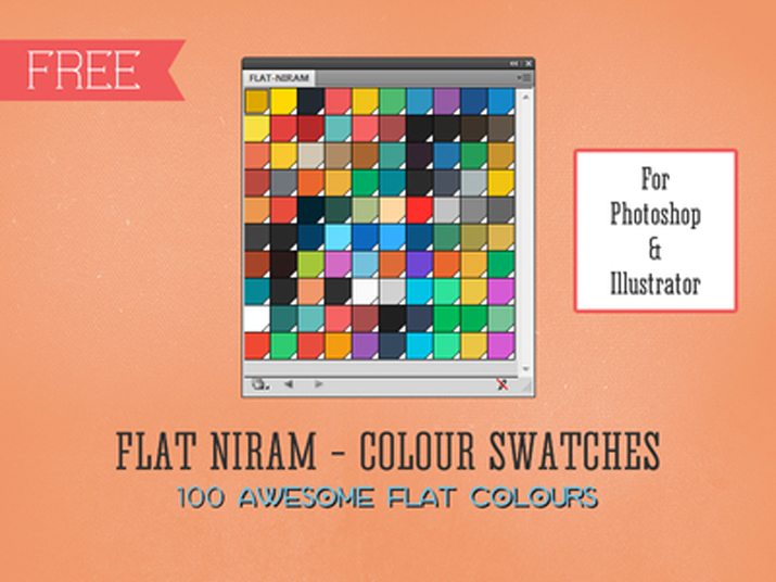
It’s not too late to grab this fun freebie from Tharique Azeez on Dribbble: Flat Niram Colour Swatches. The download, available in Adobe Illustrator or Photoshop formats, contains 100 colors in the vein of flat design.
The palette contains enough colors to get you going on almost any project featuring flat design styling and is super trendy. Each shade is bright and saturated with complementary hues that make it easy to get started on a new project.
And if you are worried that 100 colors will be overwhelming, pick your favorite and use a color tool (such as Adobe’s Kuler or Color Scheme Designer) to build a palette based off your favorite hue.
What’s New in Creative VIP?
The discounts and goodies just keep adding up for Creative VIP members, an exclusive subscription-based network of deals, design resources, discounts and even goodie bags for creative professionals. Here are five great deals members are taking advantage of right now:
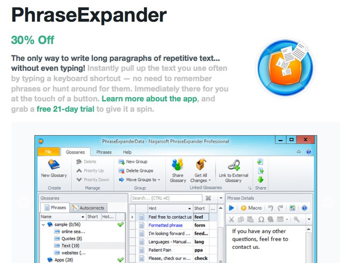
- 30% off PhraseExpander, an app designed to help you remember phrases and pull them up immediately. (Includes 21-day free trial.)
- 1 month free of Skillfeed, which is packed with video tutorials to keep you in the know.
- 10% off any Squarespace purchase to help you build a great hosted website.
- 30% off your first year of hosting from Heart Internet.
- 25% off all domain names from Name.com.
Membership plans start at $5.99 per month. You can join today.
For Your Viewing Pleasure
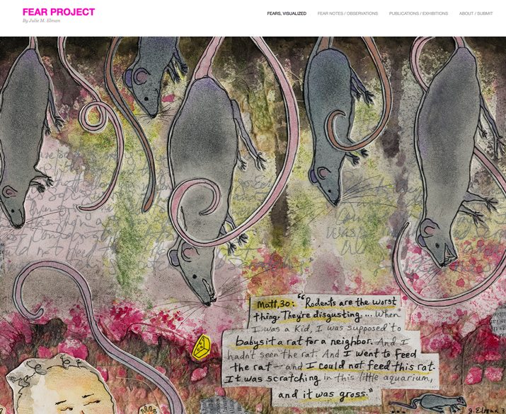
Who knew fear could be so beautiful? Thanks to visual communicator and educator Julie Elman’s The Fear Project, it can be.
The website, and accompanying Facebook, Instagram and Twitter sites, takes common fears and represent them visually through illustrations. From a fear of rodents to fear of being alone to fear of cancer or bees, Elman has sketched them all. Her work has been featured by various publications and in physical spaces all over the United States.
“Since starting this project in early 2012, I have become much more aware of how pervasive fear is in this world,” Elman says on her website. “I think often about how fear can be either crippling, or a driving force to motivate people to move past it. This project has resonated strongly with people, I’ve discovered — simply because of how deeply embedded fear is in most of our daily lives. Everyone can relate.”
What are you afraid of? Find an illustration you can relate to in Elman’s gallery or send her a request. She just might draw it for you.