This Week in Design: May 2, 2014
Sometimes a touch of something old reminds you of something new. This week the reminder of a forgotten book helped jog my creative thought process, while a new Wikipedia design concept really caught the attention of designers around the web.
Every week, we plan to a look at major product releases and upgrades, tools and tricks and even some of the most popular things you are talking about on social media. And we’d love to hear what’s going on in your world as well. Have we missed anything? Drop me a line at [email protected].
2 Million+ Digital Assets, With Unlimited Downloads
Get unlimited downloads of 2 million+ design resources, themes, templates, photos, graphics and more. Envato Elements starts at $16 per month, and is the best creative subscription we've ever seen.


‘Creative Sleep’ Applies to Writers and Designers
Just this week I came across Maria Popova’s thoughts on Stephen King’s “On Writing” memoir via Brain Pickings. Sadly, I had forgotten how inspiring the book was to me as a writer. So I read it again. I found it just as inspiring in my design life as well.
King’s writing really helps you think about the creative mind in a new way. He encourages you to think differently about the way you see and do things. The book makes you think.
Popova said it beautifully: “King likens the creative process to a kind of wakeful dream state. Just like sleep shapes our every waking moment, King argues this dozing of the waking mind shapes our creative capacity by releasing our repressed imagination:
‘In both writing and sleeping, we learn to be physically still at the same time we are encouraging our minds to unlock from the humdrum rational thinking of our daytime lives. And as your mind and body grow accustomed to a certain amount of sleep each night — six hours, seven, maybe the recommended eight — so can you train your waking mind to sleep creatively and work out the vividly imagined waking dreams which are successful works of fiction.’”
And the idea of “creative sleep” is one I wholeheartedly endorse. There are many nights I fall asleep trying to work out a problem – in text or design – and wake up with an answer. The creative parts of my mind were working and figuring while my body was at rest. (Just like the idea of talking a walk or listening to music when you are stumped, allowing yourself to step away from a problem in order to solve it.)
I love the idea and find it fascinating and recommend the book for writers or designers. “On Writing” was first published in 2000 and a 10th anniversary edition is widely available.
History of the Penny and Its Typography
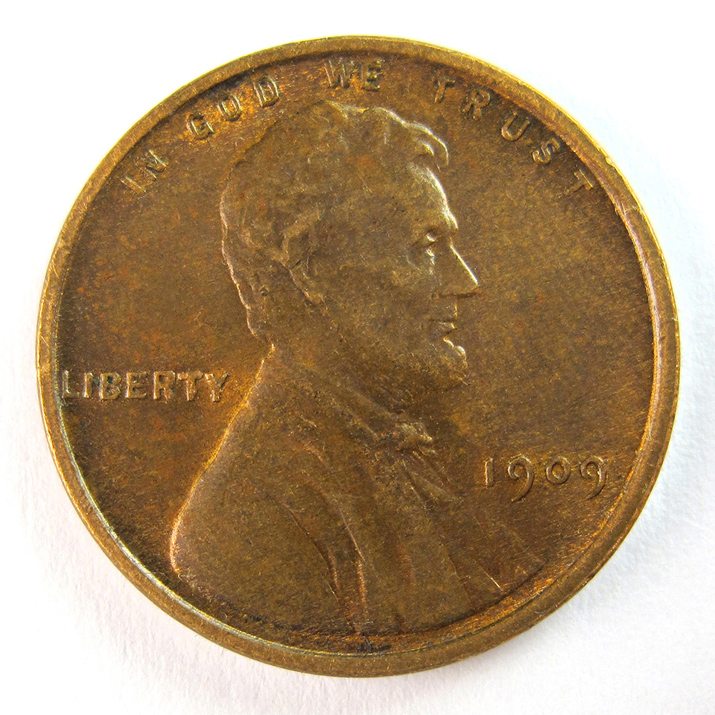
The penny. One cent. It’s a coin that has been the subject of great debate in the United States – should it be retired? And an afterthought – it is only 1 cent.
“Pennyspotting” on the Frere-Jones blog is a fun look at the history of the coin. The post takes a look at the coin and type on it from the very first year of mintage in 1909 to more modern coins.
It’s fun to see how some lettering has changed, such as “In God We Trust,” around the top of the coin, and the typeface style for the date. The “wheat penny” also featured a back that was almost all lettering, which was the last of such coin designs in the United States. (Coins now dominantly feature images on both sides.)
Most interesting might be how the composition of the coin has impacted the design. (It’s quite the lesson in package design.) While the coin was made lighter and shallower, the type followed suit.
“The figures became lighter and more monotone, losing the modeled quality of sculpture. The trend towards flatter surfaces has gradually continued since then, and now a penny feels more like a laser print than the tiny sculpture it actually is,” the post reads.
A Fresh Take on Wikipedia
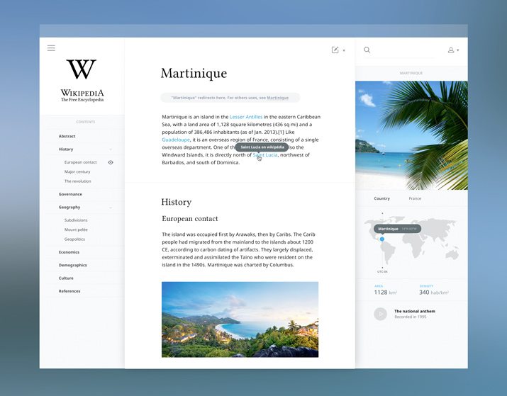
Fast Company recently featured a new Wikipedia design concept that would aesthetically take the site to a new aesthetic level. The design is by UX designer Salomon Aurelien, who has no affiliation with Wikipedia.
While it looks vastly different, Fast Company’s writer argues that it would never actually come to pass. While the reasons are numerous – you can read them all in the article – the main concern is cross-device and platform accessibility.
But don’t get too set on the current look of Wikipedia. The site’s design team is working to develop a new look; there is no timetable for when it might happen.
UX Research Can Improve Your Website
What if you could perfect your website with three bits of information? In a recent post for Webdesigner Depot, Paula Borowska explains three user testing concepts that can make a lot of difference. The article also explains how each method works and what the benefits can be for your design.
The methods are described in full detail in “Perfect Your Website With 3 Simple UX Research Methods.” They are:
- Experience sampling
- Card sorting
- Usability testing
The article makes each method easy to understand and doable for a number of web-based projects. Which method(s) do you prefer? Share your thoughts in the comments.
Cool Tools: ChargeKey and ChargeCard
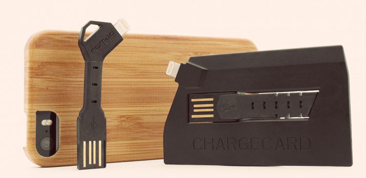
There’s nothing better than little gizmos that make your life easier. ChargeKey and ChargeCard are two of those tools. The tiny USB cables are the most portable connectors you will find.
ChargeKey is shaped like a key – and fits on your key ring – and ChargeCard is a credit card-sized device. Both allow you to transfer files quickly and easily and don’t require you to keep a bunch of cords stuff in your bag. As an added bonus both small devices, ahem cables, work double duty as chargers for your USB devices as well. (And it works perfectly on my iPhone.)
ChargeCard started as a Kickstarter project last year and ChargeKey was launched on Indiegogo, but both are now available in the U.S. and UK on Amazon.com. Each item retails for $29 and is available as USB to lightning (works with newer Apple devices) or USB to Micro USB (Samsung Galaxy, Android, Windows Phone and Kindle). ChargeCard also has an iPhone 4 option.
You can learn more from parent company NOMAD and even try to barter for a ChargeCard or ChargeKey. (Really!) The company says it has received an overwhelming response, ranging from custom bikes and die-stamped office furniture to wall art and artisanal popcorn for one of these cordless USB “cables.”
Buy direct from NOMAD and save 20 percent. Happy shopping!