This Week in Design: May 9, 2014
This week has been busy. From a list of the best new typefaces of the year being released to a new PayPal logo, there has been plenty of news in the design world. Add in a few fun topics as well – the Target Photoshop disaster that just won’t go away — and this week in design has been packed with news and information.
Every week, we plan to a look at major product releases and upgrades, tools and tricks and even some of the most popular things you are talking about on social media. And we’d love to hear what’s going on in your world as well. Have we missed anything? Drop me a line at [email protected].
The Ultimate Designer Toolkit: 2 Million+ Assets
Envato Elements gives you unlimited access to 2 million+ pro design resources, themes, templates, photos, graphics and more. Everything you'll ever need in your design resource toolkit.


Top Typefaces of the Year
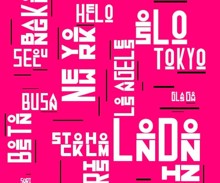
The Type Directors Club has named its top typefaces of 2014. The list of 24 typefaces was selected from nearly 200 entries submitted from 29 different countries. The winners will be included in the Annual of the Type Directors Club, Typography 35 and exhibits that will tour cities all over the world.
Four of the world’s best-known typographers served on this year’s jury – Andy Clymer of Hoefler & Co.; Jesse Ragan of type@Cooper; Ellen Lupton of Cooper-Hewitt; and Georg Seifert of Glyphs App. Find the complete list of winners from the Type Directors Club. Here’s the top 10:
- Sori
- Metro Nova
- Odesta
- Azer
- Pizza Press
- Columbia Titling
- Amplify
- Chimera
- Mislab
- Duplicate Ionic
Every Color Charted, Before Pantone
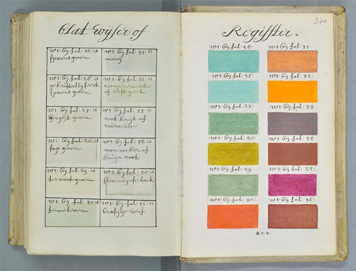
Eight hundred pages of color swatches. 800 pages. And the book was published (or handwritten as the case may be) in 1692. “Traité des couleurs servant à la peinture à l’eau” by Dutch painter A. Boogert catalogued color long before the authority we know today, Pantone, was ever imagined. (The first Pantone Color Guide was published in 1963.)
The book was featured in art, design and visual culture blog Colossal this week. The featured pages from the book are pretty amazing to look at and are so similar to the look of swatches we are so used to seeing today. You can also view the full book from e-corpus.
Erik Kwakkel, a medieval book historian who translated the introduction, told Colossal that the book was developed as an educational guide. Sadly, few people likely saw the color collection. The only copy of what is likely the world’s first color guide book is at the Bibliotheque Mejanes in France.
Why Developers Need to Learn Design
Thank you Stephen Caver for saying something that many designers think, but might hesitate to say. “… developers should learn and practice design.”
Caver, now a developer at Happy Cog, has the right experience to say this. He’s been a designer. He knows how to code and write websites. And understanding both is the key to real success.
Caver points to four things that are important for developers when learning design and you can read about each in detail on the Happy Cog blog. Here are the highlights:
- ”The primary reason any developer should learn design is to gain empathy for the designers with whom they work.”
- Adapt for a responsive web and learn to make changes on the fly.
- An understanding of design can equate to an understanding of the user.
- ”Perhaps the best reason to learn design is to enjoy the work more. … The satisfaction I feel when a project launches is even greater when my contribution goes beyond the technical.”
PayPal Gets a Facelift
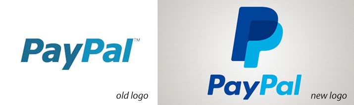
If you are a PayPal user, it’s likely you noticed a change to the logo this week. The image changed from a simple logotype of the brand name to a logotype with a double P image. (You can see the old and new versions above.)
The new logo is a simple evolution, according to PayPal. “Our new logo is not dramatically different, rather it’s an update of what millions of people look for and use every day, around the world. We want this update to confer a sense of momentum that embodies our vision of optimism, progress and empowerment. For our name, we chose a typeface, colors and shapes that are simpler, richer and more vibrant.”
The logo has started appearing on many of PayPal’s products, including the homepage and app icon. It will be rolled out worldwide in the coming days and weeks.
The reviews of the icon are mixed. While it is simple, the typography leaves something to be desired. The double P looks nice as an app icon but a little odd to me on the website. The blues used in the new logo seem a bit richer and brighter.
How do you feel about the new logo? Share your thoughts with us in the comments.
More Photoshop Mishaps

A Photoshop disaster in a recent Target ad went viral earlier this spring. The image shows a woman in a bikini with some obviously edited parts of the image. (Can you spot the three major issues?) It has sparked a lot of conversation about the common practice of altering images and related body issues.
And as bad as this mistake was, it isn’t the first time a big company has made a major blunder. Business Insider put together a great slideshow of other ads gone wrong in “The Worst Photoshop Fails of All Time.”
Take a look at each image before clicking next. Can you spot the Photoshop fail?
Stumped? Here are 7 Things to Sketch

We all know that sketching can be a great way to get the creative juices flowing. But how do you get started? Whatever would you sketch?
The blog Geek Mom had a pretty good answer recently with “Seven Sketching Hacks for the Artistically Inhibited.” The post lists a handful of different things or concepts to sketch when you are trying to feel more creative. The post explains how to get started with each different type of sketch and how it can prove to be beneficial.
- Draw rebus pictures
- Draw studies
- Draw the same thing repeatedly
- Draw your feelings
- Draw your day
- Draw on memories
- Draw abstractly
- Doodle
Remember, you don’t have to be a great artist or illustrator to benefit from sketching. Almost any designer or creative professional can benefit from this activity. (Learn why in the previous Design Shack post “You Should be Sketching, Even if You Can’t Draw.”)