This Week in Design: Sept. 19, 2014
Are you learning something new in your career? How are you working to push the boundaries of design? Those are things that good designers do. This week, we look at one of the guiding voices in web design since the earliest days of the Internet, ways to be student for life and a few bits of food for thought this week in design.
Every week, we plan to a look at major product releases and upgrades, tools and tricks and even some of the most popular things you are talking about on social media. And we’d love to hear what’s going on in your world as well. Have we missed anything? Drop me a line at [email protected].
2 Million+ Digital Assets, With Unlimited Downloads
Get unlimited downloads of 2 million+ design resources, themes, templates, photos, graphics and more. Envato Elements starts at $16 per month, and is the best creative subscription we've ever seen.


An Intimate Look at Jeffrey Zeldman
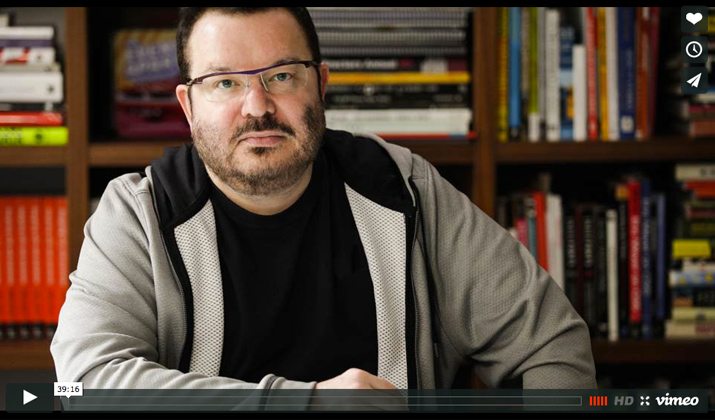
“The voice of our field.” That’s the way An Event Apart co-founder and self-proclaimed communication designer Jeffrey Zeldman is described in the opening frame of a new documentary about his time in the web design community.
The 40-minute video produced by Lynda.com is an inspiring look at design, our industry and one of the pioneers that many of us look up to. Zeldman, also the man behind A List Apart and A Book Apart, talks about his evolution with the web from the early days of AOL (and some poor looking websites) to some of the more modern designs we know today. Other influencers in the industry also explain how his vision has helped shape almost everything we do on the web.
“He’s also a community leader that other designers look to for inspiration. This film is an intimate portrait of a man who has helped shape the web but isn’t recognized by most of the people who use it everyday.”
Some of the things you may know Zeldman for include his design style, which is quite narrative visually, and being at the forefront of pushing ideas to the next level. He convinced Netscape and Internet Explorer to support HTML and CSS and now he’s working to evolve the web even more. And it all started for him in the seventh grade with a comic book.
If you want to feel invigorated about design or the web or just innovation in general, this short documentary is a must-watch. Set aside some time and dive in to the video in the same way Zeldman says he gets into every project: “Whenever I get interested in something, I dive into it obsessively, pretty much to the exclusion of everything else.”
Junior vs. Seniors Designers
It’s your workflow in sketches. The creative processes designers go through en route to completing a project can vary greatly depending on the stage of your career. Julie Zhuo perfectly describes this process in a series of sketches in a recent blog post “Junior Designers vs. Senior Designers.”
“I like words a lot,” Zhuo says. “But sometimes a few sketches communicate a point more simply and memorably.” While you can see the process of a junior designer above, you’ll have to visit her post for the other sketches. But here are my takeways of how the processes vary in words.
- Junior designers follow a crooked path to a single end result.
- Senior designers start and stop multiple times on the way to a completed project.
- Junior designers want to make things look good.
- Senior designers want to make things that have use and value.
- Junior designers are most burdened by the actual design but are confident in understanding the problem and selling the design.
- Senior designers work from easy to hard during the process of understanding the problem, designing and then selling and executing the design.
Never Stop Learning

One of the best ways to better yourself as a designer is to never stop learning. Tim Larsen, president of Larsen Design recently penned a great bit of inspiration for AIGA on his experience as a designer.
So how can you keep learning and evolving? The simple answer is to be a student for life. “After college, stay involved; keep learning, questioning, growing. Knowing how much there is to know will keep you humble, and creativity and humility make a good pair,” he writes.
Other ways to keep learning include:
- Be broad-minded
- Be detail-oriented
- Be generous
8 Tips for a Perfectly Minimal Design
Minimal design styles are super-trendy right now. Simple color, simple lines and few effects are all the rage when it comes to web and printed projects. But what can you do to ensure that you don’t add too many effects when you are trying to think minimal for the first time?
Optimind Technology Solutions, a marketing firm, recently published a great list to help you figure out of minimal is for you. (And if you can do it inline with the trend.) Specific elements of the minimalist trend include use of logo, color and layout together in a way that embodies the style. Adding too many effects to “punches or pops” to any of these part of the design can blow your minimal outline.
Here are eight tips for thinking minimal:
- Embrace flat design
- Integrate white space
- Minimize choices
- Simplify navigation
- Integrate bold typography
- Lessen colors
- Introduce patterns
- Evoke emotion
Just for Fun
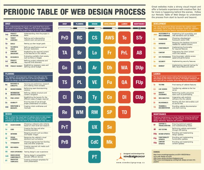
Getting a website from the design phase to launch can be a pretty overwhelming process. But planning it all out step-by-step can make it a lot easier. That’s where the “Periodic Table of Web Design Process” infographic comes in.
The massive chart is a fun and visual look at planning a project from the design brief to planning to design to development to launch to maintenance, and all the steps in between. Everything you need to know from start to finish is detailed.
Head over to New Design Group and download the chart today. You might even consider printing and laminating it for your office wall.