Design Trend: A New Generation of Image Sliders
Website sliders are one of those design elements that we don’t love but have learned to live with. Generally, they don’t provide a lot of click value, but clients seem to love them.
A new design trend that features a new style of image sliders, fixes some of the functionality (and design boredom) issue of sliders. These aren’t your old-school image scrollers (and you won’t recreate these techniques with plugins).
Here’s a look at different design elements and ways of using this design trend so you can find renewed inspiration next time a slider is part of a project.
The Ultimate Designer Toolkit: 2 Million+ Assets
Envato Elements gives you unlimited access to 2 million+ pro design resources, themes, templates, photos, graphics and more. Everything you'll ever need in your design resource toolkit.
Connected Slides
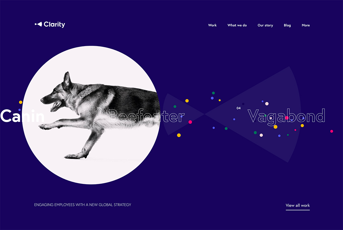
When you think of a website slider, the image of the inter-connected image and text blocks that move from left to right across the screen probably comes to mind.
Sliders often fit inside of contained boxes with buttons to advance slides (some have auto-play).
The modern spin on this technique is to pull “slides” out of the container and make them more visually interesting and interactive.
Clarity does just this with a slider that moves left or right and includes images and text (with some nifty animation). Each slide features a portfolio project, which users can click to access.
This slider works as you would expect but it has a much more visual presence.
Scrolling Cues
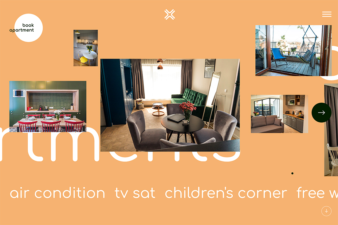
A key component of creating optimum understanding and usability for sliders is to include visual cues for scrolling.
Most sliders include either left and right arrows to signify this action or timeline dots that show which slide you are on. Both styles can work with user click to advance interactions or in an auto-play situation.
What’s most important is signaling that scrolling slides are possible (and encouraged). Because so many website visitors are prone to skipping over anything other than the slide they see, these cues can help keep them interested for longer and to potentially click through to other slides.
Mini Navigation
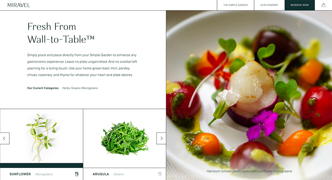
Most sliders are designed to provide multiple points of information and links to different parts of the website. So, it’s almost a no-brainer that sliders can serve as a type of navigation.
The example above from Miravel is an example of a neat mini navigation slider with a couple of elements on the screen that users can advance left or right or click to change the large image for a menu item using that ingredient.
It turns the slider element into a simple type of navigation with an almost gamification style that makes users keep clicking once they understand how the interaction works.
Hover States
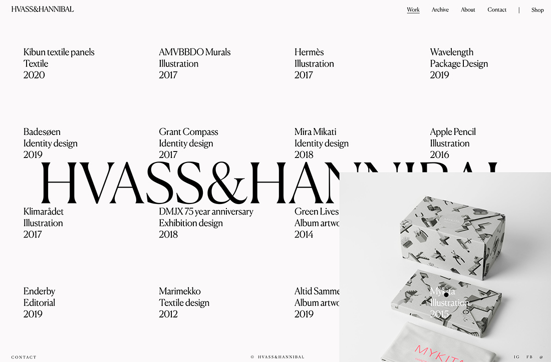
What if your idea of a slider isn’t a slider at all? It’s a tool that gets at the same usability – highlighting multiple elements on one screen – without all the sliding.
There are probably a few ways you can do it, but one that stands out is the use of hover states by Hvass & Hannibal, above.
The faux-slider uses hover states that bring up images of projects when you bring the mouse to the name of the said project. It’s not a complicated aesthetic but provides a “slider” solution without all the scrolling and sliding. It’s intuitive and easy to use and understand.
For E-Commerce or Shopping
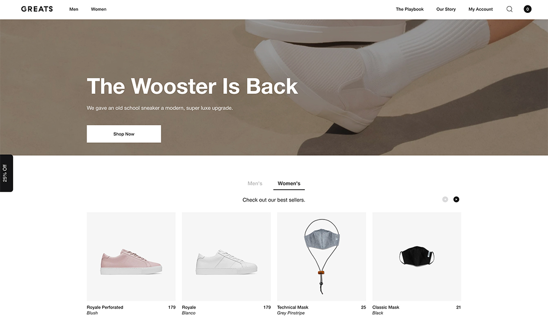
Sliders are becoming more commonplace for e-commerce and shopping websites. These sliders are structured in a visually different manner than hero header versions.
The biggest difference is in the size of image elements – they are often much smaller and only show a product image. The other considerable difference is that text is dropped out of the image area to space below the image. (This makes it easier to see the product and read the descriptive information.)
This shopping slider style might appear on home or landing pages and helps show website visitors a variety of product options early in the click funnel. The slider intends to show potential shoppers something they would want to buy.
Most of these sliders are rather simple and contain five to 10 slides. But they can be quite small as well. Greats, above, uses a small version of its main slider in other locations on the website with just two visible slides at a time. Otherwise, it looks like the larger counterpart.
To Showcase Multiple Elements

The primary reason a slider is used in most website designs is to provide the ability to showcase multiple elements “at one time.” (You can argue the merits of this with clients later.)
One way more designers are making this clear in a way that encourages sliding is to have elements – most often images – cut off on either side of the screen. This is an obvious visual cue that there is more to the photo and you need to do something to see it.
This use of visual disruption can provide just enough of a usability cue to help website visitors interact with the design, and slider.
In a Split Screen
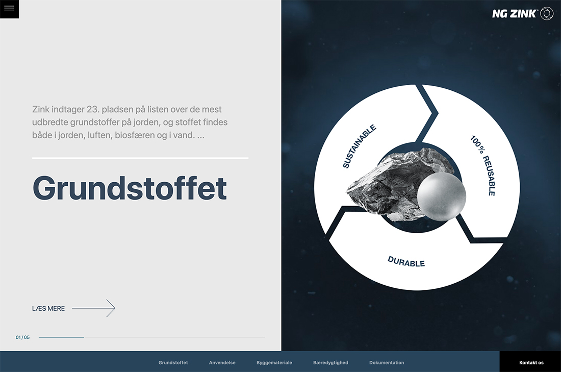
Add a slider to another trending design element – split screens.
Keep in mind that when you use a different shape – the slider element will likely be a lot less vertical now – it’s important to help users understand what to do. NG Zink, above, uses arrows to indicate interaction. The arrow shows you what to do as well as helps shift the eyes to that part of the screen.
This design uses multiple scroll actions and is fun to play around with some.
Conclusion
The bad news is that sliders are trending again. The good news is that you can create a design that uses multiple slides and bits of content interestingly.
If you pay close attention, some of these sliders aren’t sliders in the traditional sense. They simply mimic the left to right “slide” behavior that many people have become accustomed to. When it comes to sliders, be creative and think about the problem you are trying to solve with the design before jumping in.
