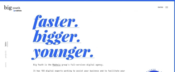
Back to Basics: Beautiful Typography in Web Design
A great website starts with beautiful typography. And while breaking the occasional rule is great, sometimes it’s good to get back to the principles of what makes great typography — and how to create it.
It’s a vital refresh that can help you rethink projects, consider a new approach or just get back to a simpler, more streamlined design.
So today, we’re ignoring trends and ways to break the rules to focus on typography theory and how the “rules” can be a great guideline for creating phenomenal type.
2 Million+ Digital Assets, With Unlimited Downloads
Get unlimited downloads of 2 million+ design resources, themes, templates, photos, graphics and more. Envato Elements starts at $16 per month, and is the best creative subscription we've ever seen.


Size and Hierarchy

Size matters. Size can be one of the most important factors when creating an outline for readable typography on screens. Tiny text can be jarring and difficult to see. Oversized text can break across lines in odd ways and cause confusion.
Readable typography has several layers of hierarchy to tell users what to read first, second and so on. There’s an obvious scale so that body text is one size across the design, headlines are another size and breakouts and subheads have their own specifications as well.
Tracking and Kerning

Often confused, tracking and kerning are not the same thing. Kerning is adjustment of space between a pair of letters. Tracking is adjustment of space between a full set of characters, such as a paragraph or overall adjustment to a block of text.
Kerning is often applied to individual elements to create precision and enhance readability and even style for large text. Tracking is often used to tighten a loose typeface in body copy.
Limit Typefaces

Too many typefaces can be overwhelming and jarring. Two or three typefaces is enough for most projects.
The key to picking a solid type option is to choose a type family with plenty of variation in style. Most quality typefaces come with multiple styles – bold, regular, italic, condensed, black and so on. By choosing a typeface with multiple options, you’ll have a weight and style for multiple uses. (Some families even include serif and sans serif options if you want to keep the entire design in a single font family.)
Mix and Match Styles

When you are picking typefaces – admittedly this can be the toughest part of many design projects – it is ok, and even preferred, to choose two different styles of type.
The most common pairing is a serif and sans serif. But you don’t have to stick to that.
When pairing different styles and typefaces, look for lettering that has a similar x-height (look for character sets with the same vertical lowercase “x” size) and shape of bowls (space inside of closed letters such as an “o”).
These details can make a lot of difference in terms of how typefaces feel together and how easy it is for users to read the text. Using similar letterforms in different styles still has a visual familiarity that can make all the type easier to read together.
Forget Hyphens and Justification
Most of the time, hyphens and full justification are unnecessary.
Particularly online, these techniques can make text more difficult to digest and understand at a glance. Hyphens break up the reading experience and full justification often results in odd spacing that’s difficult to read.
While both elements have their place in some projects, they should most often be avoided.
Don’t Alter Fonts
You should never ever adjust a font. Don’t try to make it fatter or taller or thinner. Pick a new typeface instead.
Type designers work hard to create a consistent set of characters for a typeface that are readable and fit the style of the font. Don’t try to change the look of a set of characters. You won’t improve them and often will make a mess of the type in the process.
If a typeface doesn’t quite work the way you need it to, look for something else. Try the Identifont similar font tool, which identifies typefaces with similar appearances, to select another option that might work better in your project.
Contrast

Design for contrast using typography. Just as you would use different sizes to create hierarchy, consider different font weights, colors and styles to provide visual interest.
Color is one of the most effective – and easy – ways to create contrast. The ideal contrast is dark text on a light background (or the reverse). There are an almost unlimited number of color options to help you achieve this. When playing with color and typography, be aware that some color combinations, such as bright red on right blue can be really tough to read. Look for combinations that are different in terms of light vs. dark, vibrancy and saturation.
When it comes to contrast, simple backgrounds are often best for giving text room to be read. But if the background contains visual elements, such as an image or pattern, bump of the size of lettering to create separation between the background and foreground text element.
Measure Matters
A measure is the size of the container that holds text. This can be the width of an entire text frame or a single column in a multi-column format.
Measure matters because the number of characters (including spaces, glyphs and punctuation) across the screen can impact readability. The theory behind this concept is that if lines are too long or too short, it can be tiring for the user’s eye to read because of a constant back and forth motion from one line to the next.
From The Elements of Typographic Style: “Anything from 45 to 75 characters is widely regarded as a satisfactory length of line for a single-column page set in a serifed text face in a text size. The 66-character line (counting both letters and spaces) is widely regarded as ideal. For multiple column work, a better average is 40 to 50 characters.”
This is a pretty good starting point for most projects, although many projects are skewing to type sizes that are a little bit larger, which would make the character count fall into the smaller end of that range.
Even though mobile typography wasn’t a concern when the book was first published, the guideline for multiple columns is an acceptable starting point. You can even opt to go a little lower and aim for a more optimal 35 characters per line for small screens.
Conclusion
If you want to keep thinking about typography theory and lettering, there are some great books in addition to the classic mentioned above.
Consider:
- Thinking with Type by Ellen Lupton
- Why Fonts Matter by Sarah Hyndman
- Just My Type: A Book About Fonts by Simon Garfield