8 Things to Stop Doing With Typography (Right Now!)
Good typography is an art that shouldn’t be messed with too much. Letterforms flow together to form words and phrases that are readable and have subtle visual meaning.
But if you aren’t careful, it’s easy to ruin typographic beauty in an instant.
If you have slipped into any of these design traps, this is the time to stop doing anything on this list to type and clean up your design pieces. (Your portfolio will thank you.)
2 Million+ Digital Assets, With Unlimited Downloads
Get unlimited downloads of 2 million+ design resources, themes, templates, photos, graphics and more. Envato Elements starts at $16 per month, and is the best creative subscription we've ever seen.


Adding Drop Shadows
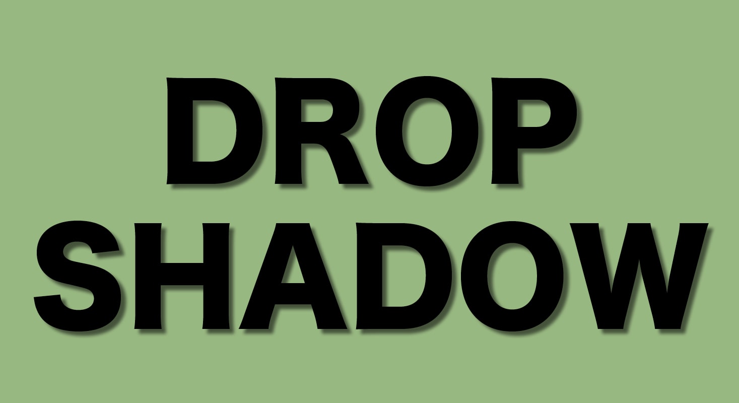
Most fonts are perfect just the way they are. (I am dead serious.)
If the letters don’t work for your design, maybe you should consider another type choice. Don’t take the lazy option and add a way-too-obvious drop shadow or outline to the text.
There’s this general rule about drop shadows that more people should follow — the best shadows go completely unnoticed. If you can see the shadow on a text element, then it is probably too big, too dark, and will get in the way of readability.
Honestly, using these effects is a fairly lazy way of trying to make text work. (You commonly see shadows and outlines on text that should have more contrast against the background.)
On the other hand, you can create some cool art-type text elements with shadows and outlines. But it is a technique that you’ll probably only ever use a couple of times in your design career.
Using Too Many Fonts
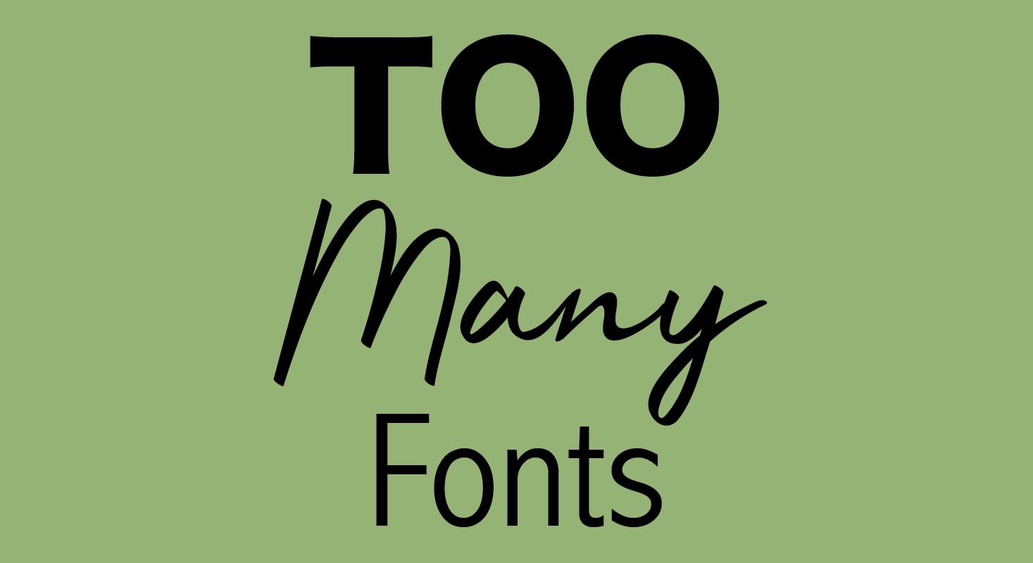
It should go without saying. But it requires repeating.
Using too many fonts ruins all of the typography in a design. Using fonts that don’t pair well with each other (or the content for that matter) can ruin the design.
Pick a typography palette for projects. Set a type hierarchy and work from there. Obey the type style rules that you set for the project and chances are that it will turn out ok.
Not sure how to pair fonts? Learn more.
Ignoring Contrast
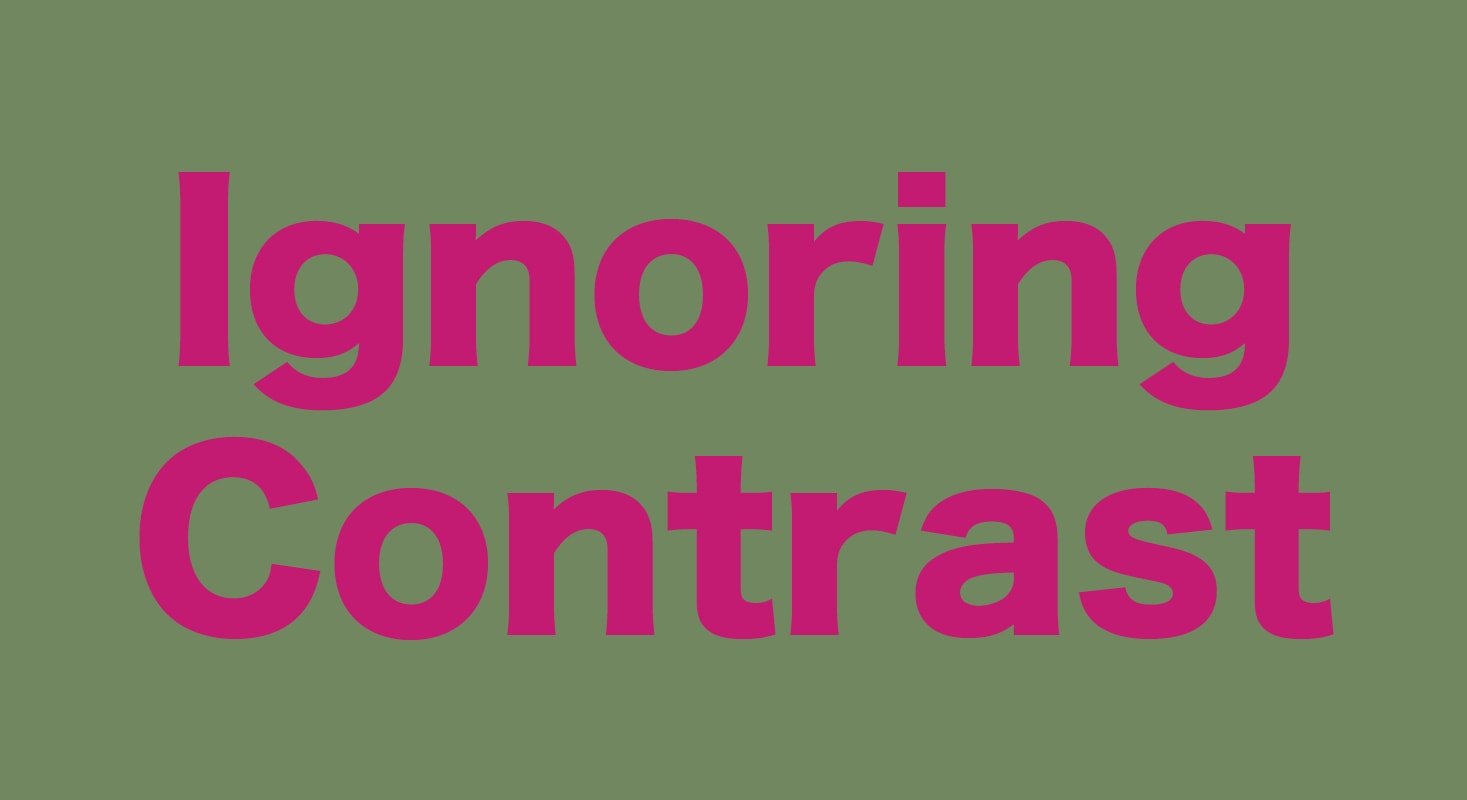
Contrast is the thing that makes every bit of the type in your design readable. This is true of print materials, websites, and even tactile items like shirts or billboards.
Not having enough contrast between the background and typography — or not accounting for changes to contrast due to backlighting or environmental elements — is a common mistake. And it can kill the effectiveness of every word in the design.
You only have a few seconds to capture someone’s attention with a design. Don’t waste that precious time as users struggle to understand the words you want them to read.
To ensure readability, you want to put light text on a dark background (or vice versa) and not use similarly saturated colors against one another. As a rule of thumb, using black (or dark gray) and white text is the best option, when you have doubts about color combinations.
A tool such as the WebAIM Color Contrast Checker can help you determine contrast for text elements. As a bonus, highly readable typography with strong contrast is a positive in terms of website accessibility as well.
Using Caps, Bold, and Italics Too Much

Did you know that lots of type styles can cause concerns when it comes to accessibility?
Using too many type variations – all caps, bold, italics, and underlining – can cause text to appear much more compressed and squeezed in than it really is. That’s a problem when it comes to readability.
If you are using these text effects for accents or to make a point, stop and ask yourself if there is a better way. All of these things are ok when used sparingly, but shouldn’t be throughout the overall design.
Double Spacing
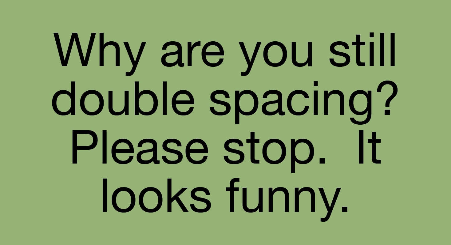
Stop putting two spaces between periods (and other punctuation) at the ends of sentences and the start of the next sentence. It only leaves an odd gap. This gap can get even more awkward at the ends of lines and result in spaces at the beginning of a sentence on a new line.
Modern digital typesetting is designed to take care of spacing between sentences for you. While you may occasionally need some manual adjustment, two spaces are seldom necessary (unless you are creating design elements on a typewriter).
Forgetting Device/Screen Size
Don’t forget about mobile users when setting font sizes for website design, emails, or even social media images that will be displayed on small screens (and contain text).
While this isn’t something that you do to typography per se, size has a great impact on whether people can understand the message. Some typefaces are also made for smaller sizes and render well, whereas other type families are much better suited for large display.
When it comes to thinking about font adjustments consider the size and leading. The space between lines is just as important as the size of the text itself.
Think about use and pick fonts accordingly. (Even if you have to adjust for different screen sizes, and you likely will.)
Using Hyphens in Display
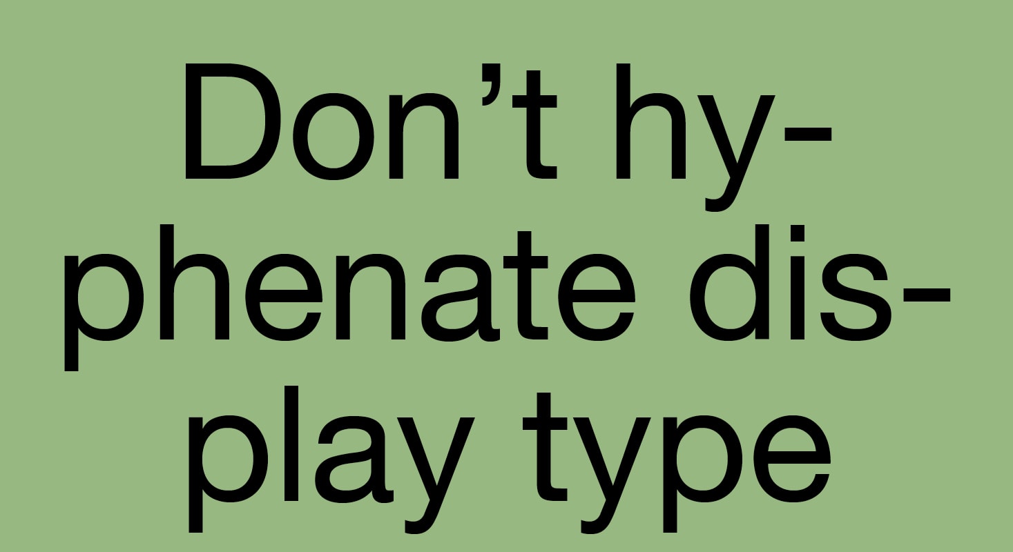
It’s not that big of a concern typically for web designers, but it’s a big deal for everyone else: Don’t hyphenate words in display type.
It’s just ugly. And hard to read.
Don’t do it.
Going On and On and On…
It’s time to stop thinking that you can just go on and on and on with type because it is on the web. No one is reading all of that no matter how beautiful the lettering is.
Stick to words that matter. It’ll make better use of your type choice so that people actually read it.
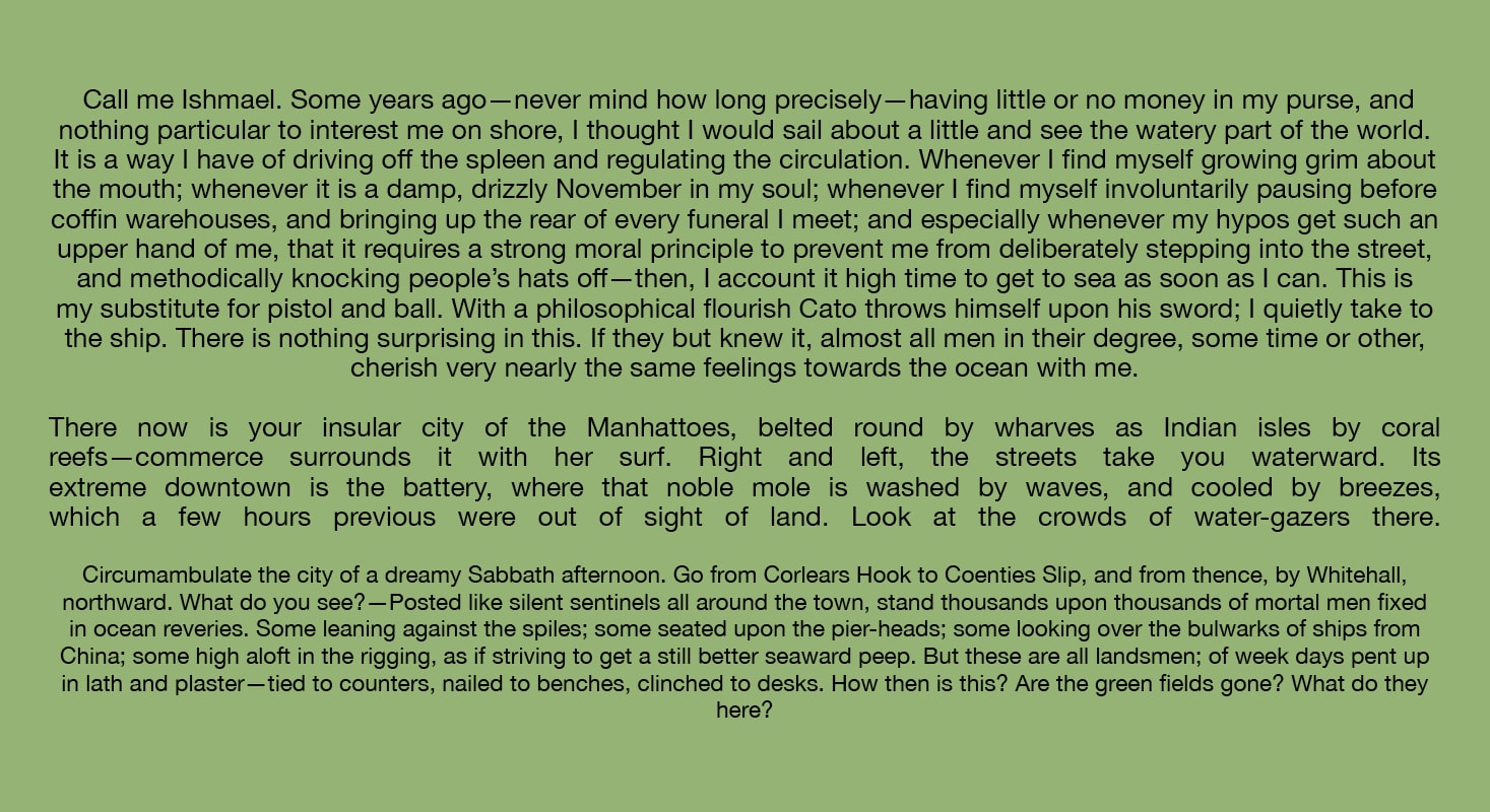
When it comes to text that goes on and on, think about the length of text blocks. Are paragraphs short and digestible? Do you use lists and formatting that makes it easier to scan?
Think about the number of characters per line – this helps dictate font size – and aim for 40 to 60 characters per line (somewhat less for the smallest screens). This can help you figure out if blocks of text are too chunky or awkward to read.
Stick to standard alignment for everything except headlines. Long blocks of centered text are incredibly hard to read. People don’t like or expect it – outside of poetry – and it causes a lot of eyestrain. Justified blocks of text are equally difficult to read if they are long and can cause awkward spacing issues that are a challenge to resolve in responsive frameworks.
The more text you have in the design, the more important typography becomes. Use a clear and easy to read font without difficult formatting in long blocks to facilitate readability.
Conclusion
Poor typography can ruin a project faster than almost any other design issue. For a design to be effective, people must be able to read and understand it. Most commonly, that’s in the form of typography.
Too much decoration, improper contrast or scale, and over-doing text elements are the most common issues you’ll find when it comes to typography. Remember to let letters stand on their own, provide plenty of contrast for optimum readability, and use fonts with words that have shared meaning and context.