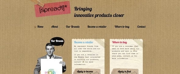
Spreadt
The handmade paper look of this site works well with the use of a custom typeface.
I like the torn paper effect and use of light blue and pink to highlight the key headings. I also find the use of punctuation in the logo helps to make the company name recognisable.