5 Typography Do’s and Don’ts Everyone Should Know
So you love typography, who doesn’t these days? The question is, how sloppy are you when it comes to implementing type in your designs?
Today we’re dishing up some great and simple typography tips that everyone who works with type should know. Whether you’re an expert or a beginner, read on to see if you’re guilty of any of these pitfalls.
Don’t: Let Photoshop Kern Your Text
This principle is typography 101. Photoshop is a great tool, but it and all other software with a type tool are no match for those crazy scopes implanted into the front of your face (your eyes).
Software uses an algorithm to find a “best guess” for how a section of typography should be kerned. In some apps, you can select between a couple of different versions of this. For instance, Photoshop and Illustrator allow you to choose between a “Metrics” and an “Optical” mode.
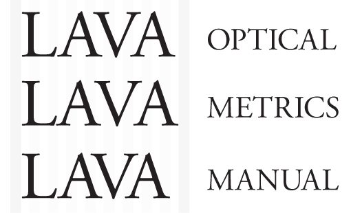
This is a nice option that you should experiment with frequently for various blocks of text. I’ve not found that one of the options works better in 100% of the cases, it really depends on the letters and typeface used.
Another thing to keep in mind is that different typefaces will require different kerning needs. To test the kerning in a font, I often type out the uppercase word “LAVA” so that I can get a feel for some of the typical problematic areas.
Do: Kern Manually
The multiple automatic kerning modes are nice, but for really important text, it’s always best to just eyeball it.
Keep in mind that I said, “Really important text.” If you’re working with large paragraphs, leading across the entire text area is more worthwhile to tweak than individual kerning pairs. Sure, you could go in and kern each word manually, but it would a inane exercise. However, if you’re creating logo, it’s worth the extra time to make sure that every single letter is placed perfectly.
Don’t: Use the Default Underline
I’ve mentioned a few times on Design Shack that, while I’m all in favor of using lines to add some visual interest to a design, I’m definitely not a fan of the default underline function in most applications.

The text in the example above was created using Photoshop’s text underline command. As you can see, it’s terribly awkward, especially when combined with descenders.
Do: Get Creative With Underlines
Just like kerning, underlines are often best when handled manually. When you draw out a stroke, you have complete customization control. You can change up the stroke weight, create a double stroke, extend the underline past the word or even transform the line into interesting shapes.
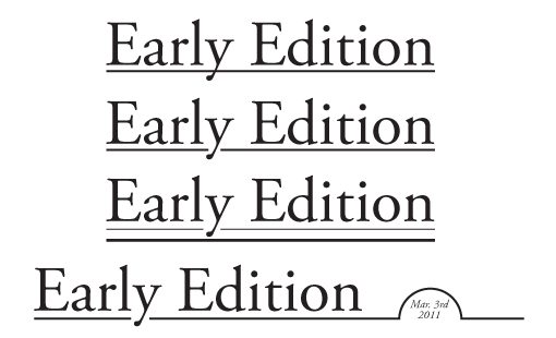
One trick that I use quite often with underlines is creating a little notch for descenders as seen in the second example above. It’s by no means a rule that underlines can’t intersect descenders, I merely prefer how it looks when you avoid the meeting of the two.
Don’t: Use Ornate Fonts for Body Copy
This is a classic mistake that new designers and non-designers make constantly. Fonts are an easy way to inject fun and personality into a design, so the temptation to use interesting typefaces is nearly unbearable.
The problem is that many people don’t know how to properly implement a unique-looking font. Take the following for example.
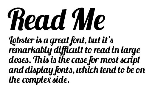
Here I used the wildly popular Lobster font in a manner that I’ve seen on real websites. The problem should be obvious, the paragraph might look fancy but it takes you forever to read.
Further, there’s a lack of contrast between the headline and the body copy. Sure, they’re different sizes but taking boldness into consideration is just as important.
Do: Use Orntate Fonts Fonts for Headlines
In the example below, I’ve fixed the problem. We still get to use our crazy font, but instead of overwhelming the reader with it, we’re being more selective.
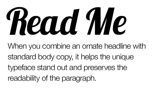
Notice that our two text elements are contrasting very well now. The headline is big, the paragraph is small. The headline is bold, the paragraph is thin. The headline is fancy, the paragraph is plain. The differences go on and on.
The key here is that attractive design elements are appreciated in small doses. Use a creative font in a headline and I’ll think you’re a decent designer, use it everywhere and I’ll think you have no idea what you’re doing.
Don’t: Use Cufon for Text Replacement
This is a debate that I’ve written about before and, despite pushback, I hold my position firmly. I used to think Cufon was a great solution, but modern practices have really moved along to CSS.
Cufon has some big downsides. For starters, it’s a JavaScript-powered text replacement script. Granted, I’m a huge fan of JavaScript for just about everything, but I’m just not sure it’s necessary here when CSS has a solid solution (though I do use Google Web Fonts so maybe I’m a hypocrite).
More importantly, as a user I always notice Cufon because I can’t select/copy/paste text properly. It’s annoying to see live text and to almost have the ability to interact with it, but be stopped short by buggy selections.
Do: Use @font-face
The CSS solution is of course @font-face. It’s simple, loads fast, easy to use and works in modern browsers.
There are a few things to keep in mind when working with @font-face. First of all, the “best” syntax has changed a few times. The current favorite web developer favorite is Fontspring’s New Bulletproof @Font-Face Syntax.
Further, though @font-face is the preferred technology for Google Web Fonts, Typekit and others, not everyone one favors it over Cufon. Some point to font rendering problems, especially on Windows-based computers, as a reason to avoid @font-face. To explore this side of the argument, check out Cufon vs. Font-face: A Visual Comparision.
Don’t: Use Faux Small Caps
Using small caps can be a fun way to add a little variation to your all caps headline. Basically, you’re using all uppercase letters but keeping the letter sizing similar to if you were using title case (the first letter is bigger).
The tricky part about pulling this off is that your first instinct for how to do it is wrong. Consider the example below:
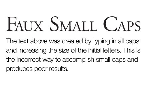
Here I typed some text in all capital letters and then simply made the first letter of each word larger. The result is truly different sized fonts, which is pretty ugly to the astute observer. Notice how the line thickness between the two different letter types is considerably different.
Do: Use a Font with Small Caps
The most obvious solution to this problem is to use a font that was actually built with small caps. Trajan is the overused typical case, but there are plenty of others such as Goudy Small Caps & Old Style Figures. Fonts like these are designed to keep a consistent look despite the varying letter sizes.
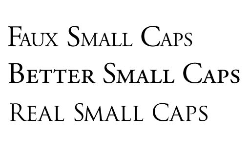
If you need an in-between, Photoshop and Illustrator both have a “small caps” option built into the character palette. This is showcased in the “Better Small Caps” example above. Notice how the letters are much more consistent than in the first example where I tried the same thing manually.
With some old style fonts, the small caps feature can work pretty decently. However, the results can be just as poor or worse than manual efforts on other fonts. For instance, here’s what happens when you try to use the feature on Helvetica.
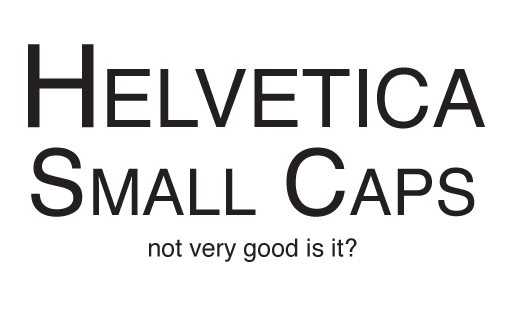
As you can see, we’re back to a noticeable lack of consistency in stroke width. My best advice is to always try to use small caps in conjunction with a font that has it built in. If this isn’t an option, try using the software function for small caps and testing the result to see if it’s acceptable.
Come Back for Part Two!
Thanks for reading our 5 Typography Do’s and Don’ts Everyone Should Know. The surprise is, we’ve got five more still to come! Check back later this week for the conclusion containing some more classic blunders and how to avoid them.
In the mean time, leave a comment and let us know what your typography pet peeves are and which mistakes you’re guilty of committing.