75+ Best Serif Fonts
Bring a classic touch to your designs with our serif fonts. Known for their small lines or strokes attached to larger strokes, these fonts are perfect for printed materials, formal documents, or any design requiring a traditional feel.
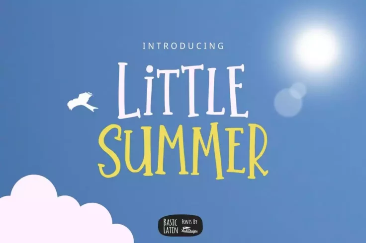
Little Summer Creative Serif Font
This fun and quirky serif font is perfect for designing creating greeting cards and book covers, especially related to kids and fun activities. The fo...
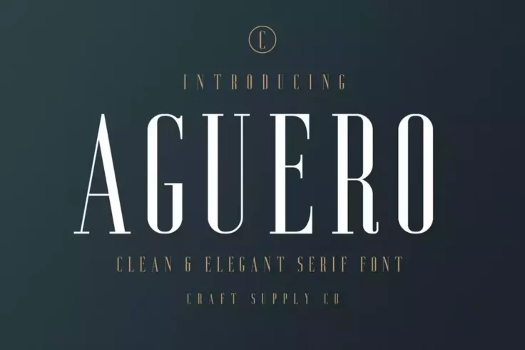
Aguero Serif Clean & Elegant Font
Aguero is a great example of a luxury font that features a set of tall and narrow letters. This font is perfect for designing logos for luxury watch b...

Coldiac Luxury Serif Font
If you want to create a logo that shares the same vibes as popular luxury brands such as Gucci or Georgio Armani, this font is the perfect pick for yo...
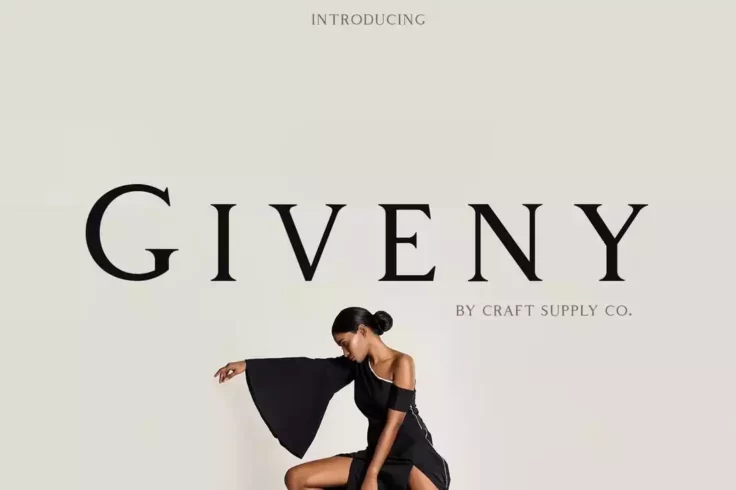
Giveny Classy Serif Font
Giveny has the classic and elegant look that you commonly see on many luxury brand designs. It especially looks similar to the fonts used by Tiffany &...
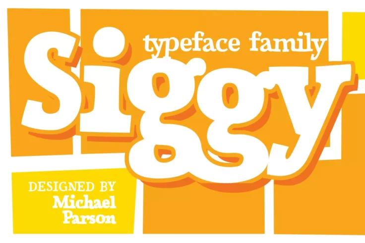
Siggy Font
Next in our list of the best modern serif fonts is Siggy, a sincere serif typeface, that comes with a slight jiggle. It can be a great addition to you...

Tonic Luxurious Serif Typeface
If you’re working on a logo or label design for a modern luxury brand, Tonic is a brilliant serif font you can use to craft your design. This fo...

Minty March Condensed Font
This is the type of font that you usually see on greeting cards and wedding invitations. Minty March is a condensed font that also doubles as a serif ...

Milk and Balls Creative Serif Font
Surely an odd name for a font, but the design and the classy look of this serif make it a must-have font for professionals. The clean-cut letter desig...

Kohm Modern-Vintage Font
Kohn is a unique vintage font with a design of its own. The great thing about this font is that even though it has a rough vintage design, it will ble...

Batusa Professional & Modern Serif Font
Batusa is a highly professional serif font you can use for crafting designs for business and corporate brands. This font features a clean letter desig...
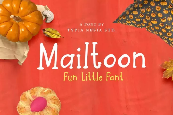
Mailtoon Fun Serif Font
If you’re looking for a fun and quirky serif typeface, Mailtoon is the perfect font for you. It features a creative design that will allow you t...
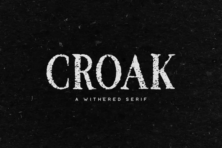
Croak Font
Croak is a spooky Halloween font with a withered design. The font features 2 different designs including a rough version of the font. It also features...

EXPLORER Sailor Original Typeface
Explorer is a serif font family that features 4 different weights, light, medium, regular, and bold. The fonts have minimalist designs that makes them...

Clab Modern Slab Serif Font
This font is the perfect example of a slab serif font. It has a chunky letter design with thick serifs. Making it a great choice for designing attract...
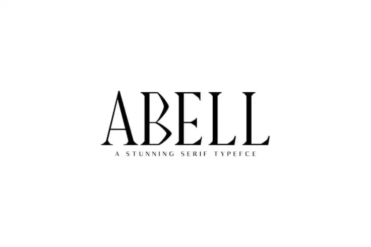
Abell Serif Font Family Pack
Featuring 8 different font weights, Abell is a family of unique fonts that will allow you to create all kinds of business and branding designs. The fo...

Leah Gaviota Casual Decorative Font
Leah Gaviota is a fun and casual family of fonts that can help you create a range of artistic designs from greeting cards, badges, stickers, to logos,...
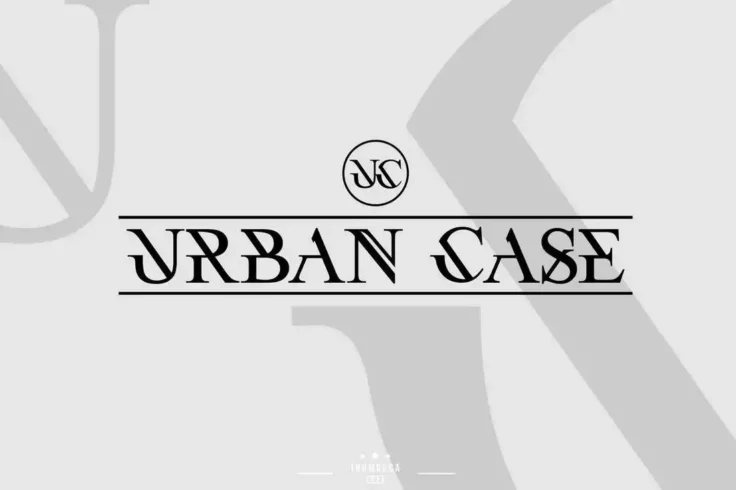
UrbanCase
UrbanCase is a future modern font for luxury design projects. It comes in 2 versions, regular and a Slant version. The font is ideal for logotypes, si...

Oatmeal Jack Hand-Lettered Decorative Font
This is a rare hand lettering font that features a unique decorative design. It comes with lots of stylish ligatures and glyphs. And, as a bonus, incl...

Madelin Bold Serif Font Family
Madelin is a modern serif font featuring a thick and geometric design that makes it stand out from the crowd. The font comes in 5 different font style...
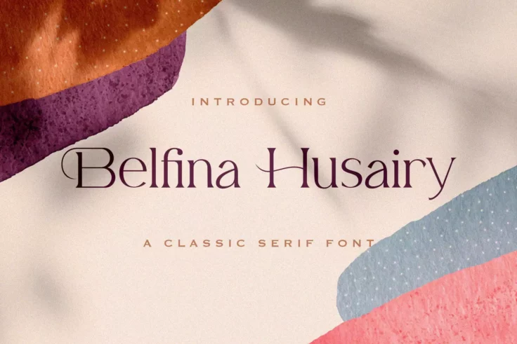
Belfina Husairy Serif Font
Belfina Husairy is a clean, and elegant serif font suitable for any business that’s looking to achieve an upscale, and chic look. Use Belfina Hu...

Nandia Modern Serif Font
Nandia is a creative serif font that’s ideal for making casual and lifestyle designs. The font comes with a stylish and attractive design that w...
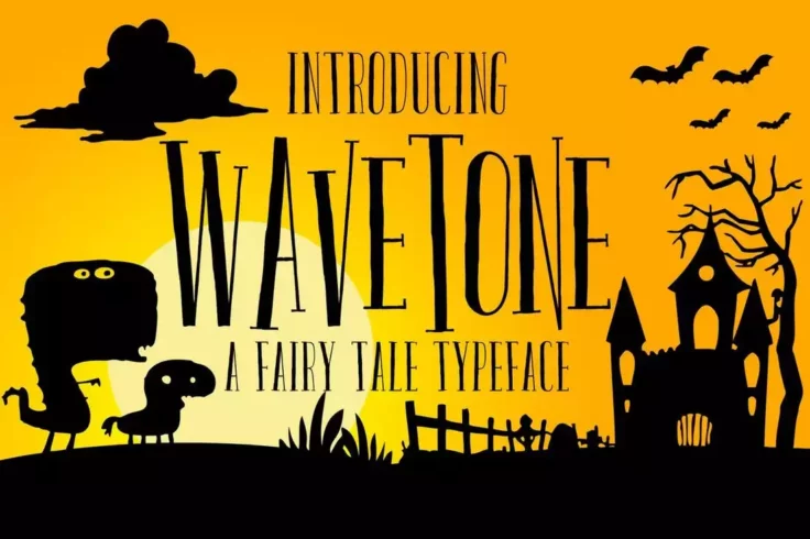
Wavetone Serif Font
Wavetone is a creative serif font that you would use to design a book cover, poster, greeting card, or a flyer. Inspired by classic ads and movie post...

Magista Modern Stylish Serif Font
Magista is a modern and stylish serif font that features a beautiful design. It’s perfect for everything from designing logos to crafting labels...

Anko Modern Serif Font
If you’re looking for a multipurpose serif font that you can use to design everything from creative logos to elegant business cards, this is the...

Washington Display Serif Font
Just like the name, this display font also shows off a certain professionalism with its character design. Its classy look will fit in perfectly with b...
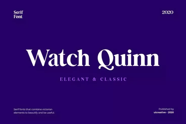
Watch Quinn Elegant Serif Font
At first glance, you can see how classy this font really looks. It features a certain elegant look unlike any other. The clean design of the letters m...

Pomino Modern Serif Font Family
Pomino is a family of serif fonts that comes with multiple styles you can choose from to craft various professional designs. The font family includes ...

MAONA Creative Serif Font
If you’re looking for a serif font with a casual look and feel, this font is perfect for you. Maona comes with a creative and fun letter design ...
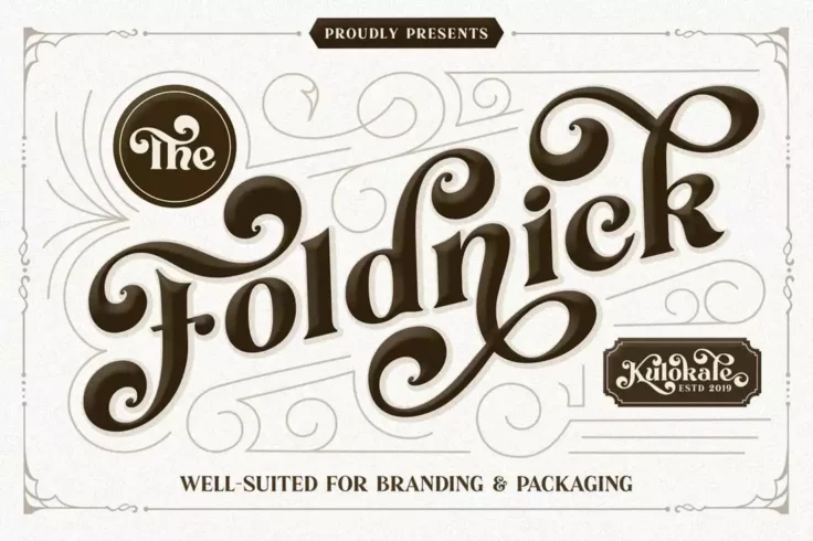
The Foldnick Vintage Decorative Font
If you’re thinking about using a serif font with a creative project, it’s the perfect excuse to use a decorative serif font. This decorati...
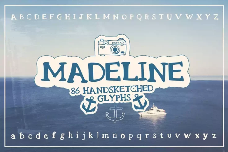
Madeline Handsketched Serif Font
For a carefree hand-sketched effect, consider Madeline. It’s a cute slab serif font, meticulously designed to give your projects a unique look. ...

Willton Elegant Serif Font
Willton is an elegant serif font that comes with a design that uses elements from both vintage and modern eras. It’s perfect for designing logos...

Quixote Obsolete Classic Typeface
The plain and simple design of this font makes it the best choice for designing monograms for luxury and high-end brands. The clean classic look of th...

Harold Modern Serif Font
Harold is a modern serif font with an elegant and a minimal design. It’s an all-caps font that also includes numbers and punctuations. It’...
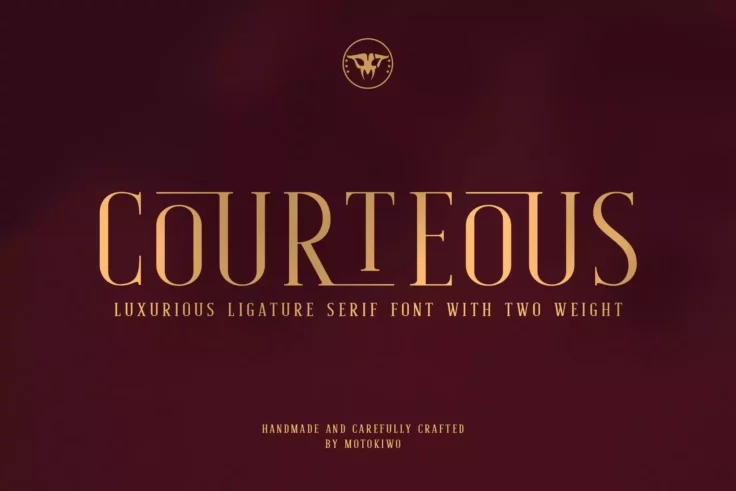
Courteous Serif Font
Courteous is a decidedly elegant, and modish semi-condensed serif font that best fits beauty, and fashion projects. It comes in regular and bold versi...

Legalitere Luxury Serif Font
This modern serif font comes with a luxurious design. It’s perfect for creating labels, logos, and titles for your high-end product and branding...
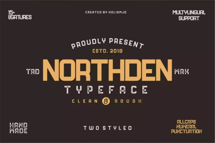
Northden Industrial Serif Font
If you need a design that has a retro, nostalgic touch but is still modern, Northden is well worth checking out. It’s a serif font with an indus...
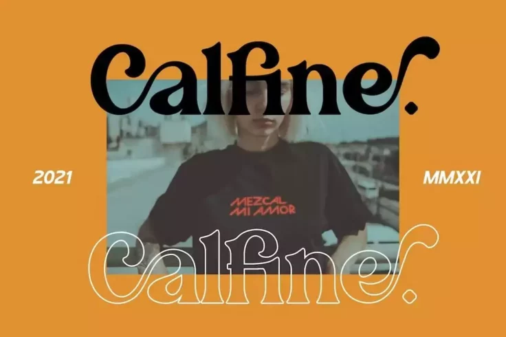
Calfine Stylish Modern Serif Font
Another stylishly modern serif font that combines elements from retro and modern design trends. This font comes in 4 different styles and it includes ...

Caringin Creative Vintage Font
Caringin is an elegant vintage font that’ll look great on a bottle label or a badge for an alcohol brand. The font features a creative serif des...
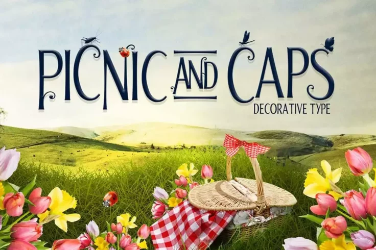
Picnic Caps Serif Font
This is a decorative serif font you can use to create unique book covers and flyers for special events. It’s also great for crafting creative gr...

Merova Classic Serif Font
Merova is a modern serif font that features a design inspired by classic typeface designs. It’s made specifically for crafting logos and signage...

Carentro Classy Serif Font
Carentro is another elegant serif font that’s been made specifically for luxury and high-end branding designs. This font is ideal for crafting e...

Glowist Decorative Serif Font
An ideal pick for greeting cards, t-shirt designs, posters, and other branding material, Glowist is a stunning font that is sure to make a bold statem...

Midtown Groveed a Modern Serif Font
You can use this font to design modern and urban-style titles and headings for your projects. The font includes regular, bold, and outline styles that...

Style Clubs Font
This creative serif font is the perfect choice for crafting fashion, apparel, and luxury brand logos and stationery designs. The font comes in 2 style...

Maiah Serif Font Family Pack
Maiah is a family of serif fonts that comes with 4 different font weights ranging from light to bold. It features both uppercase and lowercase letters...

Bistro Font
Even creative font designers are now slowly adopting the monospaced style. This is one of those fonts that perfectly combines creativity with monospac...

Vera Typeface
A font made specifically for luxury brands and high-end products, Vera is ideal for showing off authority and class. Vera features a design similar to...

Galvin Slab Serif Font Family Pack
Galvin is a complete slab serif font family that comes with 8 different weights ranging from regular, outline, thin, and bold. The condensed design of...

Jerrick Serif Font Family
Jerrick is a modern serif fonts family that include 6 different typefaces ranging from regular to bold and italics. The font features both uppercase a...
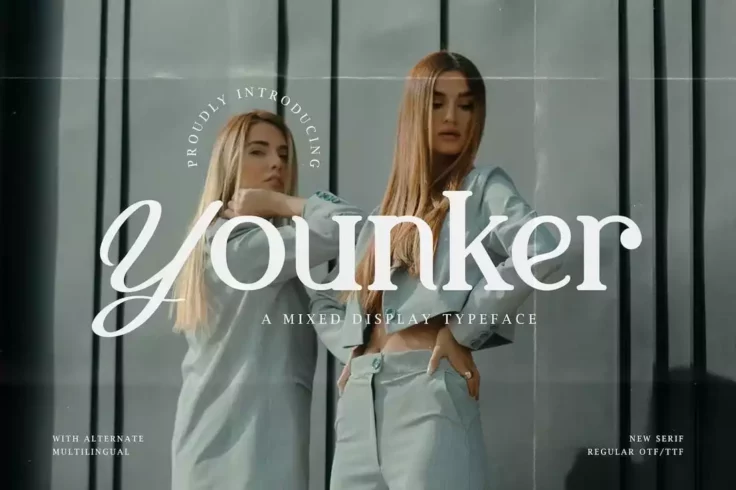
Younker Unique Mixed Display Font
Younker is a unique mixed display font that comes with a set of both serif and script letters. The script letters are available as an alternate set. Y...

Brant Serif Font
Brant is a classic serif typeface that oozes out an air of luxury and elegance. It has a curvy design that would work on pretty much everything from l...
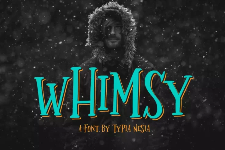
Whimsy Decorative Display Font
Whimsy is a handdrawn typeface suitable for a wide range of projects but especially suited to fantasy-themed designs. Be it a t-shirt design, logotype...

Campfire Handmade Slab Serif Font
This is a hand-made slab serif font that comes with a modern design. Even though the preview image shows off the font with a retro-look, you could eas...

Slabien Slab Serif Font
If you’re looking for a minimalist font to add a professional touch to your designs, this font is perfect for you. It’s a slab-serif font ...

The Holloway Creative Serif Font
If you’re working on a creative greeting card design, poster, or even a social media cover, this modern serif font will help add a unique touch ...

June Morning Font
June Morning is an all-caps hand-drawn display font that’s best for playful and kids-related designs, including book covers and greeting cards. ...

Samford Font
Samford comes with a clean design making it a great choice for your minimalist website and print design works. It’s available in Solid and Outli...
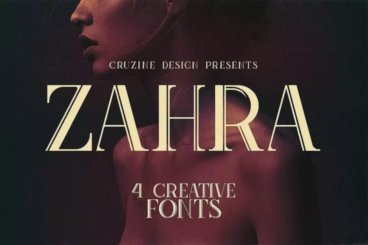
Zahra Typeface
Zahra is the type of font that you can use to craft logos, business cards, and website headers for luxury brands and high-end products. It comes in 4 ...
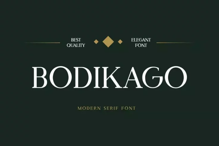
Bodikago Luxury Serif Font
Another modern luxury serif font for crafting logos, labels, flyers, and business cards for high-end brands and products. This font has a thick letter...

Westlake Serif Font
Westlake is one of the best examples of modern serif fonts with a dash of vintage charm. It’s a fantastic choice for a multitude of projects tha...
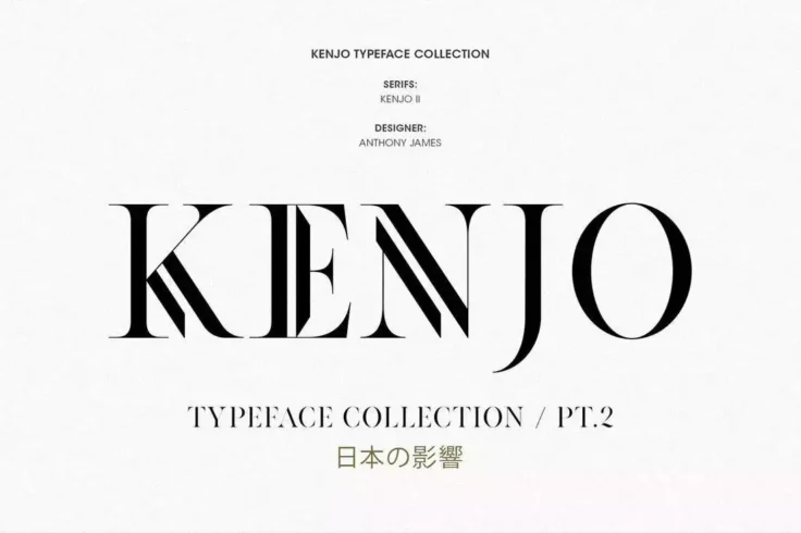
Kenjo Font
Kenjo is a collection of modern serif fonts that features a design inspired by Japanese art and decorations. It’s most suitable for making logos...

Ocean Twelve Unique Serif Font
Modeled after the 90s style typography usually seen on flyers, posters, and book covers, Ocean Twelve is a modern serif font that will give your desig...
Cloudy Aurora Font Duo
Cloudy Aurora is a fantastic product containing 2 fonts, a contemporary serif, and a handwritten script. It comes packed with six premade logos making...

Lansdowne Vintage Serif Font
Lansdowne is a perfect candidate to quench your thirst for a vintage, classic font. An all-caps, slanted typeface, Lansdowne packs a powerful punch an...
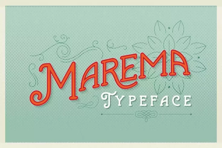
Marema Gothic Typeface
Marema is a stunning retro-vintage font that will transport you back in time with its gothic design elements. The font has a unique, creative flow tha...

Thomas Craft Modern Serif Typeface
Thomas Craft features a truly modern design with a clean and minimalist layout. You can use it to design logos, website headers, flyers, and much more...

Morning Glory
Morning glory is yet another font that’s been designed inspired by Victorian day culture and fashion. It includes both uppercase and lowercase l...
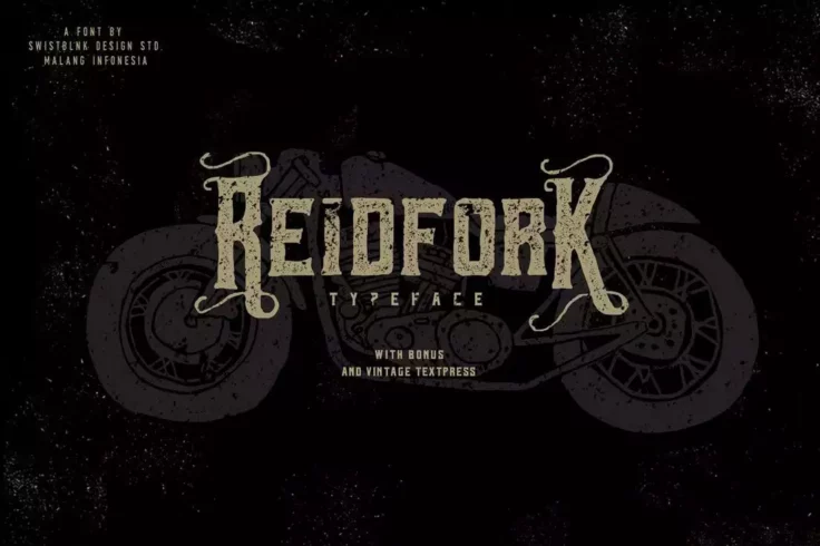
Reidfork Typeface + Textpress
Reidfork is a unique serif font that features a mixed modern vintage design. The font comes to you in 3 versions, regular, hand-drawn, and hand-drawn ...

Aspal Modern Serif Font
Aspal is an all-caps modern serif font that has a beautiful design for crafting elegant logos and signage. The font comes in both regular and stencil ...
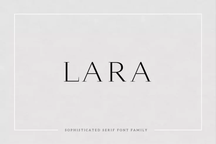
Lara Sophisticated Serif Typeface
The simple and elegant design of this serif font makes it an ideal choice for designing sophisticated brand logos for fashion and luxury businesses. I...
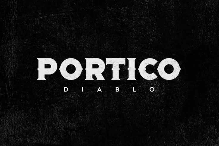
Portico Diablo Font
Portico Diablo is an impressive font that stands out with its bold and gothic design. With its unique and distinctive style, Portico Diablo is an exce...

Morgen Handwritten Serif Font Family
It’s not every day you get to see a handwritten, hand-crafted, serif font. This font will definitely make your designs stand out from the crowd....

Velomia Vanora Font
A clean, beautiful, and feminine font for crafting all kinds of print and digital designs. This font is especially great for designs related to the be...

Kula Modern Slab Serif Font
Kula is an elegant and modern slab serif font that features a thick and bold design. This font is ideal for making headings, poster titles, and even l...

Quas Stencil Font
Quas is a stencil font featuring an elegant and luxurious design. This font is perfect for making designs for luxury, high-end, and fashion-related bu...

Deadhead Classic
Deadhead is a playful serif font with a classical design. It comes with an old-school look inspired by the 1960s and includes 300 glyphs, alternate ch...
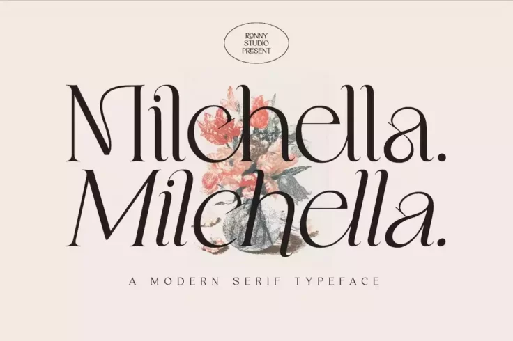
Milchella Modern Serif Font
Milchella is an elegant serif font you can use to craft designs related to fashion, lifestyle, and feminine brands. The font has a stylishly attractiv...

Jewel Display Font
Jewel is a classic serif font that features a modern vintage design. It comes in 4 different styles, regular, bold, grunge, and grunge bold. The font ...
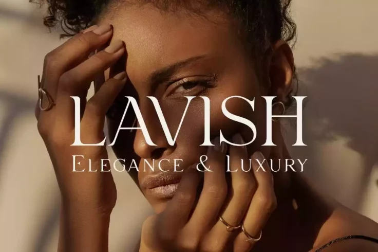
Lavish Elegant Serif Font
Lavish is an elegant serif font that comes with stylish clean-cut letters. It’s perfect for crafting packaging designs for luxury brands and hig...
FAQs About Serif Fonts
What are Serif Fonts?
Serif fonts, also known as Roman fonts, are a style of font that feature small lines or strokes attached to the ends of larger lines in the letters, symbols or numbers. This style is one of the oldest known typefaces and has been used since the Roman era.
The word 'serif' originates from the Dutch term 'schreef', meaning 'line' or 'pen stroke'. It represents a traditional and classical style and is most commonly used in printed materials due to its sharp contrast and high readability on paper.
What are some examples of Serif Fonts?
There are many serif fonts that are widely used and recognized. Some of the more popular ones include Times New Roman, Georgia, Garamond, Baskerville, and Palatino. Each of these fonts has its own unique characteristics and styles, but all feature the distinctive flourishes or 'serifs' at the ends of their strokes.
These fonts are often used in formal or professional documents, such as academic papers, newspapers, books, and legal documents due to their traditional style and high readability.
How do Serif Fonts affect the readability of text?
One of the main effects of using serif fonts is that it can enhance the readability of text, especially in printed materials. The little 'feet' or serifs at the end of strokes can make letters more distinctive and easier to recognize. This can help guide the eye along lines of text, improving reading speed and reducing eye fatigue.
However, on low-resolution screens, these serifs can sometimes found hard to display, making the text harder to read. In these cases, sans-serif fonts, which lack these additional strokes, are often a better choice.
Can Serif Fonts be used in web design?
Yes, serif fonts can be used in web design. While they were once shunned for their poor readability at smaller sizes on low-resolution screens, advancements in screen technology as well as the advent of font smoothing technology such as anti-aliasing have made serif fonts much more suitable for use in digital environments.
But keep in mind, readability is crucial in web design, so making the right choice between serif and sans-serif fonts, considering the nature of your content and the overall aesthetic of your website, is of utmost importance. Comments and feedback from users can also be helpful in deciding which font style is most suitable.
What’s the difference between Serif and Sans-Serif Fonts?
The main difference between serif and sans-serif fonts lies in the small decorative lines attached to the ends of strokes in serif fonts. 'Sans' is French for 'without', so a sans-serif font simply means a font without serifs. Serif fonts tend to appear more elaborate and traditional, while sans-serif fonts look simpler and more modern.
Furthermore, while serif fonts tend to be easier to read in print, sans-serif fonts are typically considered more legible on-screen, especially at smaller sizes or lower resolutions. However, with increasing screen resolutions and improving display technologies, the gap between these two typefaces is narrowing.